

1 Before you start
This is not graded, and it does not count towards anything. Answer every question even if you are only guessing — having a go at something before you have been taught it is one of the best ways to remember it afterwards. The lesson ends with another short check, and there you will be shown the correct answer for anything you missed. Choose an option for every question and confidence rating, then click Submit answers.
A fitted model gives an age slope of 0.05 with a 95% confidence interval of 0.02 to 0.08. What does that interval tell you?
A 95% confidence interval for a regression slope runs from -0.01 to 0.12. What can you conclude at the 5% level?
You fit lm(hba1c ~ age) on patients aged 45 to 75, then call predict() for a 95-year-old. Why should you be cautious?
To predict HbA1c for a new 68-year-old, which call is correct given a model fitted with predictor age?
In a residuals-vs-fitted plot, what pattern suggests a straight line was the right shape?
On a Normal Q-Q plot of a model's residuals, the points curve away from the diagonal at both ends. What does this suggest?
What makes a variable a confounder of the relationship between a predictor and an outcome?
In lm(hba1c ~ bmi + age + sex), how do you interpret the bmi slope?
I can attach a 95% confidence interval to a regression slope with confint(), predict the outcome for a new patient with predict(), and explain when a prediction is unsafe extrapolation.
I can read the residuals-vs-fitted and Normal Q-Q plots from plot(model) to judge whether a linear model's assumptions hold before I trust its slope.
I can explain what a confounder is, fit an adjusted multiple regression by adding covariates with +, and compare the raw and adjusted slopes to see how the estimate moves.
2 Introduction
In Part I you fitted a straight line through a cloud of clinical measurements with lm() and read its slope, intercept, and R-squared. A slope on its own is only half the story: it is one estimate from one sample, it assumes a shape that may not fit, and it can be an artefact of a variable you never measured. This part shows you how to put a range around a slope, use the line to predict a new patient, check whether the model's assumptions actually hold, and see how an estimate moves once you account for a confounder.
This part of the module covers four steps that turn a fitted line into a result you can defend:
- Uncertainty and prediction — a confidence interval for the slope with confint(), a prediction for a new patient with predict(), and the fitted line drawn with geom_smooth(method = "lm").
- Diagnostic plots — what plot(model) is really testing, reading the residuals-vs-fitted plot for the wrong shape and the Q-Q plot for non-Normal residuals.
- Confounding — how a third variable linked to both predictor and outcome can distort a slope, and why a significant raw slope is never proof of cause.
- Adjusting with multiple regression — adding covariates with + to estimate each predictor's effect with the others held fixed, and comparing raw and adjusted estimates with broom::tidy().
By the end of this part you will be able to attach a 95% confidence interval to a slope and say what it means, predict the outcome for a new patient and know when a prediction is unsafe, read the first two diagnostic plots to judge whether the linearity and Normality assumptions hold, and fit a small adjusted model to watch a slope move once you account for a confounder.
Try every snippet in the R Scratchpad on the right. This part needs no data file — you will build a small cohort with set.seed(), rnorm(), and data.frame() so everyone sees the same numbers. Use the native pipe |> if you reach for a pipe, and call library() explicitly for ggplot2 and broom when you need them.
3 Uncertainty, prediction, and drawing the line
A slope is an estimate from one sample, so it comes with uncertainty. Now you put a range around it, use the line to predict a new patient, and draw the whole thing so you can see what the model is claiming.
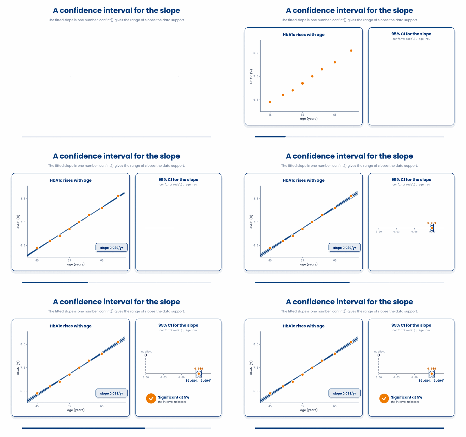
A confidence interval for the slope is the plausible range for the TRUE slope in the wider population, given your sample. You get it with confint, which returns the lower and upper bound for every coefficient. If the age slope is 0.05 with a 95% interval of 0.02 to 0.08, the data are consistent with anything in that band.
Try this snippet in the R Scratchpad on the right.
set.seed(123)
age <- round(rnorm(40, mean = 60, sd = 8))
hba1c <- 4 + 0.05 * age + rnorm(40, mean = 0, sd = 0.4)
clinic <- data.frame(age, hba1c)
model <- lm(hba1c ~ age, data = clinic)
confint(model)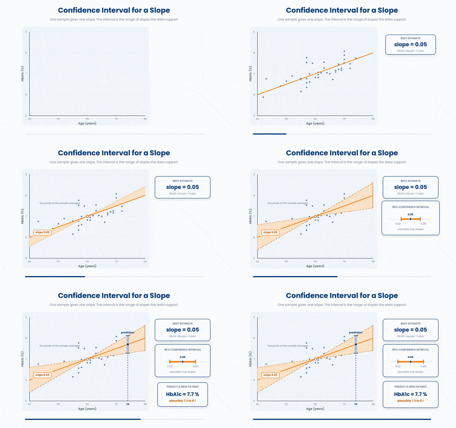
If a slope's confidence interval does NOT cross zero, the predictor is statistically associated with the outcome at the 5% level. But a slope being statistically significant still does not make it causal — significance and causation are separate questions, and Section 6 shows why.
To predict the outcome for a new patient, hand predict the model and a small data frame holding the new predictor value. The column name must match the predictor in the model exactly. Here you predict HbA1c for a 68-year-old.
Try this snippet in the R Scratchpad on the right.
set.seed(123)
age <- round(rnorm(40, mean = 60, sd = 8))
hba1c <- 4 + 0.05 * age + rnorm(40, mean = 0, sd = 0.4)
clinic <- data.frame(age, hba1c)
model <- lm(hba1c ~ age, data = clinic)
new_patient <- data.frame(age = 68)
predict(model, newdata = new_patient, interval = "confidence")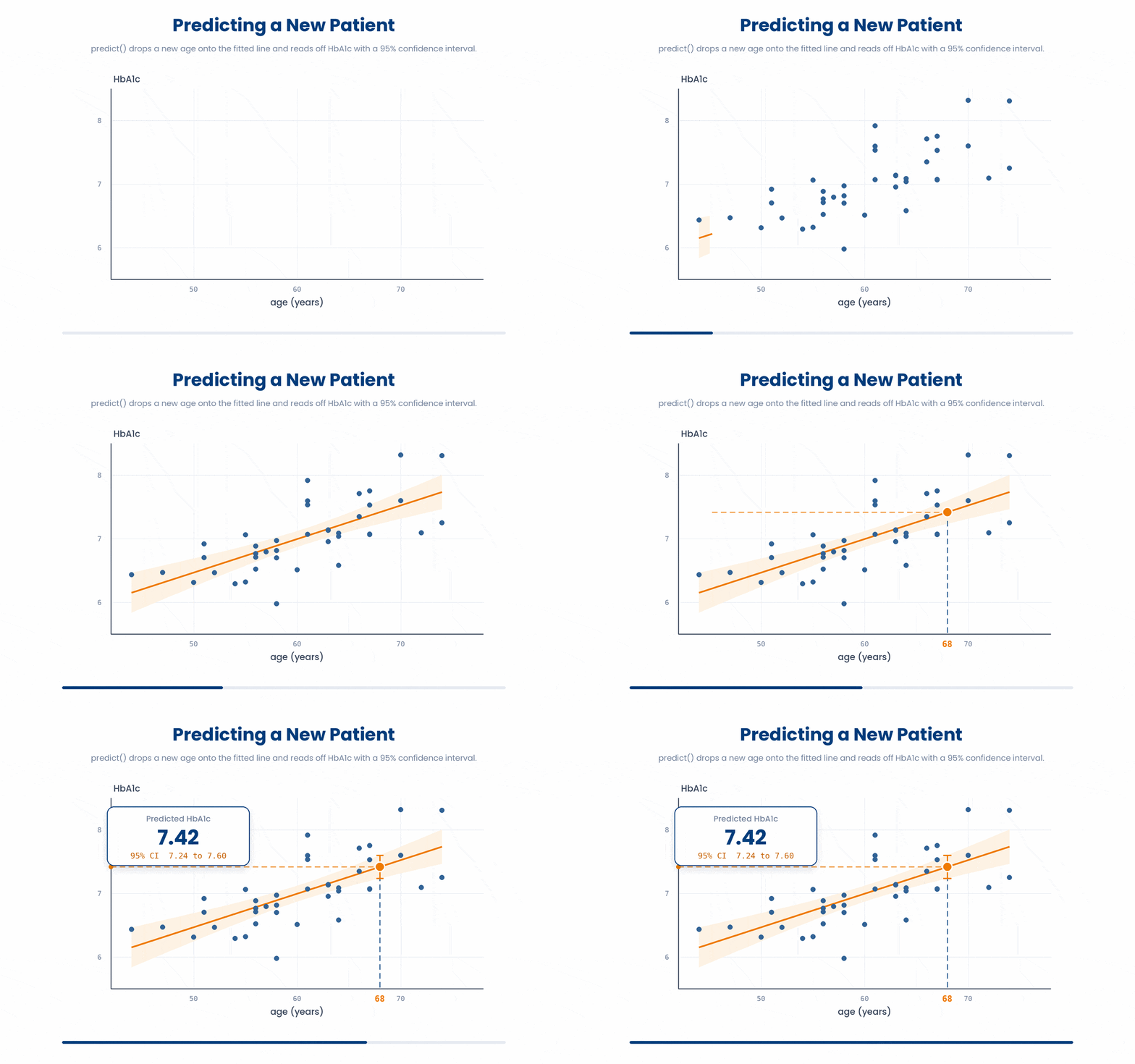
Beware prediction beyond your data. Predicting far outside the range of ages you actually observed — extrapolation — is unreliable, because the straight line may not hold out there. A model built on patients aged 45 to 75 says little about a 95-year-old.
3.1 Drawing the fitted line with ggplot2
Numbers are easier to trust once you see the line on the data. With ggplot2 you draw the scatter of points with geom_point(), then overlay the regression line with geom_smooth(method = "lm"). The method = "lm" tells ggplot to fit the same least-squares line and draw its confidence band.
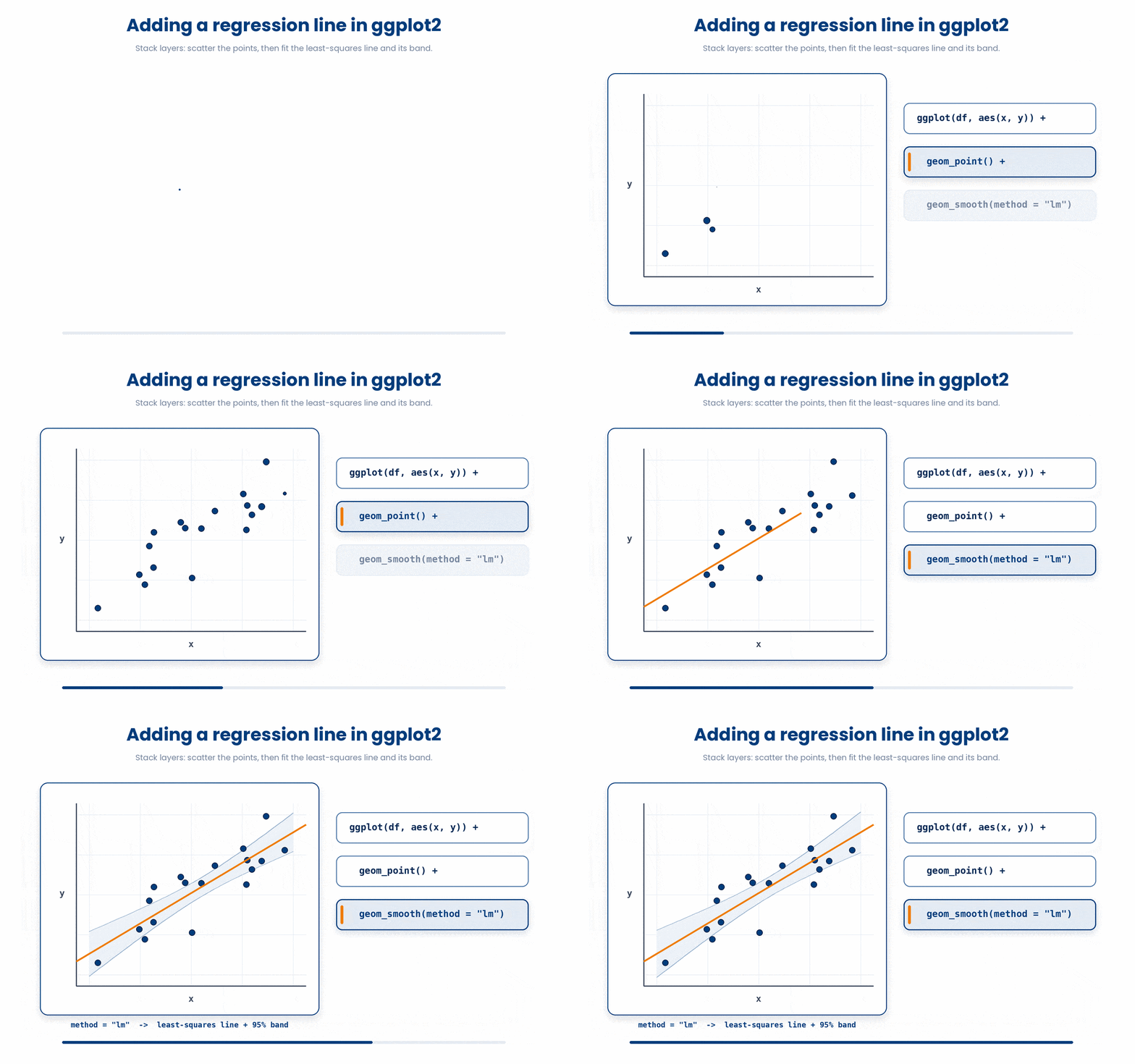
A ggplot only appears when it is printed at the top level, so end the snippet with the plot object itself. Run this and read the line against the cloud of points.
Try this snippet in the R Scratchpad on the right.
library(ggplot2)
set.seed(123)
age <- round(rnorm(40, mean = 60, sd = 8))
hba1c <- 4 + 0.05 * age + rnorm(40, mean = 0, sd = 0.4)
clinic <- data.frame(age, hba1c)
ggplot(clinic, aes(x = age, y = hba1c)) +
  geom_point() +
  geom_smooth(method = "lm")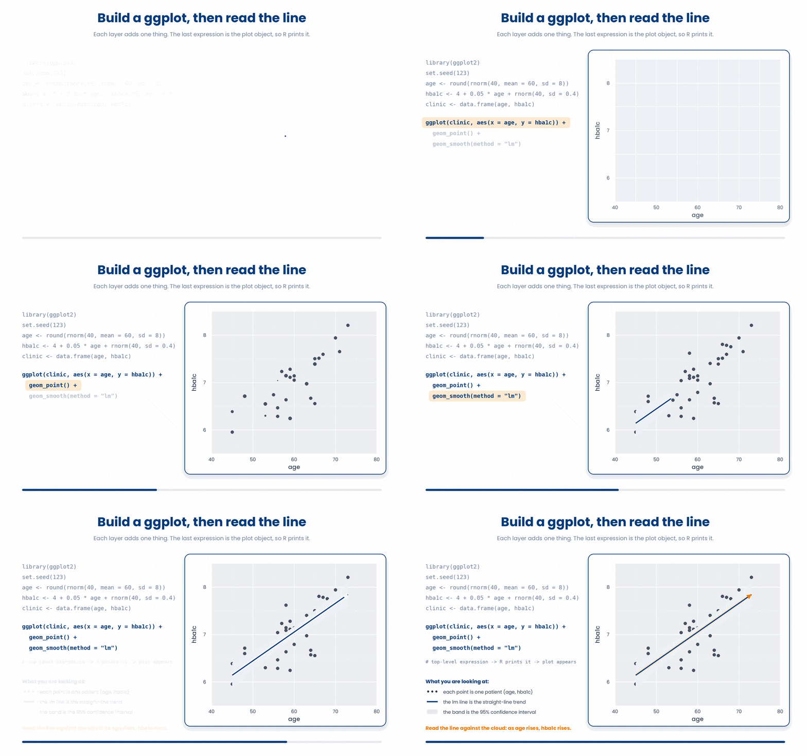
We can practice using the example below to put an interval on the slope.
Work through this example in three stages. You unlock each stage only after the tutor confirms the previous one. Each stage removes more of the scaffolding — by the end you are writing it yourself.
Problem: Fit HbA1c on age for the eight patients and report the 95% confidence interval for every coefficient with confint(), rounded to three decimals.
age <- c(45, 52, 61, 58, 70, 49, 65, 55)
hba1c <- c(6.4, 6.9, 7.8, 7.5, 8.6, 6.7, 8.1, 7.2)
model <- lm(hba1c ~ age)
round(confint(model), 3)- fit the model
- confint() returns the lower and upper bound for each coefficient
- a slope interval that excludes 0 is significant at the 5% level
The same solution with key parts replaced by ???.
Fill in every ??? so the code matches the reference,
then ask the tutor to check it.
Your turn: The age slope is about 0.05 HbA1c per year. Over ten years, how much higher is predicted HbA1c? Report 0.05 * 10.
4 Checking the fit with diagnostic plots
You can fit a line to any data, even data where a straight line makes no sense. So before you trust a slope, you check whether the model's assumptions actually hold — and R gives you the plots to do it in one call.
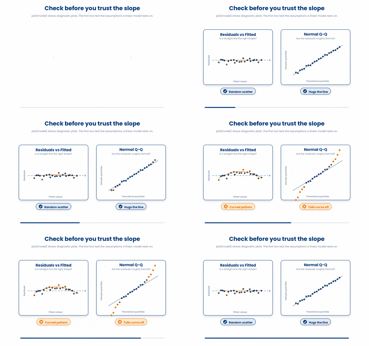
plot(model) draws four diagnostic plots; the first two matter most here. They test the assumptions a linear model rests on, using the residuals — the leftover gaps between each point and the line you met in Section 2.
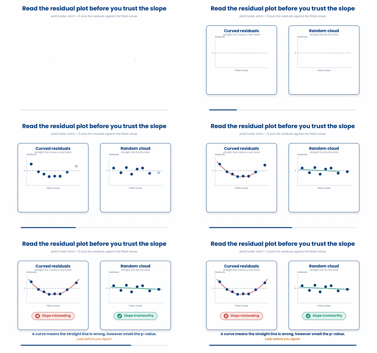
The residuals-vs-fitted plot checks whether a straight line was the right shape. You want the points scattered randomly around the horizontal zero line with no pattern. A clear curve or funnel shape is a warning that the relationship is not linear, or that the spread of the outcome changes across its range.
The Q-Q plot (quantile-quantile) checks whether the residuals are roughly Normal, which the usual p-values and intervals assume. You want the points to sit close to the diagonal line. Points curving away at the ends flag skew or heavy tails in the residuals.
A base-R plot appears as soon as you call it — no printing needed. Run this and read the first two panels.
Try this snippet in the R Scratchpad on the right.
set.seed(123)
age <- round(rnorm(40, mean = 60, sd = 8))
hba1c <- 4 + 0.05 * age + rnorm(40, mean = 0, sd = 0.4)
clinic <- data.frame(age, hba1c)
model <- lm(hba1c ~ age, data = clinic)
plot(model, which = 1)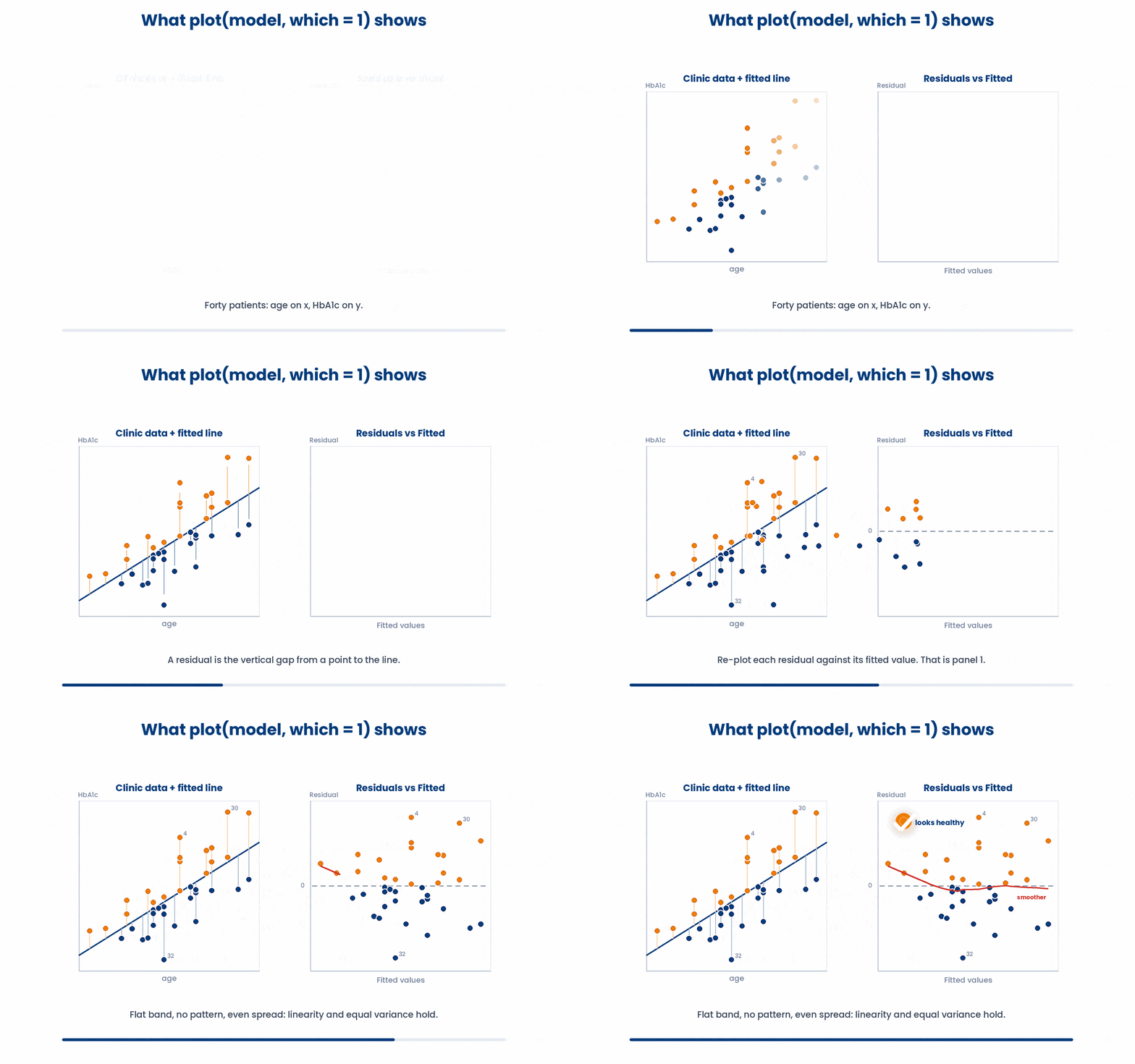
The second panel is the Q-Q plot of the residuals. Swap which = 1 for which = 2 to see whether the residuals track the diagonal — a quick read on the Normality the p-values assume.
Try this snippet in the R Scratchpad on the right.
set.seed(123)
age <- round(rnorm(40, mean = 60, sd = 8))
hba1c <- 4 + 0.05 * age + rnorm(40, mean = 0, sd = 0.4)
clinic <- data.frame(age, hba1c)
model <- lm(hba1c ~ age, data = clinic)
plot(model, which = 2)
The mistake to avoid: skipping the diagnostic plots and reporting a slope from a model whose assumptions are clearly broken. A curved residual plot means the straight-line slope is misleading, no matter how small its p-value. Look before you report.
Always check the model before you trust it. Try the example below.
Work through this example in three stages. You unlock each stage only after the tutor confirms the previous one. Each stage removes more of the scaffolding — by the end you are writing it yourself.
Problem: Fit HbA1c on age for the eight patients and draw the residuals-vs-fitted diagnostic plot.
age <- c(45, 52, 61, 58, 70, 49, 65, 55)
hba1c <- c(6.4, 6.9, 7.8, 7.5, 8.6, 6.7, 8.1, 7.2)
model <- lm(hba1c ~ age)
plot(model, which = 1)- fit the model
- plot(model, which = 1) draws residuals against fitted values
- a random cloud around zero means a straight line fits
The same solution with key parts replaced by ???.
Fill in every ??? so the code matches the reference,
then ask the tutor to check it.
Your turn: Draw the Q-Q plot of the residuals with plot(model, which = 2).
5 Confounding and adjusting for other variables
A single-predictor slope answers one question in isolation, but patients are not isolated. The last and most important idea in this part is that another variable can lurk behind your slope and change its whole meaning.
A confounder is a third variable that is linked to BOTH your predictor and your outcome, and so distorts the relationship between them. Age is the classic one: it relates to almost everything in medicine, so an unadjusted slope often partly reflects age rather than the predictor you care about.
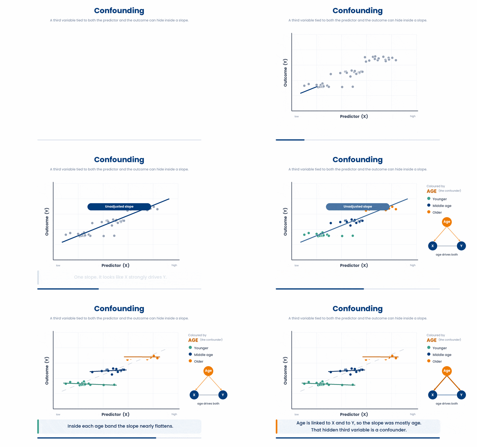
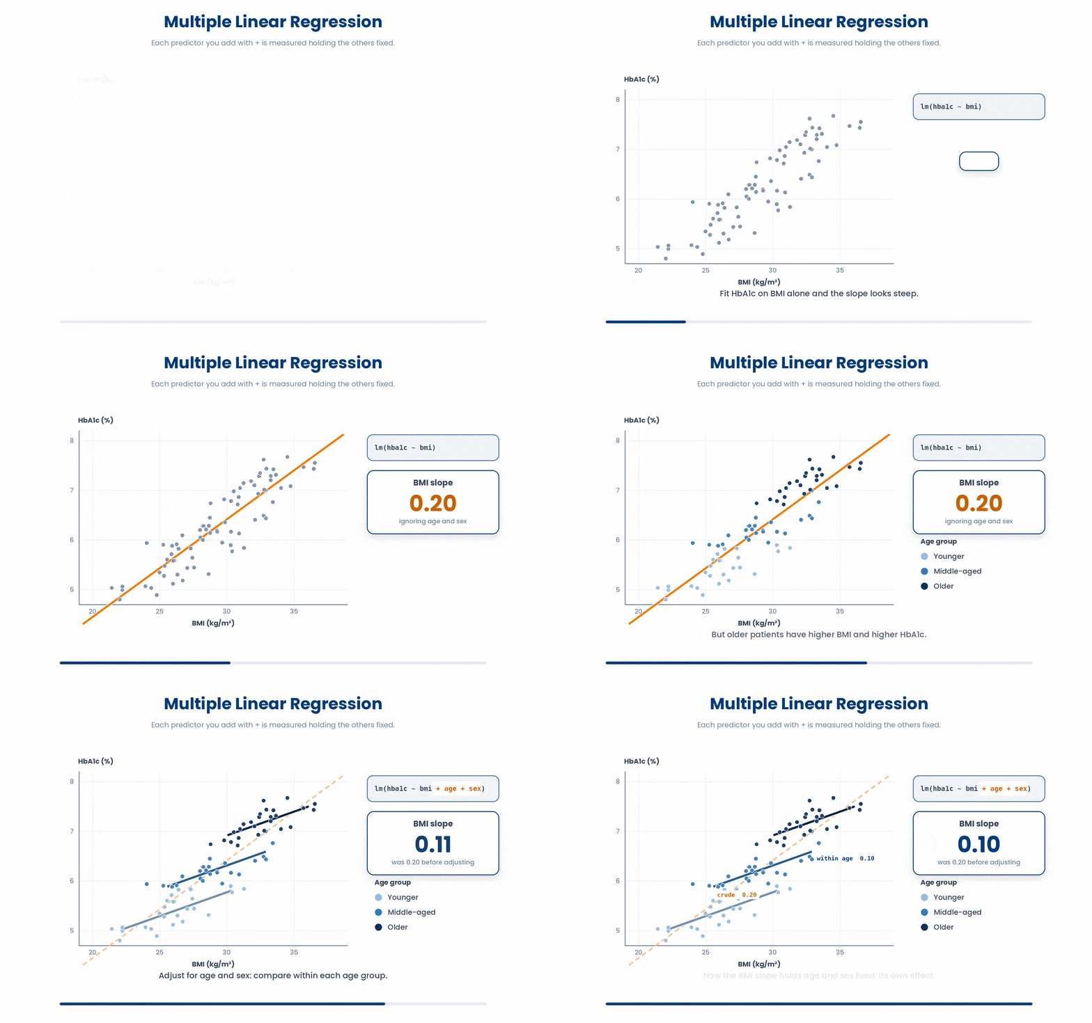
Make it concrete. Suppose you regress HbA1c on body-mass index and find a clear positive slope. But older patients tend to have both higher BMI and higher HbA1c. Some of that BMI slope may really be age in disguise. To see the BMI effect on its own, you adjust for age.
You adjust by adding more predictors to the formula with +. lm(hba1c ~ bmi + age + sex) fits one model where each slope is the effect of THAT predictor while holding the others fixed. The BMI slope now answers: among patients of the same age and sex, how does HbA1c change per unit of BMI? This is a multiple linear regression.
Build a cohort where age genuinely drives both BMI and HbA1c, fit the unadjusted model, then add age and sex, and watch the BMI slope move.
Try this snippet in the R Scratchpad on the right.
set.seed(42)
age <- round(rnorm(60, mean = 60, sd = 9))
sex <- factor(sample(c("F", "M"), 60, replace = TRUE))
bmi <- 0.15 * age + rnorm(60, mean = 15, sd = 2)
hba1c <- 3 + 0.05 * age + 0.02 * bmi + rnorm(60, mean = 0, sd = 0.4)
clinic <- data.frame(age, sex, bmi, hba1c)
unadjusted <- lm(hba1c ~ bmi, data = clinic)
coef(unadjusted)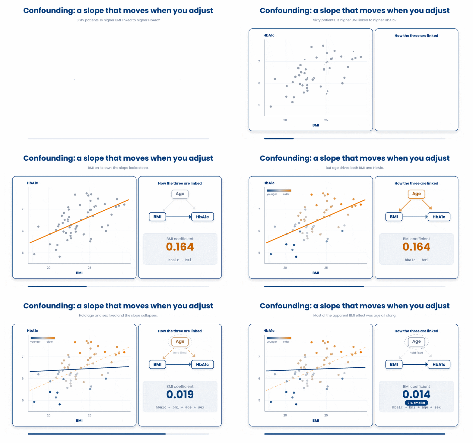
Try this snippet in the R Scratchpad on the right.
set.seed(42)
age <- round(rnorm(60, mean = 60, sd = 9))
sex <- factor(sample(c("F", "M"), 60, replace = TRUE))
bmi <- 0.15 * age + rnorm(60, mean = 15, sd = 2)
hba1c <- 3 + 0.05 * age + 0.02 * bmi + rnorm(60, mean = 0, sd = 0.4)
clinic <- data.frame(age, sex, bmi, hba1c)
adjusted <- lm(hba1c ~ bmi + age + sex, data = clinic)
summary(adjusted)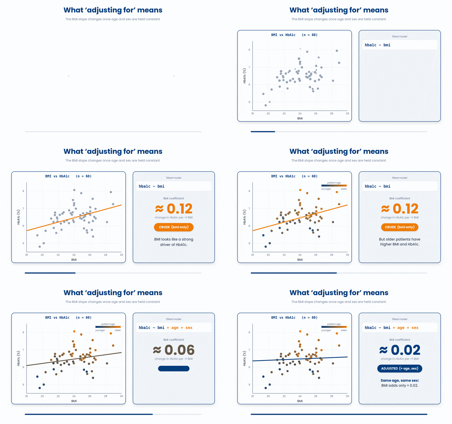
Compare the BMI slope across the two models. The unadjusted slope can shrink, grow, or even flip sign once you adjust for a confounder — this is confounding in action. That is why a significant raw slope is never proof of cause: a confounder you left out could be producing it.
The broom package makes the comparison clean. tidy() turns a model into a one-row-per-coefficient tibble of estimates, standard errors, and p-values — easy to read side by side or drop into a report.
Try this snippet in the R Scratchpad on the right.
library(broom)
set.seed(42)
age <- round(rnorm(60, mean = 60, sd = 9))
sex <- factor(sample(c("F", "M"), 60, replace = TRUE))
bmi <- 0.15 * age + rnorm(60, mean = 15, sd = 2)
hba1c <- 3 + 0.05 * age + 0.02 * bmi + rnorm(60, mean = 0, sd = 0.4)
clinic <- data.frame(age, sex, bmi, hba1c)
adjusted <- lm(hba1c ~ bmi + age + sex, data = clinic)
tidy(adjusted)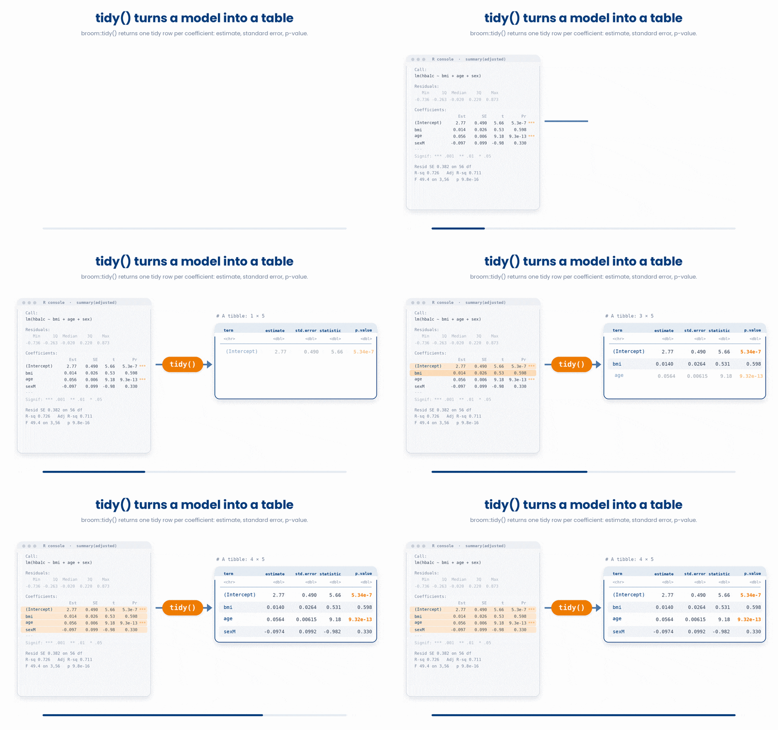
Stay inside this part's scope. You now know how to add covariates to adjust for confounding. How predictors can interact, how to CHOOSE which variables to keep, and how to spot when two predictors are too tangled to separate (collinearity and the VIF) are all Course 2 topics. For now, adjust for an obvious confounder or two and report both the raw and adjusted estimate.
Put it together — watch a slope move once you adjust.
Work through this example in three stages. You unlock each stage only after the tutor confirms the previous one. Each stage removes more of the scaffolding — by the end you are writing it yourself.
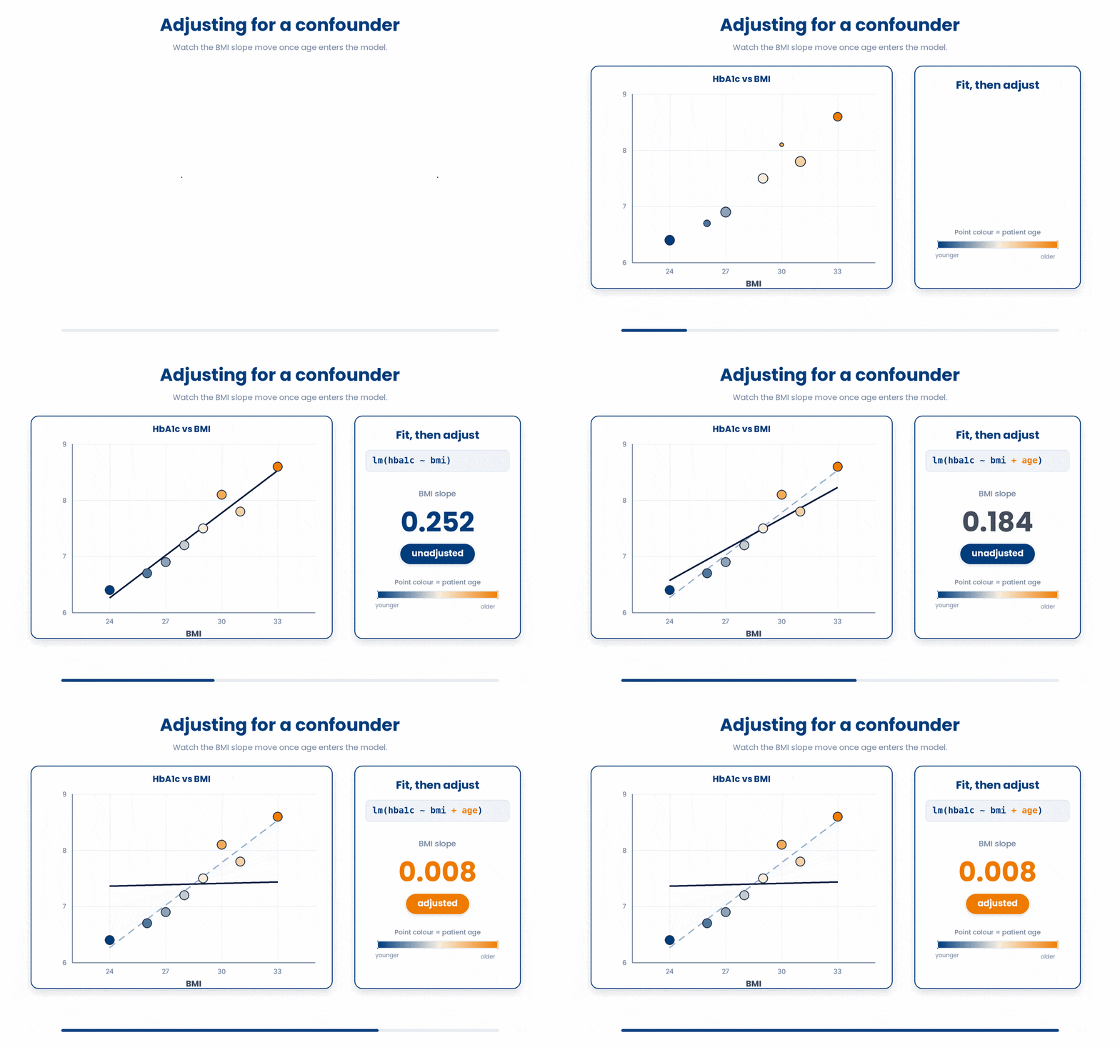
Problem: Eight patients have BMI 24, 27, 31, 29, 33, 26, 30, 28, ages 45, 52, 61, 58, 70, 49, 65, 55, and HbA1c 6.4, 6.9, 7.8, 7.5, 8.6, 6.7, 8.1, 7.2. Fit HbA1c on BMI alone, then adjust for age, and read the BMI slope each time.
bmi <- c(24, 27, 31, 29, 33, 26, 30, 28)
age <- c(45, 52, 61, 58, 70, 49, 65, 55)
hba1c <- c(6.4, 6.9, 7.8, 7.5, 8.6, 6.7, 8.1, 7.2)
unadjusted <- lm(hba1c ~ bmi)
adjusted <- lm(hba1c ~ bmi + age)
round(coef(unadjusted)["bmi"], 3)
round(coef(adjusted)["bmi"], 3)- fit the simple model first
- add age with + to adjust
- compare the BMI slope — if it moves, age was confounding it
The same solution with key parts replaced by ???.
Fill in every ??? so the code matches the reference,
then ask the tutor to check it.
Your turn: Fit the adjusted model lm(hba1c ~ bmi + age) on that data and report how many coefficients it has, including the intercept, with length(coef(adjusted)).
6 Put it together
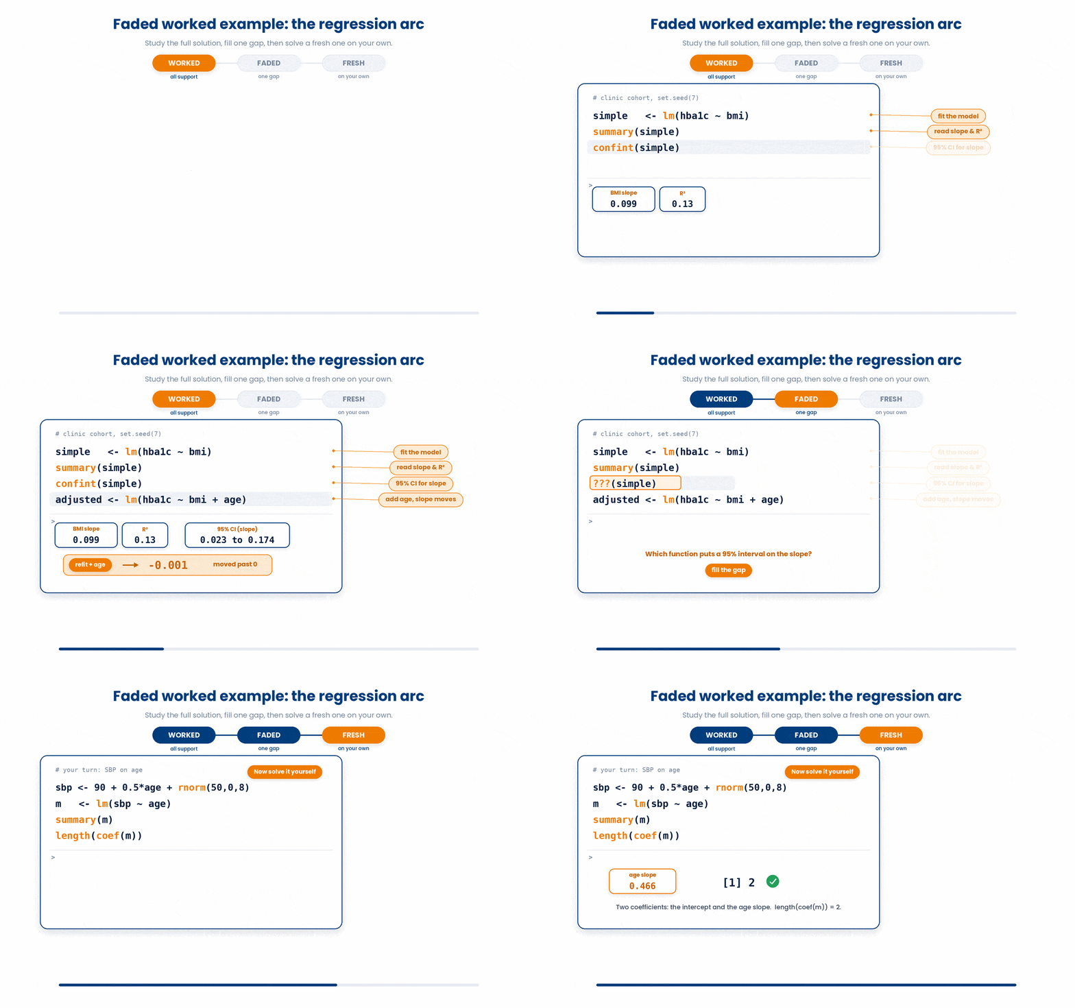
Now you run the full arc: fit a simple regression, read its slope, intercept and R-squared, put an interval on the slope, then add one covariate and watch the estimate move. The worked example fades its support — study the full solution, then fill the gap, then solve a fresh one on your own.
Work through this example in three stages. You unlock each stage only after the tutor confirms the previous one. Each stage removes more of the scaffolding — by the end you are writing it yourself.
Problem: Using a simulated cohort, regress HbA1c on BMI. Read the BMI slope and the R-squared from summary(), get a 95% confidence interval for the slope with confint(), then refit adjusting for age and report whether the BMI slope changed.
set.seed(7)
age <- round(rnorm(50, mean = 60, sd = 8))
bmi <- 0.15 * age + rnorm(50, mean = 15, sd = 2)
hba1c <- 3 + 0.05 * age + 0.02 * bmi + rnorm(50, mean = 0, sd = 0.4)
clinic <- data.frame(age, bmi, hba1c)
simple <- lm(hba1c ~ bmi, data = clinic)
summary(simple)
confint(simple)
adjusted <- lm(hba1c ~ bmi + age, data = clinic)
coef(adjusted)- Build the reproducible cohort with set.seed() so your numbers match
- Fit the simple model hba1c ~ bmi and read the BMI slope and R-squared from summary()
- Wrap the model in confint() to get the 95% interval for the slope
- Refit as hba1c ~ bmi + age and compare the BMI slope: if it moved, age was confounding it
The same solution with key parts replaced by ???.
Fill in every ??? so the code matches the reference,
then ask the tutor to check it.
Your turn: Now fit your own simple regression of systolic blood pressure on age for this cohort: sbp <- 90 + 0.5 * age + rnorm(50, mean = 0, sd = 8). Fit lm(sbp ~ age), read the age slope from summary(), and confirm the model has exactly two coefficients with length(coef(model)).
7 Check your understanding
You have reached the end of the module. Try the same questions again — your answers here, paired with your pre-test answers, are how we measure what the module taught you. Answer every question and confidence rating, then click Submit and see results to view your score.
A fitted model gives an age slope of 0.05 with a 95% confidence interval of 0.02 to 0.08. What does that interval tell you?
A 95% confidence interval for a regression slope runs from -0.01 to 0.12. What can you conclude at the 5% level?
You fit lm(hba1c ~ age) on patients aged 45 to 75, then call predict() for a 95-year-old. Why should you be cautious?
To predict HbA1c for a new 68-year-old, which call is correct given a model fitted with predictor age?
In a residuals-vs-fitted plot, what pattern suggests a straight line was the right shape?
On a Normal Q-Q plot of a model's residuals, the points curve away from the diagonal at both ends. What does this suggest?
What makes a variable a confounder of the relationship between a predictor and an outcome?
In lm(hba1c ~ bmi + age + sex), how do you interpret the bmi slope?
I can attach a 95% confidence interval to a regression slope with confint(), predict the outcome for a new patient with predict(), and explain when a prediction is unsafe extrapolation.
I can read the residuals-vs-fitted and Normal Q-Q plots from plot(model) to judge whether a linear model's assumptions hold before I trust its slope.
I can explain what a confounder is, fit an adjusted multiple regression by adding covariates with +, and compare the raw and adjusted slopes to see how the estimate moves.
8 Your results
Here is how your post-test answers compare with your pre-test answers. The pre/post pairing is the most reliable way to see what this module actually taught you.
Submit the post-test to see your results.
What is the one thing from this module that is still unclear to you?