

1 Before you start
This is not graded, and it does not count towards anything. Answer every question even if you are only guessing — having a go at something before you have been taught it is one of the best ways to remember it afterwards. The lesson ends with another short check, and there you will be shown the correct answer for anything you missed. Choose an option for every question and confidence rating, then click Submit answers.
A receiver operating characteristic (ROC) curve plots which two quantities against each other?
A diagnostic biomarker has an AUC of 0.50. What does this mean?
Which statement about the area under the ROC curve (AUC) is correct?
Why is AUC preferred over accuracy for summarising how well a biomarker discriminates?
You run roc(disease, biomarker) in pROC and the AUC comes back as 0.18. What is the most likely explanation?
The Youden index selects the cut-point that maximises which quantity?
In gtsummary, what does adding add_p() to a tbl_summary() do?
By default, add_p() compares a continuous variable across two groups using which test?
I can explain what an ROC curve and its AUC measure, and why AUC is threshold-free and not the same as accuracy.
I can build an ROC with pROC, report the AUC with its confidence interval, choose a Youden cut-point, and recognise a flipped-label curve that reads below 0.5.
I can build a Table 1 with gtsummary and add_p(), and say which default test it attaches to a continuous versus a categorical variable.
2 Introduction
In Part I you read effect measures off a 2x2 table, where the exposure was binary. But a biomarker is continuous — a blood glucose, a protein level — and a group comparison in a paper's Table 1 needs a p-value that fits each variable's type. This part turns a continuous biomarker into a discrimination number every reader trusts, and attaches the right test to a clean comparison of groups.
This part of the module covers three foundations, each feeding the next:
- ROC and AUC — how a continuous biomarker separates cases from non-cases across every cut-point at once, summarised in one number from 0.5 to 1.0.
- Building the curve and a cut-point — construct the ROC with pROC, report the AUC with a confidence interval, and pick a threshold with the Youden index.
- The right test in Table 1 — attaching a statistically appropriate p-value to a gtsummary summary with add_p(), chosen from each variable's type rather than by habit.
By the end of this part you will be able to explain what an ROC curve and its AUC measure, compute an AUC and a Youden cut-point with pROC, recognise a flipped-label curve that reads below 0.5, and build a Table 1 with gtsummary that attaches the correct default test to each row.
Try every snippet in the R Scratchpad on the right. This part needs no data file — you will build a small cohort with c(), tibble(), and set.seed(). Use the native pipe |> if you reach for a pipe, and call library() explicitly for every package so it pre-installs.
3 ROC and AUC: how well a biomarker discriminates
The effect measures above need a binary exposure. But a biomarker is continuous — a blood glucose, a protein level — and you want to know how well it separates patients who have the disease from those who do not, across every possible cut-point at once. That is what an ROC curve shows.
Pick a cut-point and the biomarker becomes a yes/no test, with a sensitivity (the fraction of true cases it catches) and a specificity (the fraction of true non-cases it clears). Slide the cut-point from low to high and both change. A receiver operating characteristic (ROC) curve plots sensitivity against 1 - specificity for every cut-point.
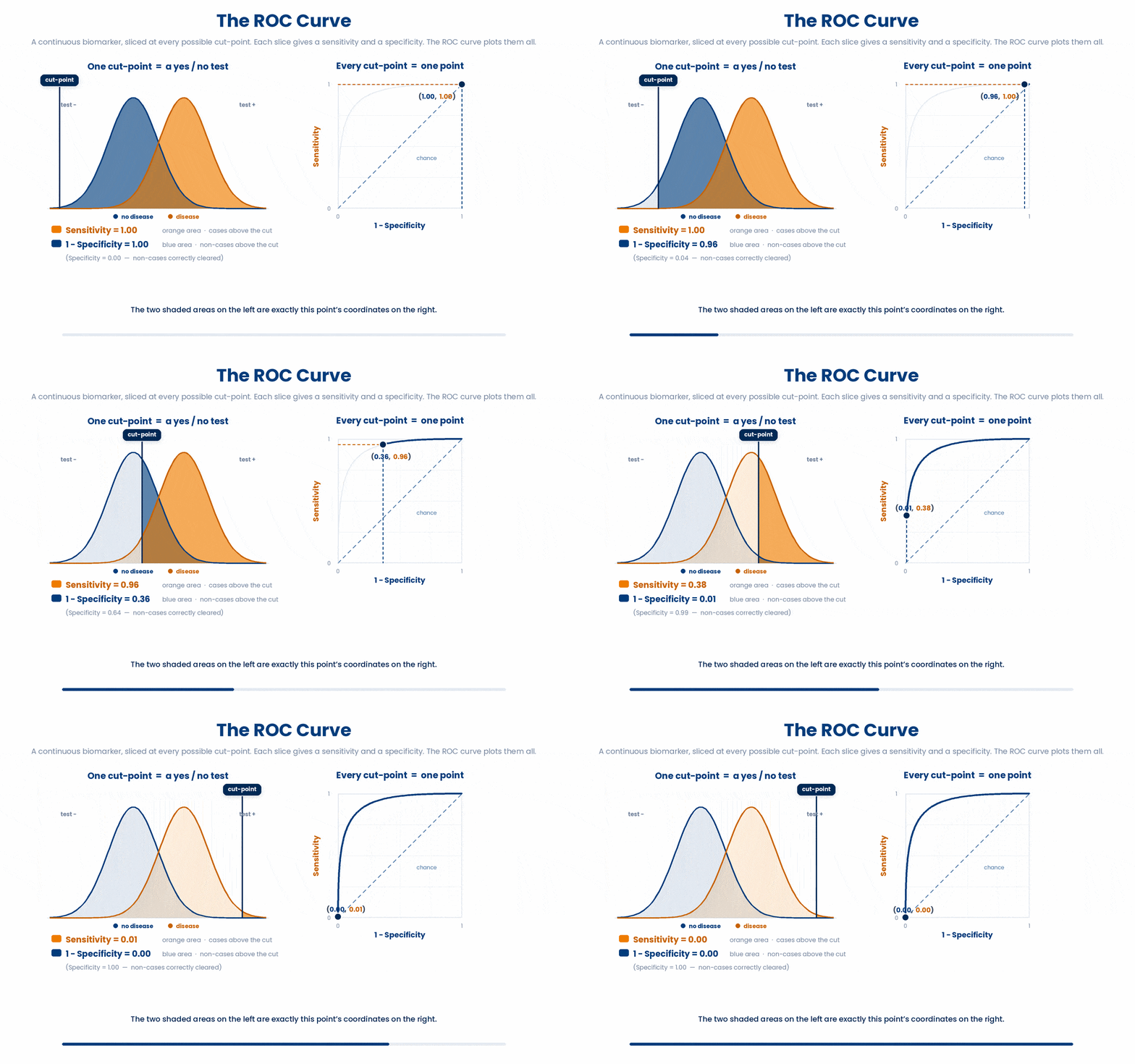
The area under the curve (AUC) summarises that whole curve in one number from 0.5 to 1.0. An AUC of 0.5 is a coin toss — the biomarker cannot tell the groups apart. An AUC of 1.0 is perfect separation. Concretely, the AUC is the probability that a randomly chosen case has a higher biomarker value than a randomly chosen non-case.
Here is the misreading to refuse. AUC is not accuracy. Accuracy is the fraction correct at one chosen cut-point and shifts with disease prevalence; AUC is threshold-free and prevalence-independent, ranking discrimination across all cut-points. A model can have a high AUC and still be useless at the threshold you actually deploy.
3.1 Building an ROC with pROC and choosing a cut-point
The pROC package builds the curve from two columns: the true outcome and the biomarker value. roc() constructs it, auc() reads the area, and ci.auc() gives a confidence interval for that area. Always print the AUC with its CI, never bare.
Try this snippet in the R Scratchpad on the right.
library(pROC)
set.seed(42)
disease <- rep(c(0, 1), each = 30)
biomarker <- c(rnorm(30, mean = 5.5, sd = 1), rnorm(30, mean = 7.0, sd = 1))
roc_obj <- roc(disease, biomarker)
auc(roc_obj)
ci.auc(roc_obj)
Now see the curve itself. Base R plots a roc object directly — sensitivity up the side against specificity along the bottom — so you can watch how far it bows above the chance diagonal.
Try this snippet in the R Scratchpad on the right.
library(pROC)
set.seed(42)
disease <- rep(c(0, 1), each = 30)
biomarker <- c(rnorm(30, mean = 5.5, sd = 1), rnorm(30, mean = 7.0, sd = 1))
roc_obj <- roc(disease, biomarker)
plot(roc_obj)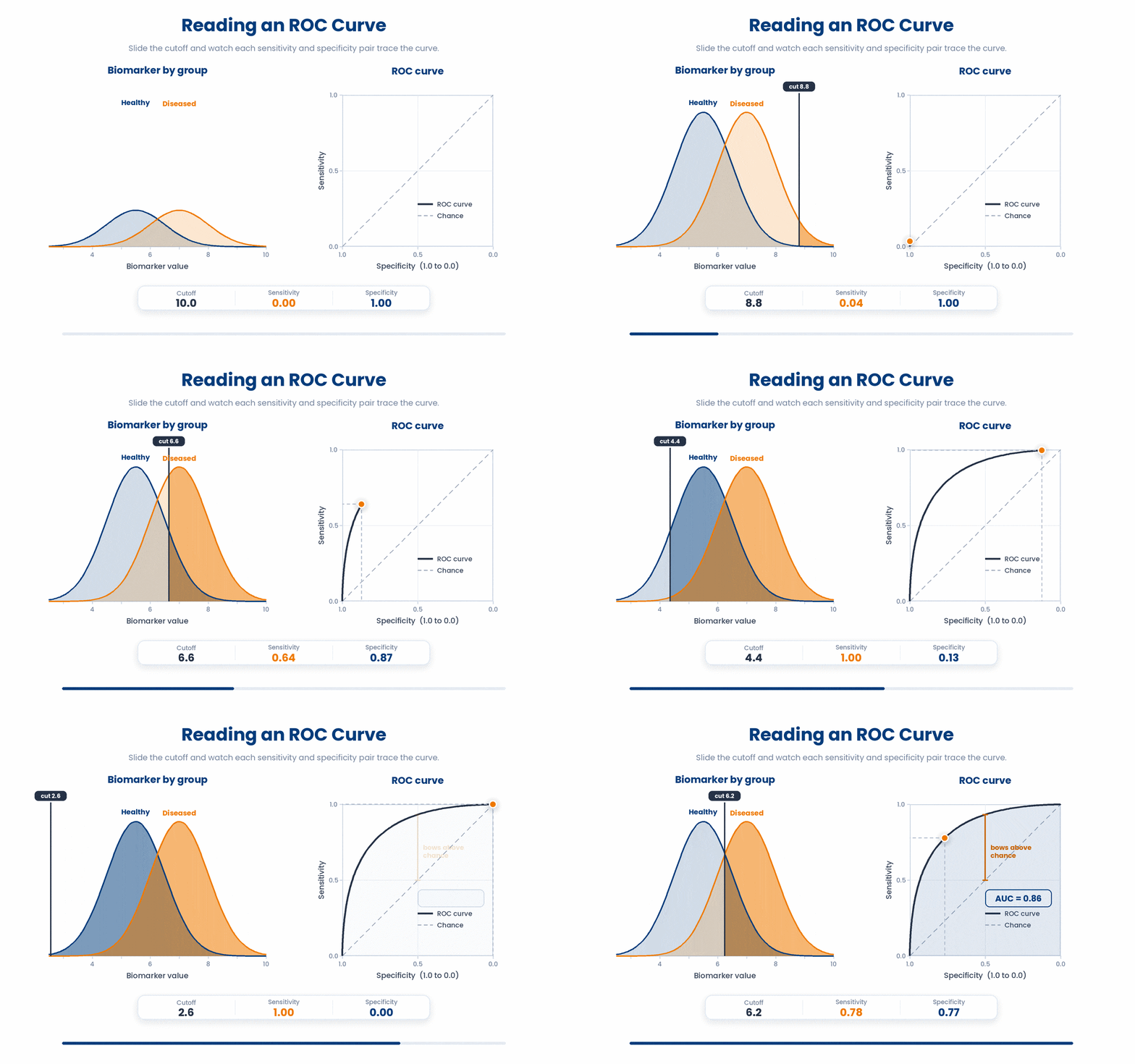
To turn the biomarker into an actual test you need one cut-point. The Youden index picks the cut-point that maximises sensitivity + specificity - 1 — the point furthest above the diagonal. coords() returns it, along with the sensitivity and specificity you would get there.
Try this snippet in the R Scratchpad on the right.
library(pROC)
set.seed(42)
disease <- rep(c(0, 1), each = 30)
biomarker <- c(rnorm(30, mean = 5.5, sd = 1), rnorm(30, mean = 7.0, sd = 1))
roc_obj <- roc(disease, biomarker)
coords(roc_obj, "best", best.method = "youden")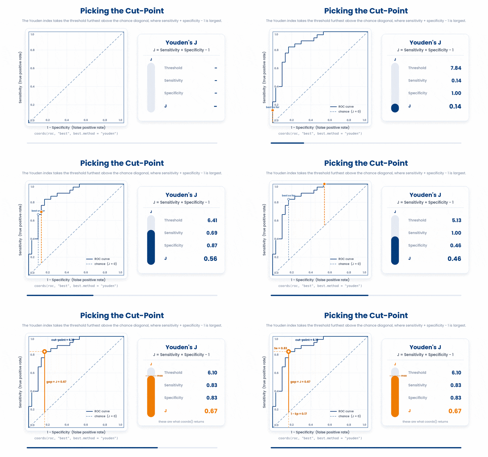
One pitfall when you plot or read the curve. pROC decides which group is the case from the order of your outcome labels, so if you reverse them the curve flips below the diagonal and the AUC reads below 0.5. If your AUC comes out at 0.18, you have not found a bad biomarker — you have swapped the labels. Pass the outcome with cases coded consistently and sanity-check that AUC is above 0.5.
4 Attaching the right test to a Table 1
You have measures and discrimination; the last step is reporting them alongside a clean comparison of groups. A Table 1 describes your sample, and you can attach a p-value to each row — as long as it is the RIGHT test for that row's variable type.
The gtsummary package builds a publication-ready Table 1 with tbl_summary(), split by a grouping variable. Adding add_p() runs a hypothesis test per row and prints the p-value. The point is that it picks the test FROM the variable type, so you do not hand-code a t-test where a chi-squared belongs.
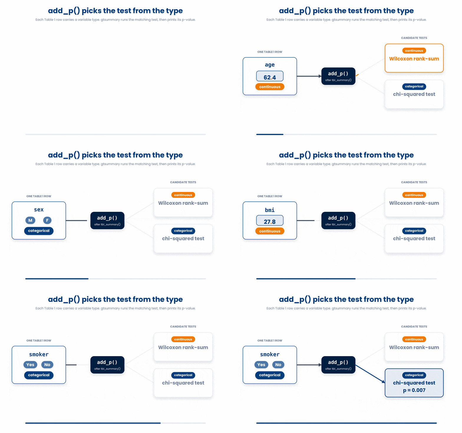
By default add_p() uses a Wilcoxon rank-sum test for continuous variables and a chi-squared test for categorical ones — a sensible, non-parametric-leaning default. Do not blindly trust the default test for every variable — a small cell count needs Fisher's exact, and a truly Normal outcome may warrant a t-test. You can override the test per variable, but first know what the default chose.
Build a small cohort and summarise treatment arm against outcome and a lab value, with a p-value on each row. Use the native pipe to pass the tibble into the summary.
Try this snippet in the R Scratchpad on the right.
library(gtsummary)
library(dplyr)
set.seed(7)
cohort <- tibble(
  arm = rep(c("Treated", "Control"), each = 30),
  hba1c = c(rnorm(30, 6.8, 0.6), rnorm(30, 7.4, 0.6)),
  mi = rep(c("Yes", "No", "No"), times = 20)
)
cohort |> tbl_summary(by = arm, include = c(hba1c, mi)) |> add_p()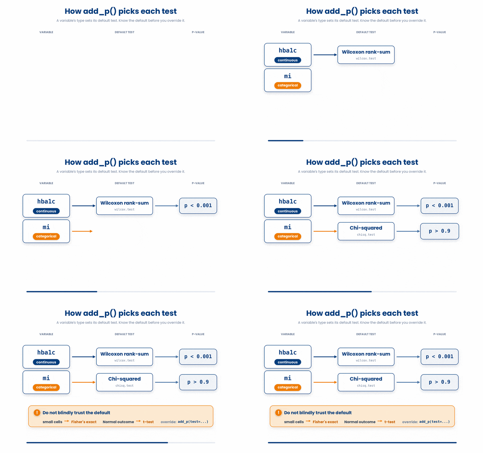
5 Put it together
Now you will do the full move that papers report: turn a binary outcome into a 2x2 table and read OR, RR, and NNT from epi.2by2(), then build a quick ROC for a biomarker and report its AUC. The worked example fades its support — study the full solution, then fill the gap, then solve a fresh one.
Work through this example in three stages. You unlock each stage only after the tutor confirms the previous one. Each stage removes more of the scaffolding — by the end you are writing it yourself.
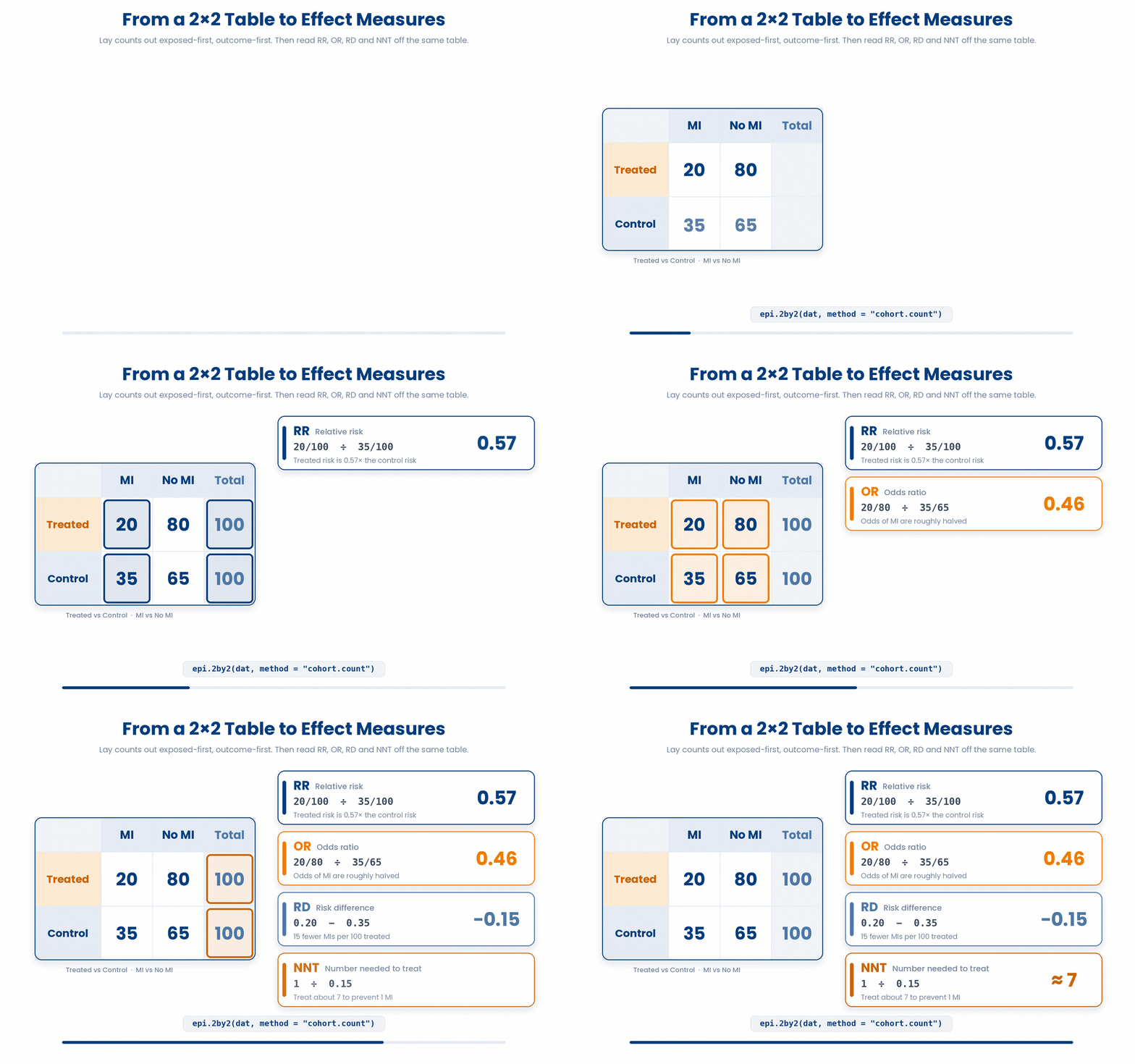
Problem: In a small trial, 20 of 100 treated patients had a heart attack (MI) and 35 of 100 controls did. Build the 2x2 table with explicit row and column names — Treated then Control, MI then No MI — and read the effect measures with epiR::epi.2by2().
library(epiR)
dat <- matrix(c(20, 80, 35, 65), nrow = 2, byrow = TRUE)
rownames(dat) <- c("Treated", "Control")
colnames(dat) <- c("MI", "No MI")
epi.2by2(dat, method = "cohort.count")- Lay the counts out exposed-row-first, outcome-present-column-first so the ratios are not reciprocated
- Name the rows and columns explicitly so you can sanity-check the table before trusting the output
- Call epi.2by2 with method = "cohort.count" because a trial measures real risk, giving RR, RD and NNT as well as the OR
The same solution with key parts replaced by ???.
Fill in every ??? so the code matches the reference,
then ask the tutor to check it.
Your turn: Now switch to discrimination. A continuous biomarker is measured in 30 cases and 30 non-cases; build an ROC and report the AUC. Run: library(pROC); set.seed(1); disease <- rep(c(0, 1), each = 30); biomarker <- c(rnorm(30, 5.5, 1), rnorm(30, 7, 1)); as.numeric(auc(roc(disease, biomarker))) > 0.5 . Predict the printed value of that final comparison.
6 Check your understanding
You have reached the end of the module. Try the same questions again — your answers here, paired with your pre-test answers, are how we measure what the module taught you. Answer every question and confidence rating, then click Submit and see results to view your score.
A receiver operating characteristic (ROC) curve plots which two quantities against each other?
A diagnostic biomarker has an AUC of 0.50. What does this mean?
Which statement about the area under the ROC curve (AUC) is correct?
Why is AUC preferred over accuracy for summarising how well a biomarker discriminates?
You run roc(disease, biomarker) in pROC and the AUC comes back as 0.18. What is the most likely explanation?
The Youden index selects the cut-point that maximises which quantity?
In gtsummary, what does adding add_p() to a tbl_summary() do?
By default, add_p() compares a continuous variable across two groups using which test?
I can explain what an ROC curve and its AUC measure, and why AUC is threshold-free and not the same as accuracy.
I can build an ROC with pROC, report the AUC with its confidence interval, choose a Youden cut-point, and recognise a flipped-label curve that reads below 0.5.
I can build a Table 1 with gtsummary and add_p(), and say which default test it attaches to a continuous versus a categorical variable.
7 Your results
Here is how your post-test answers compare with your pre-test answers. The pre/post pairing is the most reliable way to see what this module actually taught you.
Submit the post-test to see your results.
What is the one thing from this module that is still unclear to you?