

1 Before you start
This is not graded, and it does not count towards anything. Answer every question even if you are only guessing — having a go at something before you have been taught it is one of the best ways to remember it afterwards. The lesson ends with another short check, and there you will be shown the correct answer for anything you missed. Choose an option for every question and confidence rating, then click Submit answers.
A bar chart makes two treatment arms look far apart, but the y-axis runs from 7.6 to 7.9. What should you suspect?
A histogram of CRP shows three sharp peaks. Before you trust that shape, what should you do?
Two treatment arms have nearly identical boxplots of HbA1c on a modest sample, and you suspect one arm is really two clumps of patients. Why is overlaying the raw points with geom_jitter() the right move?
Your cohort has some missing hba1c values. In tbl_summary(cohort, by = arm, missing = "ifany"), what does that missing argument do?
Which line starts a Table 1 that summarises a cohort split by treatment arm?
CRP is strongly right-skewed. How should Table 1 summarise it, and why does gtsummary do this by default?
You have a bare tbl_summary(by = arm) and want a whole-cohort column and a between-arm comparison column added. Which line does that?
A baseline Table 1 from a randomised trial reports p = 0.04 for a 0.5-year age difference between arms. What is the right reading?
I can read a chart critically, explaining how a truncated y-axis, an unstable binwidth, and an over-collapsed summary can each change the story the data appears to tell.
I can produce a stratified, publication-ready Table 1 with tbl_summary(by = ...), add_overall(), add_p(), a missing-value row, and a caption.
I can explain why median (IQR) suits a skewed lab, when mean (SD) is safe, and why a baseline p-value in a randomised trial is rarely informative.
2 Introduction
In Part III you drew the standard figures — histograms, density curves, boxplots, scatters, and facets. Drawing a chart is only half the skill. The same data, plotted differently, can tell opposite stories, and the table that opens a clinical paper can be honest or quietly misleading. This part shows you how to read a figure with suspicion and how to build the baseline table reviewers expect.
This part of the module covers two skills, from critique to a finished table:
- Reading a chart critically — watch where the y-axis begins, remember that a histogram's shape is an artefact of the binwidth you chose, and ask what a summary hides.
- The publication-ready Table 1 — tbl_summary(by = arm) with add_overall(), add_p(), a missing-value row, and a caption — plus how to read the result: why continuous variables default to median (IQR), when mean (SD) is safe, and why a baseline p-value is rarely informative.
By the end of this part you will be able to spot a truncated axis, an unstable binwidth, and an over-collapsed summary in someone else's figure; produce a stratified, publication-ready Table 1 with gtsummary using tbl_summary(by = ...), add_overall(), and add_p(); and read a published one with a sceptical eye.
Try every snippet in the R Scratchpad on the right. This part needs no data file — each block first builds the same simulated 200-patient cohort with set.seed() and tibble(), so you can run any block on its own and watch the table appear.
3 Reading a chart critically
You can now draw the standard figures. Just as important is reading them with suspicion — because the same data, plotted differently, can tell opposite stories. Three habits protect you.
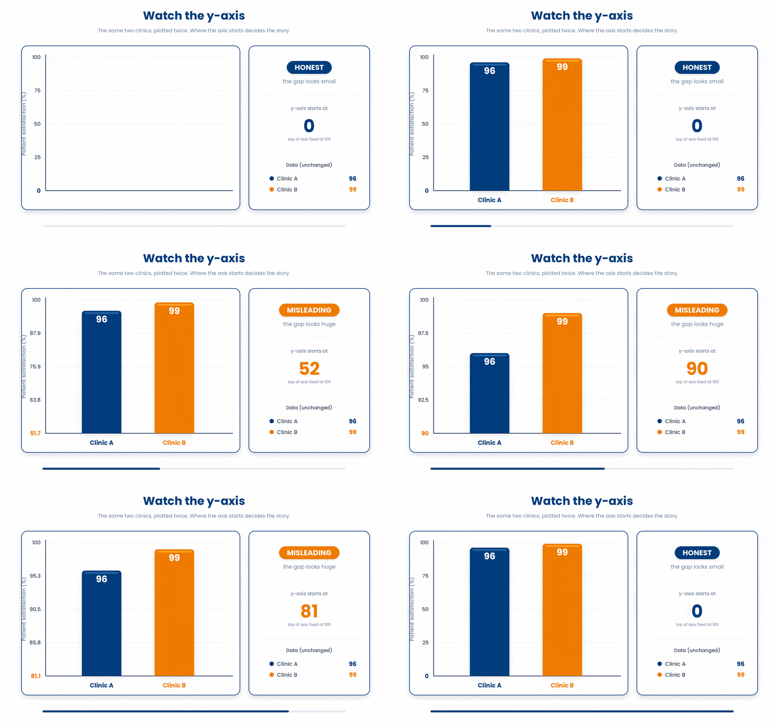
First, watch the y-axis. A bar chart whose y-axis starts at 90 instead of 0 turns a trivial difference into a dramatic-looking cliff. A truncated axis exaggerates differences — check where the axis begins before you believe the gap.
Second, remember the binwidth. You already saw that a histogram's shape is an artefact of the slice width you chose. A reader who only sees one binwidth is seeing one of many possible pictures.
Third, ask what a summary hides. A boxplot or a bar of means collapses every patient into a few numbers. The honest move on a modest sample is to show the points — geom_jitter() over a boxplot reveals gaps, clumps, and a tiny-n group masquerading as a confident summary.
4 The publication-ready Table 1 with gtsummary
Every clinical paper opens with Table 1: the baseline characteristics of the patients, usually split by treatment arm. It reports each variable's centre and spread (for continuous data) or count and percent (for categories), so a reader can judge whether the groups started out comparable.
You build it with tbl_summary from the gtsummary package. Pass the tibble and a by = argument naming the grouping column, and gtsummary picks a sensible summary for each variable type automatically.
Try this snippet in the R Scratchpad on the right.
library(dplyr)
set.seed(2024)
n <- 200
cohort <- tibble(
  arm = factor(sample(c("Standard", "Intensive"), n, replace = TRUE)),
  sex = factor(sample(c("Female", "Male"), n, replace = TRUE)),
  age = round(rnorm(n, mean = 62, sd = 9)),
  bmi = round(rnorm(n, mean = 28, sd = 4), 1),
  crp = round(rexp(n, rate = 1/5), 1),
  hba1c = round(rnorm(n, mean = 7.8, sd = 1.1), 1),
  responder = factor(sample(c("Yes", "No"), n, replace = TRUE))
)
library(gtsummary)
cohort |>
  tbl_summary(by = arm)
By default gtsummary reports a continuous variable as median (IQR) — the median and the interquartile range. That default is deliberate and clinically right, because reporting mean (SD) for a skewed lab like CRP misleads: a few extreme values drag the mean up to a number no typical patient has. Median (IQR) is robust to that long tail. Reach for mean (SD) only when you have checked the variable is roughly symmetric.
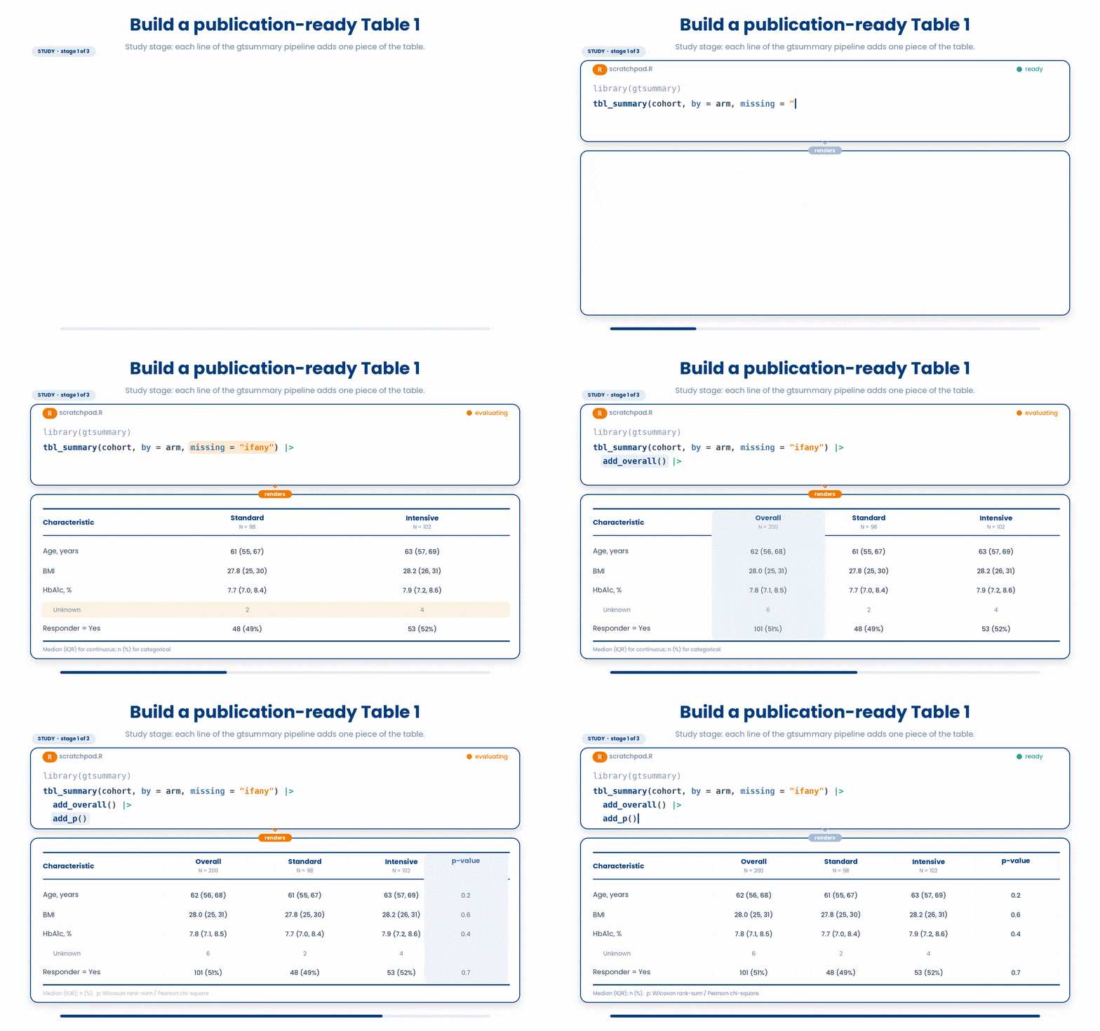
Three additions turn the bare table into a publishable one. add_overall puts a whole-cohort column beside the per-arm columns. add_p adds a column of p-values comparing the arms. And a caption names the table. gtsummary also adds an Unknown row for any variable with missing values, so the denominators are honest.
Try this snippet in the R Scratchpad on the right.
library(dplyr)
set.seed(2024)
n <- 200
cohort <- tibble(
  arm = factor(sample(c("Standard", "Intensive"), n, replace = TRUE)),
  sex = factor(sample(c("Female", "Male"), n, replace = TRUE)),
  age = round(rnorm(n, mean = 62, sd = 9)),
  bmi = round(rnorm(n, mean = 28, sd = 4), 1),
  crp = round(rexp(n, rate = 1/5), 1),
  hba1c = round(rnorm(n, mean = 7.8, sd = 1.1), 1),
  responder = factor(sample(c("Yes", "No"), n, replace = TRUE))
)
library(gtsummary)
cohort |>
  tbl_summary(by = arm) |>
  add_overall() |>
  add_p() |>
  modify_caption("**Table 1. Baseline characteristics by treatment arm**")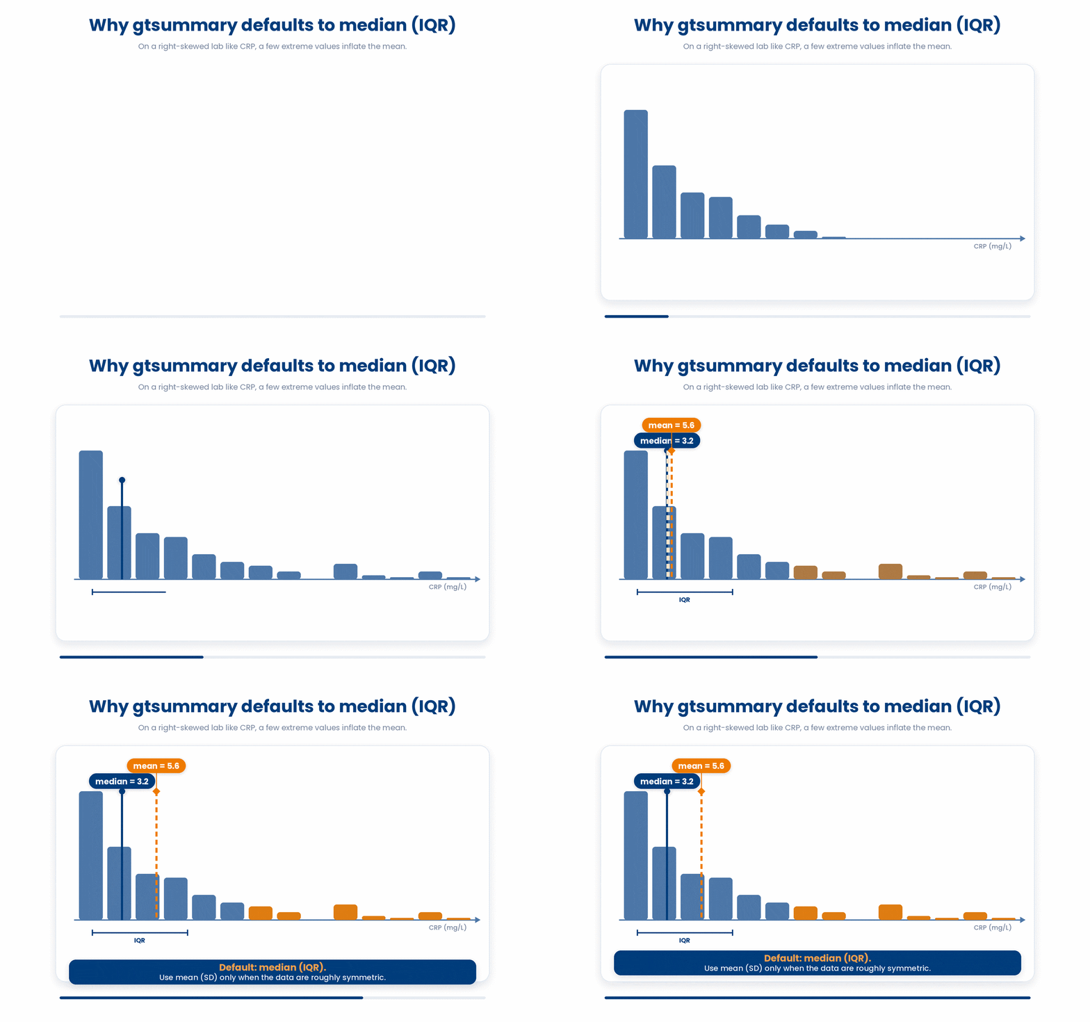
5 Put it together
The worked example below fades its support: first you study a full Table 1, then you fill the gap, then you build a fresh table on your own. Run each stage in the scratchpad.
Work through this example in three stages. You unlock each stage only after the tutor confirms the previous one. Each stage removes more of the scaffolding — by the end you are writing it yourself.
Problem: Build a baseline Table 1 from the cohort, split by treatment arm. Report continuous variables as median (IQR) and categorical as n (%), show a row for any missing values, add a whole-cohort overall column, and add a p-value column comparing the arms.
library(dplyr)
set.seed(2024)
n <- 200
cohort <- tibble(
  arm = factor(sample(c("Standard", "Intensive"), n, replace = TRUE)),
  sex = factor(sample(c("Female", "Male"), n, replace = TRUE)),
  age = round(rnorm(n, mean = 62, sd = 9)),
  bmi = round(rnorm(n, mean = 28, sd = 4), 1),
  crp = round(rexp(n, rate = 1/5), 1),
  hba1c = round(rnorm(n, mean = 7.8, sd = 1.1), 1),
  responder = factor(sample(c("Yes", "No"), n, replace = TRUE))
)
library(gtsummary)
tbl <- tbl_summary(cohort, by = arm, missing = "ifany")
tbl <- add_overall(tbl)
tbl <- add_p(tbl)
tbl- Build the cohort and switch on gtsummary with library()
- tbl_summary(cohort, by = arm) splits the table by treatment arm and auto-picks median (IQR) for continuous, n (%) for categorical
- missing = "ifany" adds an Unknown row only when a variable has missing values
- add_overall() appends a whole-cohort column; add_p() appends the comparison p-values
- printing tbl at the top level renders the finished table
The same solution with key parts replaced by ???.
Fill in every ??? so the code matches the reference,
then ask the tutor to check it.
Your turn: Now build a Table 1 split by responder instead of arm: continuous as median (IQR), an Unknown row only if needed, an overall column, and a p-value column. Add a caption naming the table.
6 Check your understanding
You have reached the end of the module. Try the same questions again — your answers here, paired with your pre-test answers, are how we measure what the module taught you. Answer every question and confidence rating, then click Submit and see results to view your score.
A bar chart makes two treatment arms look far apart, but the y-axis runs from 7.6 to 7.9. What should you suspect?
A histogram of CRP shows three sharp peaks. Before you trust that shape, what should you do?
Two treatment arms have nearly identical boxplots of HbA1c on a modest sample, and you suspect one arm is really two clumps of patients. Why is overlaying the raw points with geom_jitter() the right move?
Your cohort has some missing hba1c values. In tbl_summary(cohort, by = arm, missing = "ifany"), what does that missing argument do?
Which line starts a Table 1 that summarises a cohort split by treatment arm?
CRP is strongly right-skewed. How should Table 1 summarise it, and why does gtsummary do this by default?
You have a bare tbl_summary(by = arm) and want a whole-cohort column and a between-arm comparison column added. Which line does that?
A baseline Table 1 from a randomised trial reports p = 0.04 for a 0.5-year age difference between arms. What is the right reading?
I can read a chart critically, explaining how a truncated y-axis, an unstable binwidth, and an over-collapsed summary can each change the story the data appears to tell.
I can produce a stratified, publication-ready Table 1 with tbl_summary(by = ...), add_overall(), add_p(), a missing-value row, and a caption.
I can explain why median (IQR) suits a skewed lab, when mean (SD) is safe, and why a baseline p-value in a randomised trial is rarely informative.
7 Your results
Here is how your post-test answers compare with your pre-test answers. The pre/post pairing is the most reliable way to see what this module actually taught you.
Submit the post-test to see your results.
What is the one thing from this module that is still unclear to you?