

1 Before you start
This is not graded, and it does not count towards anything. Answer every question even if you are only guessing — having a go at something before you have been taught it is one of the best ways to remember it afterwards. The lesson ends with another short check, and there you will be shown the correct answer for anything you missed. Choose an option for every question and confidence rating, then click Submit answers.
Which three parts make up the simplest ggplot?
In ggplot2, what does an aesthetic mapping written inside aes() do?
You want every point on a scatter plot the same fixed blue. Where should colour = "blue" go?
You draw geom_histogram(binwidth = 2) of CRP and see three sharp peaks. Before trusting that shape, what should you do?
In a geom_boxplot() of CRP by arm, what does the box itself span?
You overlay two arms' CRP as geom_density() curves. Why should you always quote a sample size (n) alongside the plot?
You have already computed each treatment arm's mean HbA1c into a small tibble and want bars of those means. Which geom do you use?
You add facet_wrap(~ sex) to a scatter of CRP against age. What does it produce?
I can build a labelled scatter plot from scratch - choosing the data, an aes() mapping, and geom_point() - and fix a plot that wrongly puts a constant colour inside aes().
I can draw a histogram, density curve, and boxplot to judge a variable's shape, and explain what a boxplot summarises and what it hides.
I can choose geom_col() versus geom_bar() correctly, split a figure into subgroup panels with facet_wrap(), and finish it with readable labs().
2 Introduction
In Part I you described variables in numbers — a mean here, a median and an IQR there. Numbers alone hide shape. A mean BMI of 28 says nothing about whether the values cluster tightly or trail off in a long tail. In this part you SEE the data: you learn how a ggplot is assembled from named parts, then you draw the standard figures a clinician reaches for first.
This part of the module builds a ladder from a blank plot to a labelled, faceted figure:
- The grammar of graphics — every ggplot is data, an aesthetic mapping, and a geom, stacked with the + operator; and why a constant belongs outside aes(), not inside it.
- Distribution plots — geom_histogram(), geom_density(), and geom_boxplot() to see the shape of one variable and spot skew and outliers.
- Relationships, categories, and small multiples — geom_point() for scatter, geom_col() versus geom_bar(), facet_wrap() for subgroups, and labs() to label every figure.
By the end of this part you will be able to build a scatter plot from scratch — choosing the data, an aes() mapping, and the right geom; draw a histogram, density curve, and boxplot to judge a variable's shape; use geom_col() versus geom_bar() correctly; split a figure into per-subgroup panels with facet_wrap(); and finish any figure with readable labels.
Try every snippet in the R Scratchpad on the right. Each block begins by building the same simulated 200-patient cohort with set.seed() and tibble(), so this part needs no data file — you can run any block on its own and watch the figure appear.
3 The grammar of graphics: data, aes, geom
ggplot2 does not have one function per chart type. Instead it has a grammar of graphics: you describe a plot by naming its parts, and ggplot2 draws it. Three parts are enough to start.
- data — the tibble you are plotting, passed to
ggplot(). - aes — the aesthetic mapping: which column goes on the x-axis, which on the y, which colours the points. You write it inside
aes(). - geom — the geometric shape that draws the data: points, bars, boxes, a smooth density curve.
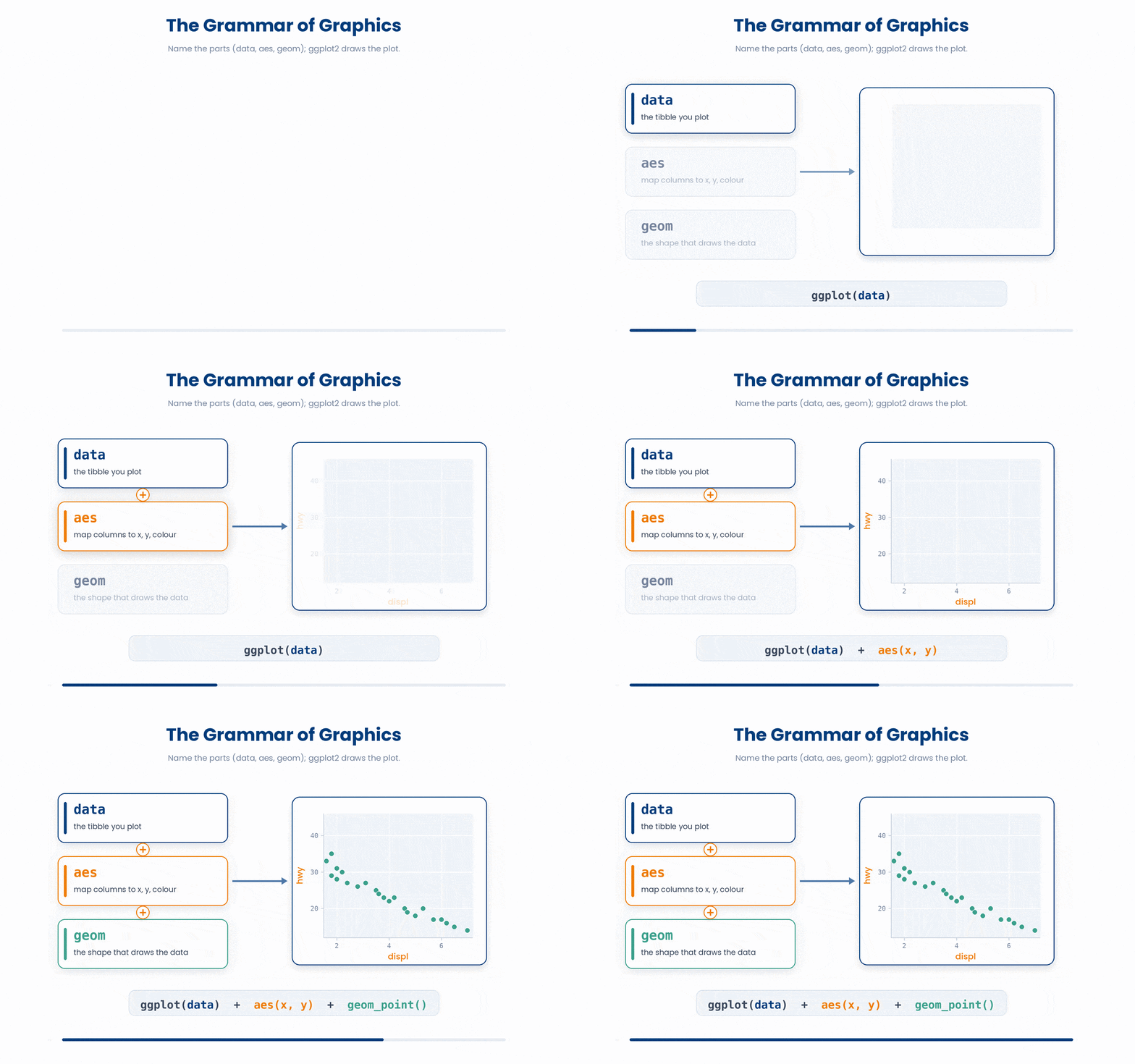
An aesthetic mapping is the link from a column in your data to something you can see on the plot — a position, a colour, a size. aes(x = age, y = bmi) says put age along the bottom and bmi up the side.
You assemble a plot by adding layers with +. Start with ggplot(), name the data and the mapping, then add a geom. The + always goes at the end of a line, never the start of the next one — R reads a line that looks finished as finished, so a leading + throws an error.
Try this snippet in the R Scratchpad on the right.
library(dplyr)
set.seed(2024)
n <- 200
cohort <- tibble(
  arm = factor(sample(c("Standard", "Intensive"), n, replace = TRUE)),
  sex = factor(sample(c("Female", "Male"), n, replace = TRUE)),
  age = round(rnorm(n, mean = 62, sd = 9)),
  bmi = round(rnorm(n, mean = 28, sd = 4), 1),
  crp = round(rexp(n, rate = 1/5), 1),
  hba1c = round(rnorm(n, mean = 7.8, sd = 1.1), 1),
  responder = factor(sample(c("Yes", "No"), n, replace = TRUE))
)
library(ggplot2)
ggplot(cohort, aes(x = age, y = bmi)) +
  geom_point()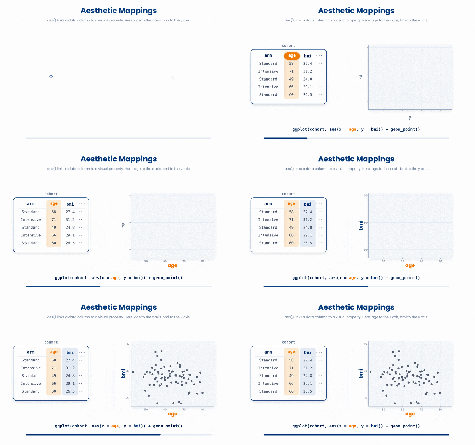
Notice what each piece did. ggplot(cohort, ...) set the data. aes(x = age, y = bmi) mapped two columns to the two axes. geom_point() drew one point per patient. The figure appears because the whole expression is printed at the top level — if you save a plot into an object and never print it, nothing shows.
Putting a constant inside aes() is the classic beginner trap. aes() is for mappings from data. To colour every point the same fixed blue, set colour outside aes(), as a plain argument to the geom.
Right way: a column inside aes() maps to the legend (aes(colour = arm) gives one colour per treatment arm). Wrong way: aes(colour = "blue") does not paint things blue — it invents a one-level variable literally called "blue" and lets ggplot pick a colour for it.
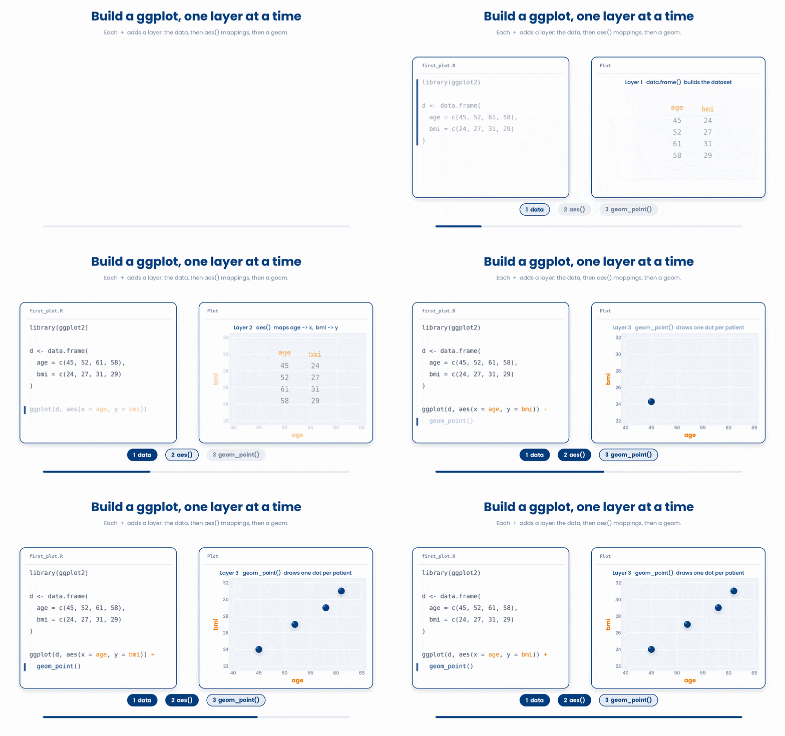
Let’s build your first plot one layer at a time.
Work through this example in three stages. You unlock each stage only after the tutor confirms the previous one. Each stage removes more of the scaffolding — by the end you are writing it yourself.
Problem: Build a tiny data frame of age and BMI for four patients, then draw a scatter of BMI against age.
library(ggplot2)
d <- data.frame(age = c(45, 52, 61, 58), bmi = c(24, 27, 31, 29))
ggplot(d, aes(x = age, y = bmi)) +
geom_point()- data.frame() holds the two columns
- aes() maps age to x and bmi to y
- geom_point() draws one point per patient
The same solution with key parts replaced by ???.
Fill in every ??? so the code matches the reference,
then ask the tutor to check it.
Your turn: Draw the same data as a scatter, but swap the axes so bmi is on x and age is on y.
4 Distribution plots: histogram, density, boxplot
A scatter shows two variables at once. To see the shape of just one variable — is it symmetric, skewed, full of outliers? — you reach for a distribution plot. These are the first figures you make when you meet a new dataset.
4.1 Histograms and density curves
A histogram slices a numeric variable into equal-width bins and draws a bar for how many values fall in each. geom_histogram() needs only an x mapping. The binwidth is the width of each slice — and it is your choice, not the data's.
Try this snippet in the R Scratchpad on the right.
library(dplyr)
set.seed(2024)
n <- 200
cohort <- tibble(
  arm = factor(sample(c("Standard", "Intensive"), n, replace = TRUE)),
  sex = factor(sample(c("Female", "Male"), n, replace = TRUE)),
  age = round(rnorm(n, mean = 62, sd = 9)),
  bmi = round(rnorm(n, mean = 28, sd = 4), 1),
  crp = round(rexp(n, rate = 1/5), 1),
  hba1c = round(rnorm(n, mean = 7.8, sd = 1.1), 1),
  responder = factor(sample(c("Yes", "No"), n, replace = TRUE))
)
library(ggplot2)
ggplot(cohort, aes(x = crp)) +
  geom_histogram(binwidth = 2)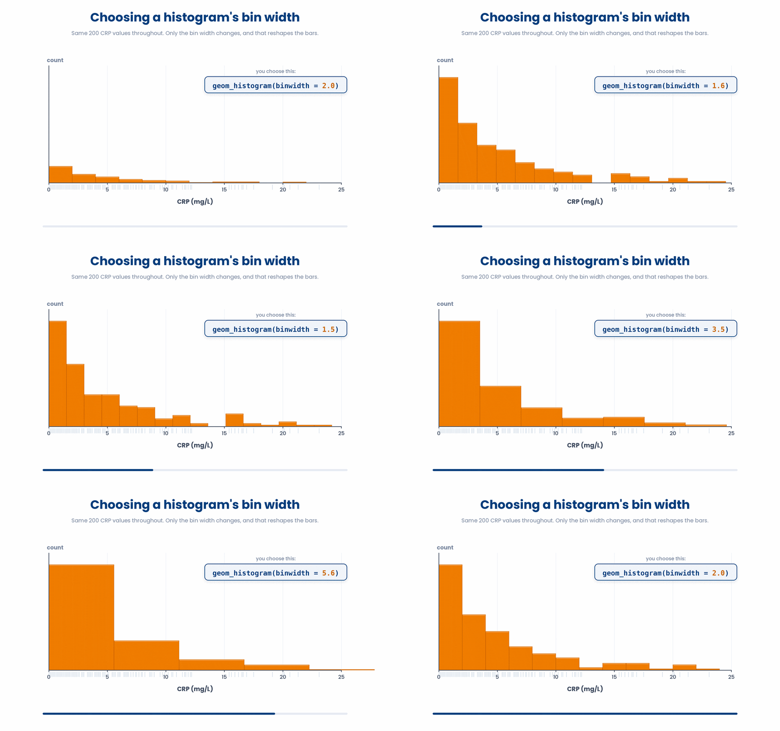
Here is the trap that catches everyone. A histogram's shape depends on the binwidth you pick. Wide bins smooth real structure away; narrow bins turn random noise into spiky fake peaks. Always try two or three binwidths before you trust a shape. Run the block again with binwidth = 0.5, then binwidth = 10, and watch the story change.
A density plot is the smoothed cousin of the histogram: geom_density() draws one continuous curve instead of bars. It is gentler on the eye for comparing the shapes of two groups overlaid, but it still hides the raw counts, so quote it alongside a sample size, never alone.
Try this snippet in the R Scratchpad on the right.
library(dplyr)
set.seed(2024)
n <- 200
cohort <- tibble(
  arm = factor(sample(c("Standard", "Intensive"), n, replace = TRUE)),
  sex = factor(sample(c("Female", "Male"), n, replace = TRUE)),
  age = round(rnorm(n, mean = 62, sd = 9)),
  bmi = round(rnorm(n, mean = 28, sd = 4), 1),
  crp = round(rexp(n, rate = 1/5), 1),
  hba1c = round(rnorm(n, mean = 7.8, sd = 1.1), 1),
  responder = factor(sample(c("Yes", "No"), n, replace = TRUE))
)
library(ggplot2)
ggplot(cohort, aes(x = crp, fill = arm)) +
  geom_density(alpha = 0.4)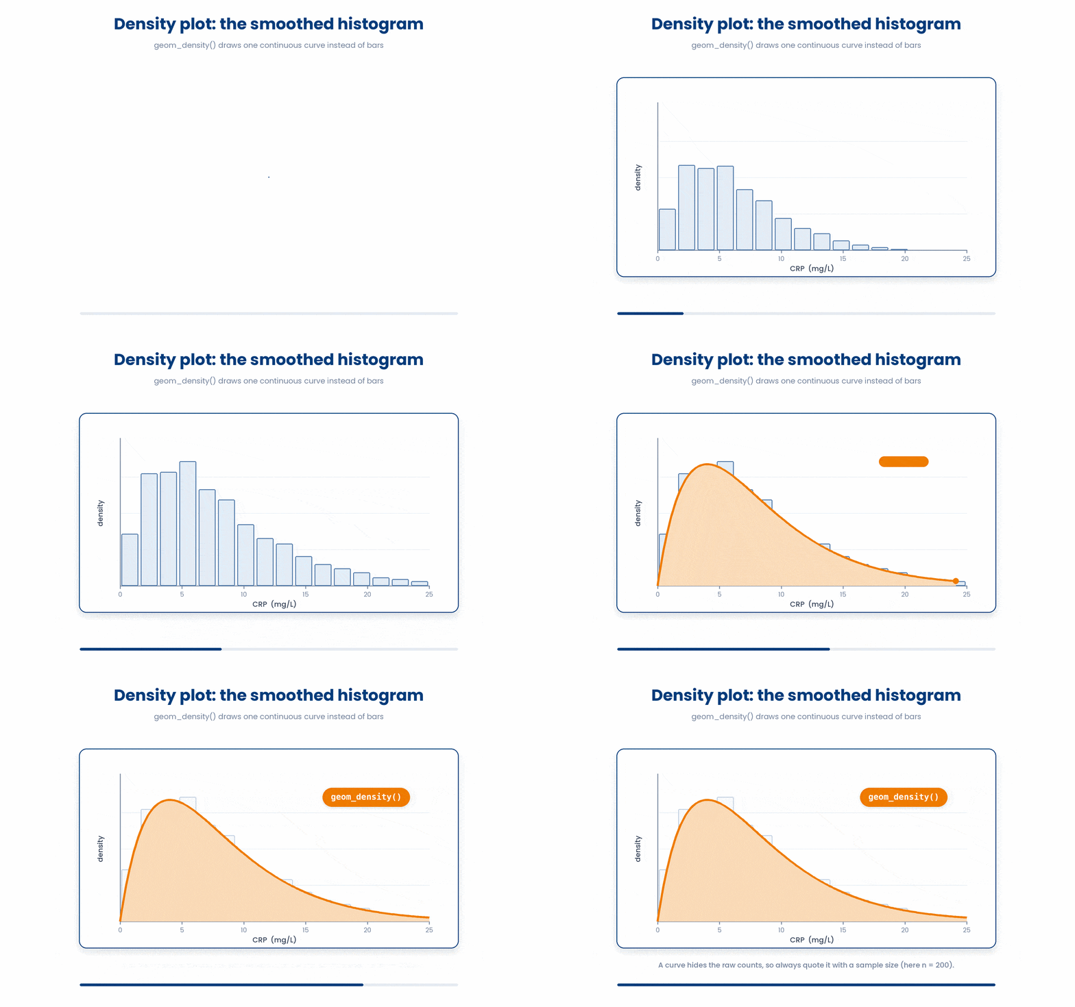
4.2 Boxplots and what they hide
A boxplot summarises a distribution with five numbers: the box spans the 25th to 75th percentile (the IQR), the line inside is the median, the whiskers reach most of the range, and dots beyond them are flagged as outliers. It is the standard way to compare a continuous variable across groups.
Try this snippet in the R Scratchpad on the right.
library(dplyr)
set.seed(2024)
n <- 200
cohort <- tibble(
  arm = factor(sample(c("Standard", "Intensive"), n, replace = TRUE)),
  sex = factor(sample(c("Female", "Male"), n, replace = TRUE)),
  age = round(rnorm(n, mean = 62, sd = 9)),
  bmi = round(rnorm(n, mean = 28, sd = 4), 1),
  crp = round(rexp(n, rate = 1/5), 1),
  hba1c = round(rnorm(n, mean = 7.8, sd = 1.1), 1),
  responder = factor(sample(c("Yes", "No"), n, replace = TRUE))
)
library(ggplot2)
ggplot(cohort, aes(x = arm, y = crp)) +
  geom_boxplot()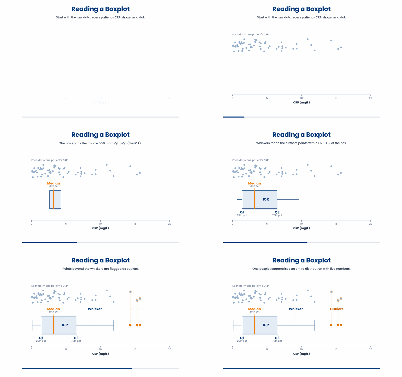
But a boxplot is a summary, and a boxplot hides the shape inside each box. Two groups with identical boxes can hide a smooth hump in one and two separate clumps in the other — the box cannot tell them apart. When the sample is small or you suspect clustering, overlay the raw points with geom_jitter() so the reader sees what the box smoothed over.
5 Relationships, categories, and small multiples
Distribution plots show one variable. Now you connect variables and split a figure into subgroups — and you label everything, because an unlabelled figure is unreadable to anyone but you.
5.1 geom_col versus geom_bar — the trap
Both draw bars, and confusing them is the most common ggplot bar mistake. geom_bar counts rows for you: give it one categorical x and it tallies how many patients fall in each category. geom_col plots a value you already computed: give it x and y, and each bar's height is your y.
Right way to remember it: use geom_bar() when you want a count of raw rows; use geom_col() when you have already summarised the numbers yourself. Feeding a pre-computed mean to geom_bar() double-counts and gives nonsense heights.
Try this snippet in the R Scratchpad on the right.
library(dplyr)
set.seed(2024)
n <- 200
cohort <- tibble(
  arm = factor(sample(c("Standard", "Intensive"), n, replace = TRUE)),
  sex = factor(sample(c("Female", "Male"), n, replace = TRUE)),
  age = round(rnorm(n, mean = 62, sd = 9)),
  bmi = round(rnorm(n, mean = 28, sd = 4), 1),
  crp = round(rexp(n, rate = 1/5), 1),
  hba1c = round(rnorm(n, mean = 7.8, sd = 1.1), 1),
  responder = factor(sample(c("Yes", "No"), n, replace = TRUE))
)
library(ggplot2)
library(dplyr)
# geom_bar counts rows per arm for you:
ggplot(cohort, aes(x = arm)) +
  geom_bar()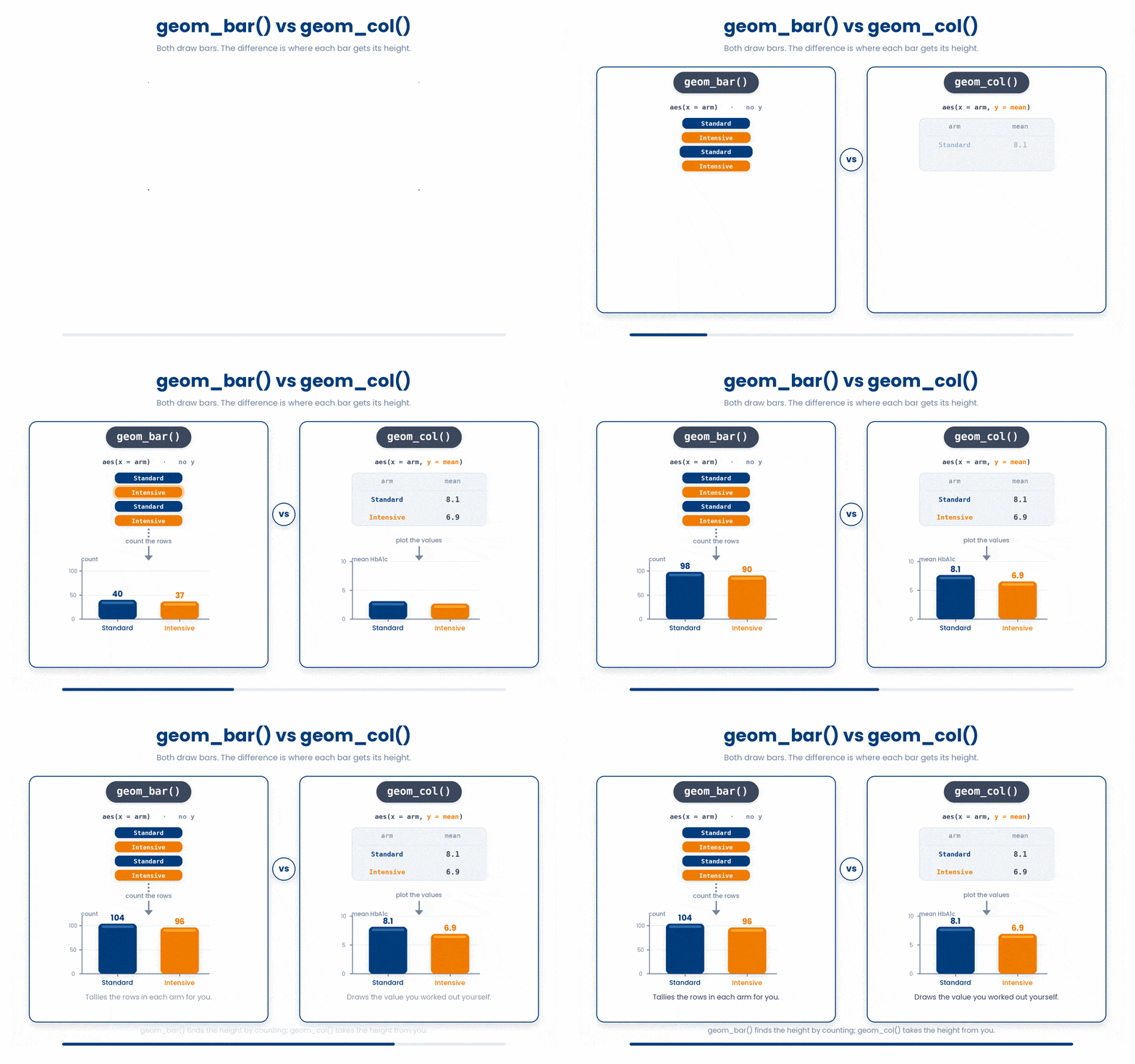
Try this snippet in the R Scratchpad on the right.
library(dplyr)
set.seed(2024)
n <- 200
cohort <- tibble(
  arm = factor(sample(c("Standard", "Intensive"), n, replace = TRUE)),
  sex = factor(sample(c("Female", "Male"), n, replace = TRUE)),
  age = round(rnorm(n, mean = 62, sd = 9)),
  bmi = round(rnorm(n, mean = 28, sd = 4), 1),
  crp = round(rexp(n, rate = 1/5), 1),
  hba1c = round(rnorm(n, mean = 7.8, sd = 1.1), 1),
  responder = factor(sample(c("Yes", "No"), n, replace = TRUE))
)
library(ggplot2)
library(dplyr)
# geom_col plots a value you computed first:
arm_means <- cohort |>
  group_by(arm) |>
  summarise(mean_hba1c = mean(hba1c))
ggplot(arm_means, aes(x = arm, y = mean_hba1c)) +
  geom_col()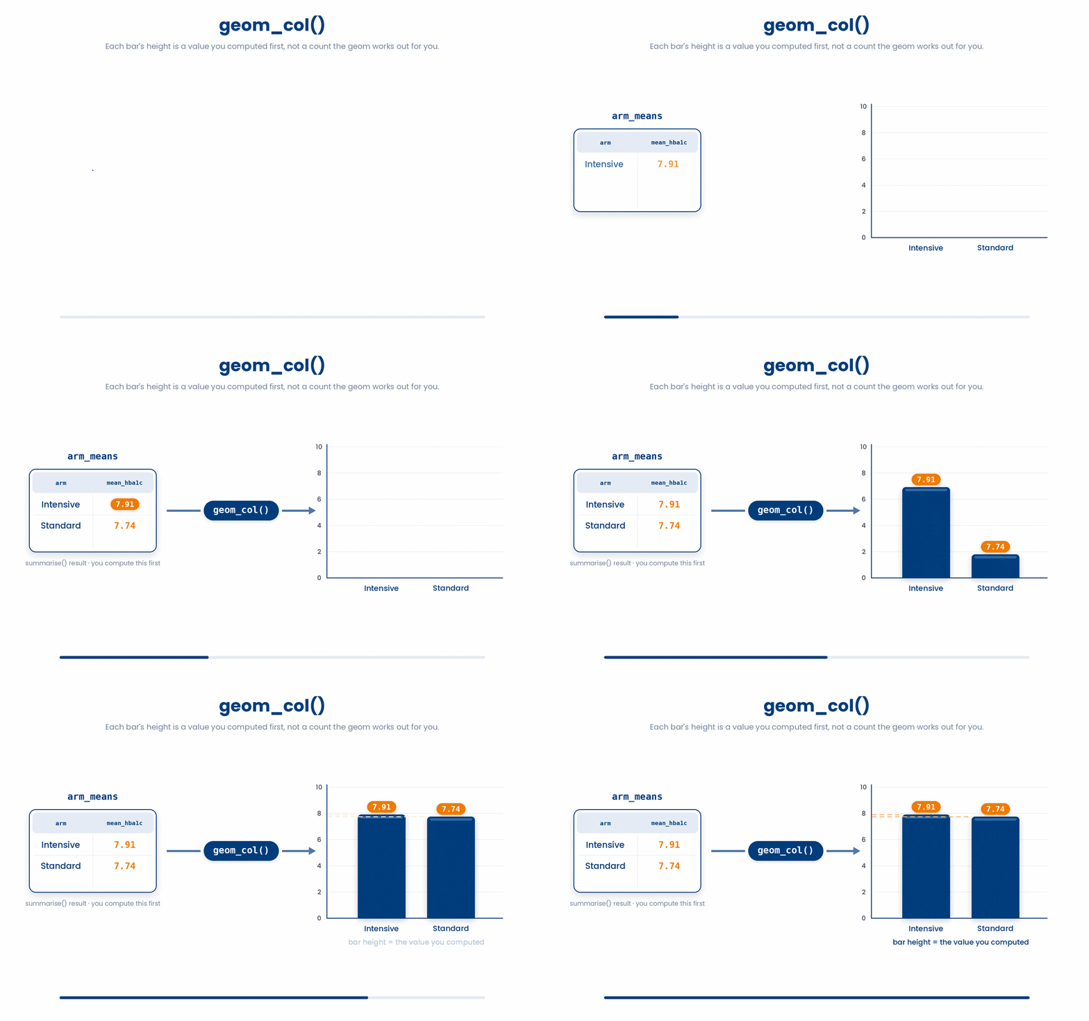
5.2 Faceting and labels
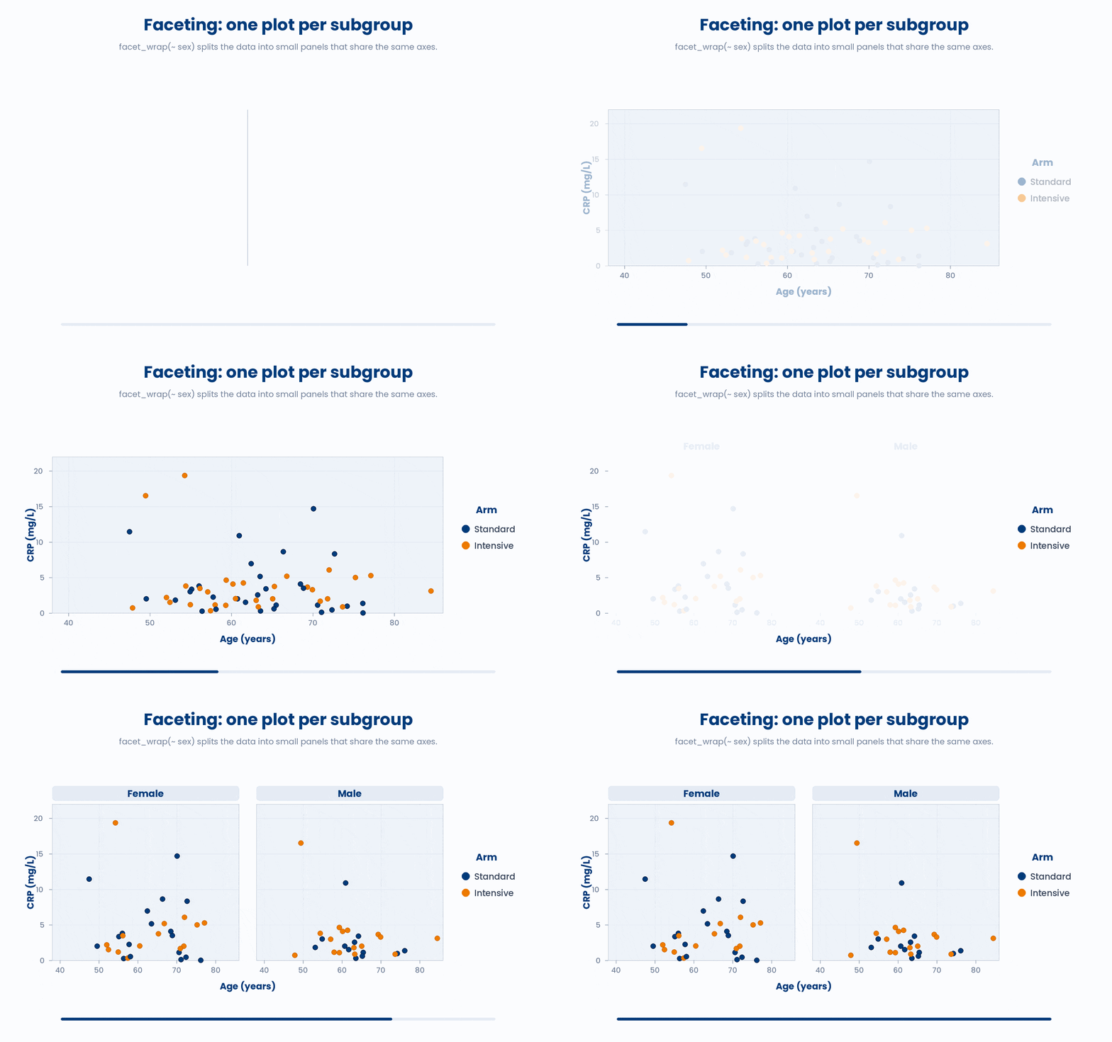
A facet splits one plot into a grid of small panels, one per subgroup, all sharing the same axes. facet_wrap(~ sex) draws the same chart once for females and once for males, so you compare shapes side by side instead of overlaying them.
Always finish a figure with labs. labs() sets the axis titles, the legend title, and an overall plot title. A raw column name like crp on an axis is fine while you explore, but a figure you show anyone needs words a human can read.
Try this snippet in the R Scratchpad on the right.
library(dplyr)
set.seed(2024)
n <- 200
cohort <- tibble(
  arm = factor(sample(c("Standard", "Intensive"), n, replace = TRUE)),
  sex = factor(sample(c("Female", "Male"), n, replace = TRUE)),
  age = round(rnorm(n, mean = 62, sd = 9)),
  bmi = round(rnorm(n, mean = 28, sd = 4), 1),
  crp = round(rexp(n, rate = 1/5), 1),
  hba1c = round(rnorm(n, mean = 7.8, sd = 1.1), 1),
  responder = factor(sample(c("Yes", "No"), n, replace = TRUE))
)
library(ggplot2)
ggplot(cohort, aes(x = age, y = crp, colour = arm)) +
  geom_point() +
  facet_wrap(~ sex) +
  labs(
    title = "CRP versus age, by sex and treatment arm",
    x = "Age (years)",
    y = "CRP (mg/L)",
    colour = "Arm"
  )
6 Check your understanding
You have reached the end of the module. Try the same questions again — your answers here, paired with your pre-test answers, are how we measure what the module taught you. Answer every question and confidence rating, then click Submit and see results to view your score.
Which three parts make up the simplest ggplot?
In ggplot2, what does an aesthetic mapping written inside aes() do?
You want every point on a scatter plot the same fixed blue. Where should colour = "blue" go?
You draw geom_histogram(binwidth = 2) of CRP and see three sharp peaks. Before trusting that shape, what should you do?
In a geom_boxplot() of CRP by arm, what does the box itself span?
You overlay two arms' CRP as geom_density() curves. Why should you always quote a sample size (n) alongside the plot?
You have already computed each treatment arm's mean HbA1c into a small tibble and want bars of those means. Which geom do you use?
You add facet_wrap(~ sex) to a scatter of CRP against age. What does it produce?
I can build a labelled scatter plot from scratch - choosing the data, an aes() mapping, and geom_point() - and fix a plot that wrongly puts a constant colour inside aes().
I can draw a histogram, density curve, and boxplot to judge a variable's shape, and explain what a boxplot summarises and what it hides.
I can choose geom_col() versus geom_bar() correctly, split a figure into subgroup panels with facet_wrap(), and finish it with readable labs().
7 Your results
Here is how your post-test answers compare with your pre-test answers. The pre/post pairing is the most reliable way to see what this module actually taught you.
Submit the post-test to see your results.
What is the one thing from this module that is still unclear to you?