

1 Before you start
This is not graded, and it does not count towards anything. Answer every question even if you are only guessing — having a go at something before you have been taught it is one of the best ways to remember it afterwards. The lesson ends with another short check, and there you will be shown the correct answer for anything you missed. Choose an option for every question and confidence rating, then click Submit answers.
You draw a heatmap of a correlation matrix. Which set of arguments makes the colour scale comparable across different correlation matrices?
You have two categorical columns and want a heatmap of how many records fall into each combination, with whole-number labels in the cells. Which approach is correct?
You are drawing a heatmap of counts that range from 0 upward, with no negative values. Which colour map best matches the data?
Which seaborn function lets you split a scatter-plus-regression into a row of panels, one per level of a third column?
What is the difference between an axes-level and a figure-level seaborn function?
You just loaded a dataset with six numeric columns and want a quick first look at every pairwise relationship at once. Which function fits best?
You want every seaborn chart in your script to share a white-grid background with larger, slide-friendly fonts, set once at the top. Which call does this?
You want one colour-blind-safe scheme applied to every chart in the script, set a single time. Which call does this?
I can draw a multi-panel figure faceted by another column using catplot, relplot, or displot in a single line.
I can produce a correlation heatmap from a DataFrame and pin the colour scale so it means the same thing every time.
I can explain the difference between an axes-level and a figure-level seaborn function, and use pairplot or jointplot to explore several numeric columns at once.
2 Introduction
In Part I you drew the everyday single-question plots: counts and means by category, the shape of a distribution, and the relationship between two numeric columns. Real analysis rarely stops at a single chart, though.
This second part is about composition and presentation — taking those plots and combining them:
- Heatmaps — coloured grids for correlation matrices and contingency tables, when you want every pairwise number on one page.
- Combining and faceting — small multiples and multi-panel figures for splitting a plot across the levels of another category.
- Themes and palettes — the one-line settings that turn an exploratory chart into a polished, presentation-ready one.
To follow along with this module, you will need the same two standard imports at the top of every script: seaborn (aliased as sns) and matplotlib.pyplot (aliased as plt). When you are ready to see your chart, calling plt.show() will pop the figure onto your screen.
Be sure to test out each snippet in the Python Scratchpad on the right as you go. By the time you finish this module, you will know how to take a raw CSV of patient measurements and turn it into a comprehensive, multi-panel figure that summarizes the entire cohort in one shot.
One thing to notice before you start: every seaborn call in both parts of this module hands it a long-form table — one row per observation, one column per variable — which is exactly why x=, y=, and hue= can each just name a column. If your own data comes to you wide instead, with one column per group rather than one column naming the group, reshape it with melt first, the way you did back in module 1.11c (Pandas III); seaborn has no wide-form equivalent of its own.
3 Heatmaps for correlation and contingency tables
Sometimes you do not just want a single chart. You want a grid. Whether you are looking at how strongly every pair of variables correlates or how often different categories overlap, a raw table of numbers is tough to scan.
3.1 Heatmap
A heatmap solves this by turning that table into a colored grid, where dark and light squares let you read the patterns in seconds.
The most common way to use sns.heatmap is for a correlation matrix. Pandas makes the math easy: calling df.corr() gives you a square DataFrame showing the correlation coefficient between every pair of numeric columns. You just hand that DataFrame to sns.heatmap, and you instantly have a publication-quality map.
Try this snippet in the Python Scratchpad on the right.
import seaborn as sns
import matplotlib.pyplot as plt
import pandas as pd

df = pd.DataFrame({
    "age": [54, 61, 47, 72, 38, 55, 49, 67, 41, 58],
    "bmi": [27.3, 28.4, 26.1, 30.2, 24.5, 27.0,
             25.8, 29.7, 24.0, 28.1],
    "glucose": [5.4, 6.1, 4.9, 6.8, 4.5, 5.5, 5.0, 6.4, 4.7, 5.7],
    "chol": [4.8, 5.5, 4.6, 6.2, 4.0, 5.0, 4.5, 5.9, 4.2, 5.1],
})
corr = df.corr()
sns.heatmap(corr, annot=True, cmap="coolwarm", vmin=-1, vmax=1, center=0)
plt.show()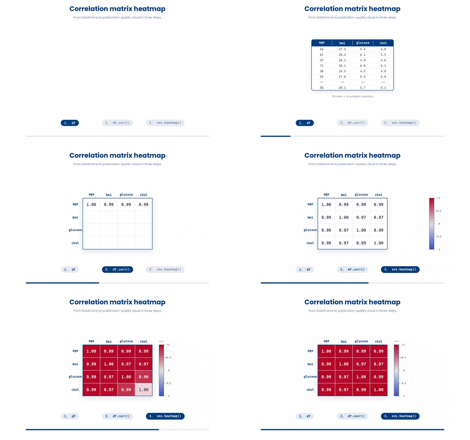
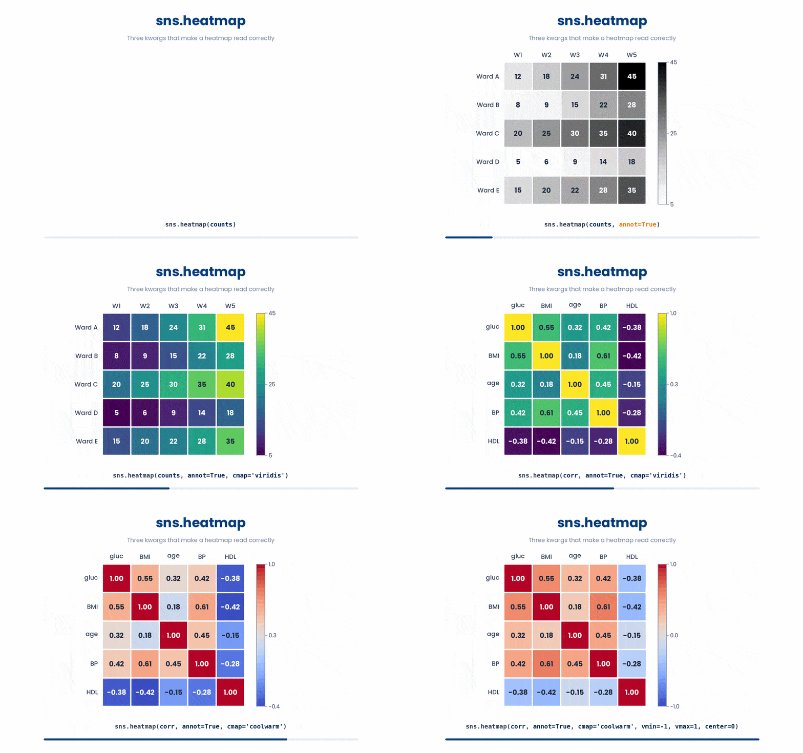
There are a few keyword arguments that will do the heavy lifting for you here:
annot=True: This writes the actual number inside each cell. It is almost always worth turning on, since colors alone can be hard to read precisely.cmap: This chooses your color palette. Use"viridis"for values going in one direction (like zero to large positive numbers), or"coolwarm"for diverging values that range from negative to positive (like correlations).vmin,vmax, andcenter: These pin your color scale to fixed limits. For correlations, settingvmin=-1,vmax=1, andcenter=0ensures your colors mean the exact same thing every time, which is critical if you are comparing multiple heatmaps side-by-side.
3.2 Contingency table
The other common use case is a contingency table, which simply shows how many records fall into specific combinations of two categories. To get the numbers, use pd.crosstab on two columns. Hand that resulting table to sns.heatmap, and you get a clear visual of your joint distribution.
Try this snippet in the Python Scratchpad on the right.
import seaborn as sns
import matplotlib.pyplot as plt
import pandas as pd

df = pd.DataFrame({
    "clinic": ["A", "A", "A", "B", "B", "B", "C", "C"],
    "sex": ["F", "F", "M", "M", "F", "M", "F", "M"],
})
table = pd.crosstab(df["clinic"], df["sex"])
sns.heatmap(table, annot=True, cmap="viridis", fmt="d")
plt.show()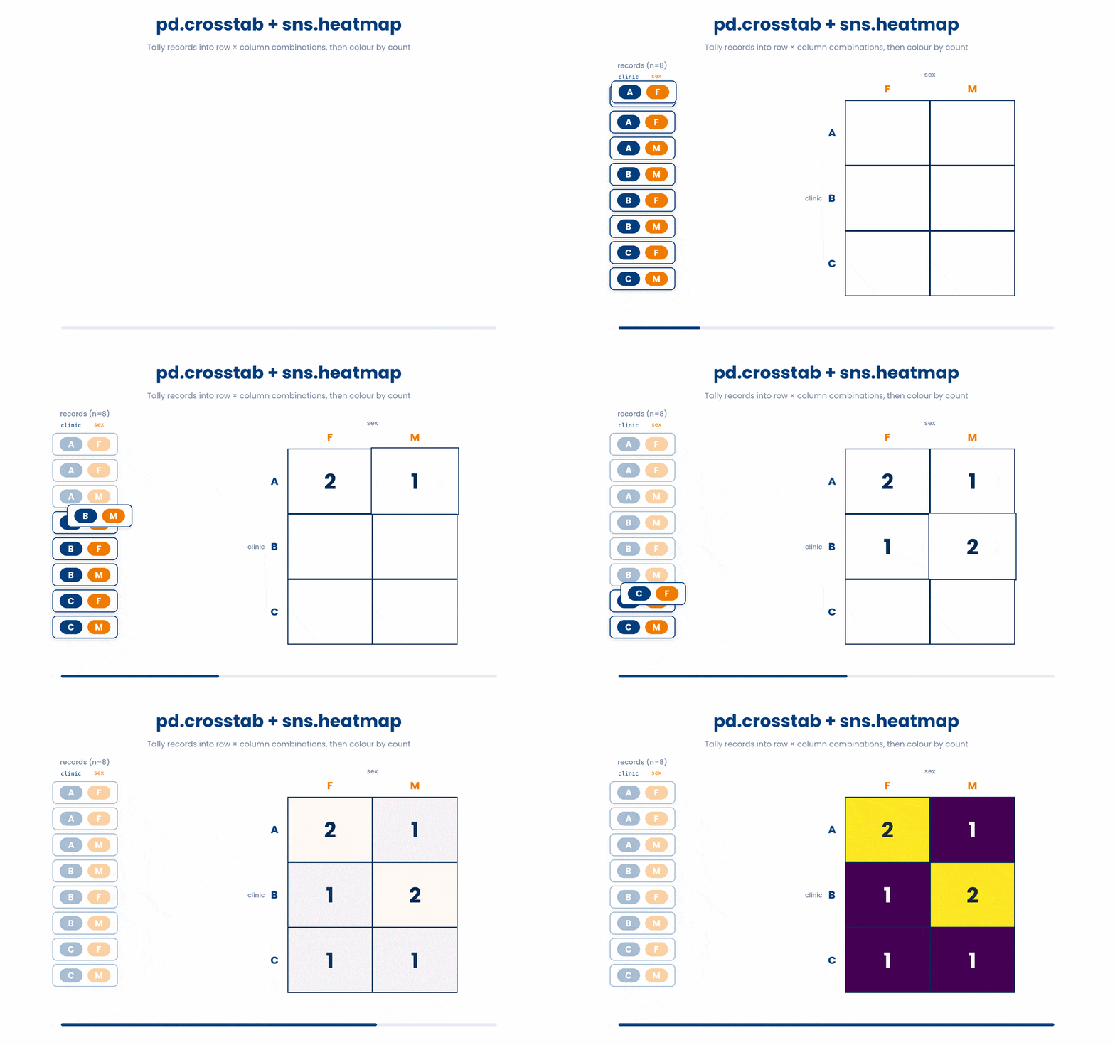
Notice the fmt="d" argument in that snippet?
That forces the cell labels to display as clean integers. Without it, annot=True defaults to writing them as floats with a bunch of messy decimal places. You can also use fmt=".2f" for two decimal places, or fmt=".0%" for percentages.
One more fmt worth knowing: fmt="g", a general-purpose format. Like fmt="d" it keeps whole numbers clean, but it also copes sensibly with floats and large numbers — dropping trailing zeros instead of printing a string of them — so it is a safer default than fmt="d" when you are not certain every cell will come out as a whole number.
One final, important note: sns.heatmap does not actually compute anything. It strictly draws whatever 2D table you hand it. All the mathematical thinking happens in pandas before you call Seaborn.
4 Combining and faceting plots
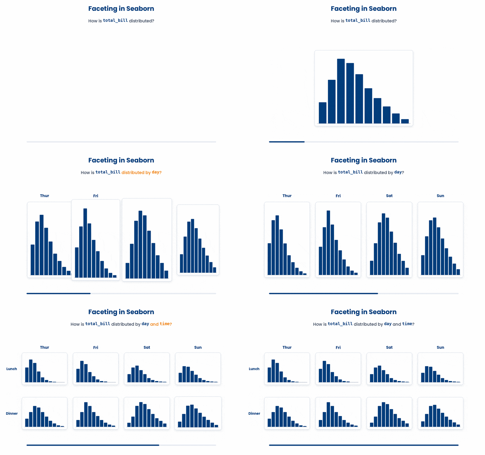
Real data analysis usually requires you to break down distributions by categories. Instead of writing messy for loops to generate multiple separate charts, Seaborn uses faceting.
Faceting takes one plot and repeats it across different categories, lining up the panels side-by-side so your eye can compare them instantly.
4.1 Core rules in faceting
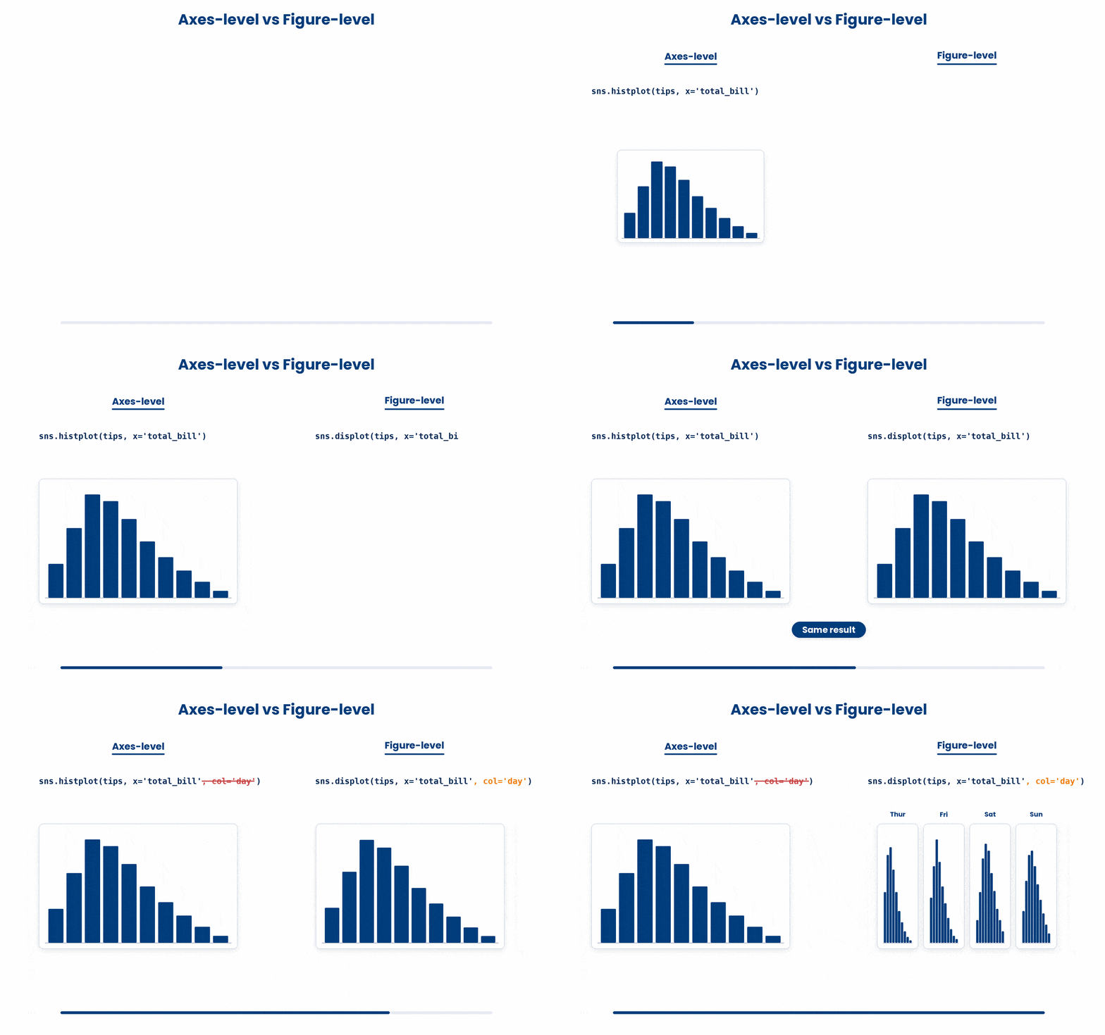
To use faceting, you must understand Seaborn's two distinct types of functions. This is the most common stumbling block for beginners:
- Axes-level functions (
scatterplot,boxplot,histplot): draw onto a single, specific chart. - Figure-level functions (
relplot,catplot,displot): control the entire figure canvas. Can split the figure into a grid using thecol=(columns) orrow=(rows) arguments.
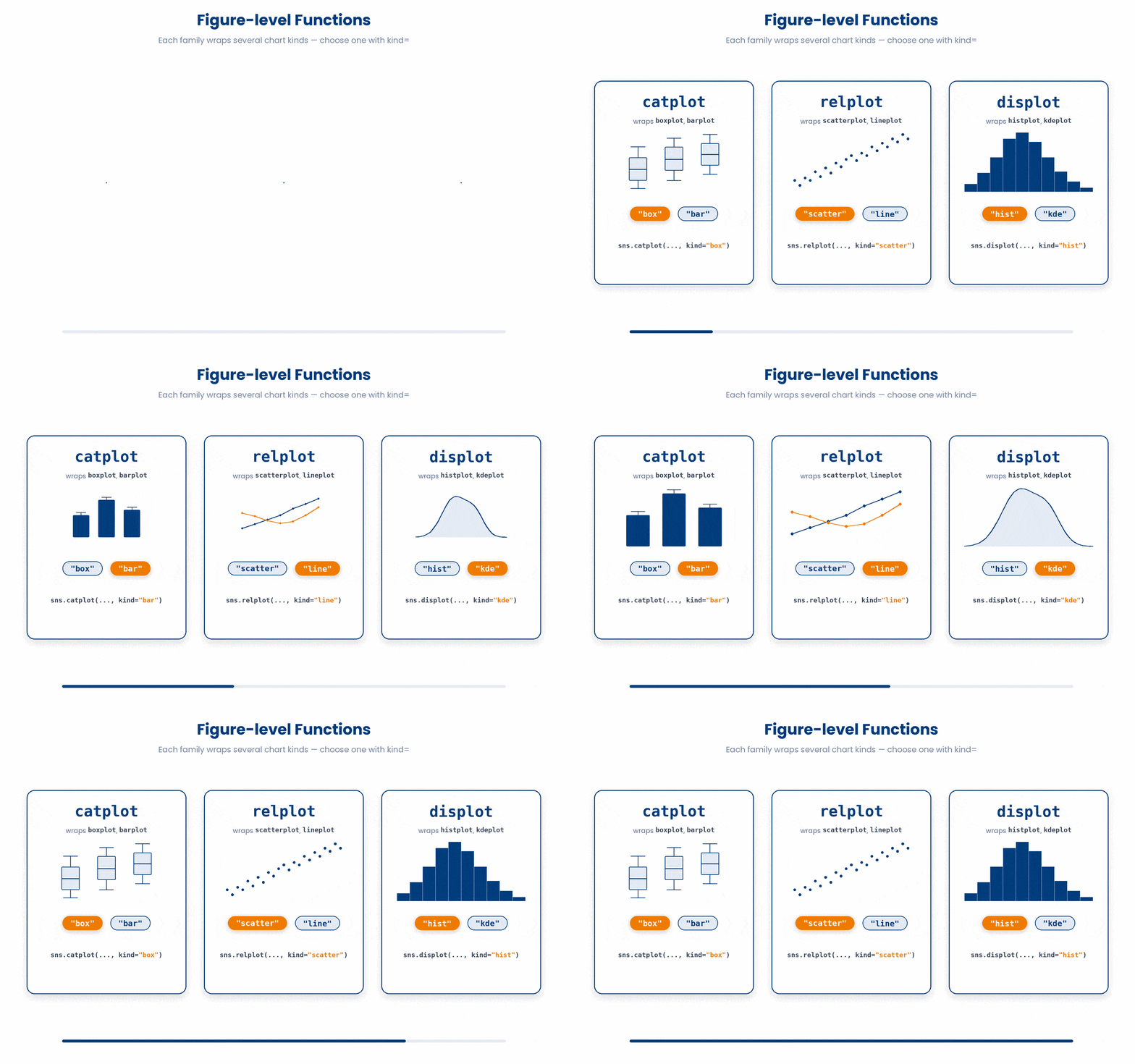
Think of figure-level functions as "families." To facet your data, you call the family function, then tell it exactly which chart to draw using the kind= argument:
- Categorical plots (
boxplot,barplot) becomecatplot(e.g.,kind="box") - Relational plots (
scatterplot,lineplot) becomerelplot(e.g.,kind="scatter") - Distributions (
histplot,kdeplot) becomedisplot(e.g.,kind="hist")
Try this snippet in the Python Scratchpad on the right.
import seaborn as sns
import matplotlib.pyplot as plt
import pandas as pd

df = pd.DataFrame({
    "clinic": ["A"]*8 + ["B"]*8,
    "sex": (["F"]*4 + ["M"]*4) * 2,
    "bmi": [22.5, 23.0, 24.0, 25.5, 28.0, 29.0, 30.5, 31.0,
             24.0, 25.0, 26.5, 27.0, 28.5, 29.5, 30.0, 31.5],
})
sns.catplot(data=df, x="clinic", y="bmi", col="sex", kind="box")
plt.show()That single line above draws two side-by-side boxplots—one for female patients and one for male—each comparing clinics A and B.
If you pass both row= and col=, you get a full grid of panels. You can control the size of these panels using the height and aspect arguments (for example, height=4, aspect=1.2 is a standard starting point for professional reports).
Try this snippet in the Python Scratchpad on the right.
import seaborn as sns
import matplotlib.pyplot as plt
import pandas as pd

df = pd.DataFrame({
    "age": [54, 61, 47, 72, 38, 55, 49, 67, 41, 58, 63, 45],
    "bmi": [27.3, 28.4, 26.1, 30.2, 24.5, 27.0,
             25.8, 29.7, 24.0, 28.1, 29.5, 25.5],
    "sex": ["F", "M"] * 6,
    "clinic": ["A", "A", "B", "B"] * 3,
})
sns.relplot(data=df, x="age", y="bmi", col="sex", row="clinic", kind="scatter")
plt.show()displot facets the same way catplot and relplot just did: pass a numeric column as x and split it into panels with col= and row=.
Try this snippet in the Python Scratchpad on the right.
import seaborn as sns
import matplotlib.pyplot as plt
import pandas as pd

df = pd.DataFrame({
    "glucose": [5.4, 4.9, 5.1, 6.1, 5.8, 6.7, 5.9, 5.2,
                  6.3, 5.6, 4.8, 7.1, 5.5, 6.0, 5.7, 6.4],
    "sex": ["F", "M"] * 8,
    "clinic": ["A"]*8 + ["B"]*8,
})
sns.displot(data=df, x="glucose", col="sex", row="clinic", kind="hist", kde=True)
plt.show()Faceting repeats one chart across a category, but often you want two different charts side by side — say a boxplot next to a histogram. That is not faceting; it is just matplotlib subplots, and every axes-level function will draw into whichever axes you hand it through ax=.
Try this snippet in the Python Scratchpad on the right.
import seaborn as sns
import matplotlib.pyplot as plt
import pandas as pd

df = pd.DataFrame({
    "clinic": ["A"]*8 + ["B"]*8,
    "bmi": [22.0, 23.1, 24.0, 23.5, 31.0, 32.1, 30.8, 31.5,
             27.0, 28.0, 27.5, 28.5, 27.2, 28.3, 27.8, 28.1],
    "glucose": [5.4, 4.9, 5.1, 5.0, 5.5, 5.2, 4.8, 5.3,
                 6.1, 5.8, 6.7, 6.3, 5.9, 6.0, 6.4, 6.2],
})

fig, axes = plt.subplots(1, 2, figsize=(10, 4))
sns.boxplot(data=df, x="clinic", y="bmi", ax=axes[0])
sns.histplot(data=df, x="glucose", kde=True, ax=axes[1])
plt.show()plt.subplots(1, 2, figsize=(10, 4)) creates one figure holding two empty axes and hands them back as axes[0] and axes[1]. Passing ax=axes[0] and ax=axes[1] tells sns.boxplot and sns.histplot where to draw instead of opening a figure of their own; sns.heatmap takes ax= the same way, so this combines any mix of axes-level plots you like.
It only works for axes-level functions, though. A figure-level function — displot, catplot, relplot, lmplot, pairplot — has no ax= argument at all, because it always builds and owns its own figure. Wrapping one in plt.figure() does not help; it just leaves an empty extra figure behind while the figure-level call draws its own separately. Rule of thumb: if you are arranging the panels yourself, use the axes-level function; if you want seaborn to arrange them for you, use the figure-level function with col=/row= instead.
4.2 Two essential explorers
There are two dedicated figure-level functions built specifically for data exploration.
sns.pairplot is the chart you should draw on day one with any new multi-column numeric dataset. It automatically draws scatterplots for every possible pair of numeric columns, plus histograms down the diagonal.
Try this snippet in the Python Scratchpad on the right.
import pandas as pd
import seaborn as sns
import matplotlib.pyplot as plt
from pyodide.http import open_url

url = "https://raw.githubusercontent.com/mwaskom/seaborn-data/master/iris.csv"
iris = pd.read_csv(open_url(url))

sns.pairplot(iris, hue="species")
plt.show()
One caution with pairplot: it draws one row and one column of panels for every numeric column you give it, so the grid grows with the square of the column count. Four columns is a manageable 16 panels; twenty columns is 400, most too small to read. Select the columns you actually care about first.
Try this snippet in the Python Scratchpad on the right.
import seaborn as sns
import matplotlib.pyplot as plt
import pandas as pd

df = pd.read_csv("patients.csv")
cols = ["age", "bmi", "glucose", "chol", "diagnosis"]
sns.pairplot(df[cols], hue="diagnosis")
plt.show()sns.jointplot is a highly focused tool for deep-diving into a single pair of variables. It places a scatterplot in the center and attaches the individual distributions along the top and right edges.
You can pass kind="reg" to add a regression line, or kind="hex" if you have so many data points that a standard scatterplot turns into an unreadable black blob.
Try this snippet in the Python Scratchpad on the right.
import seaborn as sns
import matplotlib.pyplot as plt
import pandas as pd

df = pd.DataFrame({
 "bmi": [25.0, 27.2, 24.1, 28.5, 29.0, 26.3],
 "glucose": [5.4, 6.1, 4.9, 5.8, 6.7, 5.1],
})
sns.jointplot(data=df, x="bmi", y="glucose", kind="reg")
plt.show()
When do you use the different plots?
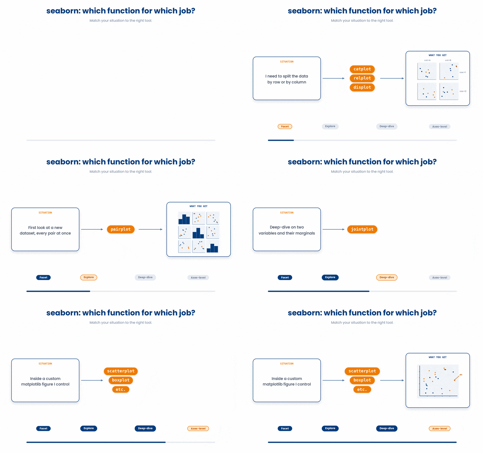
catplot,relplot,displot: Use these whenever you need to facet data into rows or columns.pairplot: Use this for first-day exploration on a new dataset.jointplot: Use this to deep-dive into two specific variables and their marginals.- Axes-level functions (
scatterplot,boxplot, etc.): Keep these for situations where you are manually managing a single set of axes yourself, usually as part of a highly custom matplotlib figure.
5 Themes and palettes
Seaborn's default theme is perfectly fine when you are just exploring your data, but it can look a bit too plain for a slide deck or a final report.
To fix this, you can use sns.set_theme(). Calling this once at the top of your script instantly updates the look of every plot that follows. It uses two incredibly helpful arguments:
- The style argument changes the background layout. Your options are
"whitegrid","darkgrid","white", or"ticks". - The
contextargument automatically scales your font sizes and line widths so they are easily readable in their final destination. Your options are"paper","notebook","talk", or"poster".

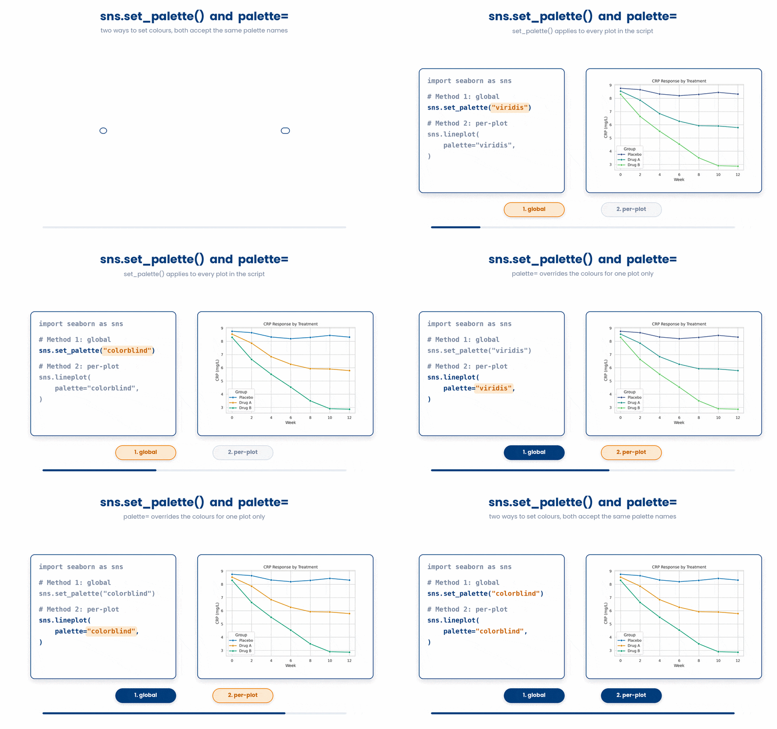
You also have full control over the colors. You can change the global color scheme using sns.set_palette(), or you can just add the palette= argument to an individual plot. Two excellent, highly accessible defaults to keep in your back pocket are "viridis" and "colorblind".
Here is how all of that comes together to create a presentation-ready chart:
Try this snippet in the Python Scratchpad on the right.
import seaborn as sns
import matplotlib.pyplot as plt
import pandas as pd

sns.set_theme(style="whitegrid", context="talk")

df = pd.DataFrame({
    "clinic": ["A", "A", "B", "B", "C", "C"],
    "sex": ["F", "M", "F", "M", "F", "M"],
    "bmi": [27.4, 29.0, 31.1, 30.5, 24.8, 26.1],
})
sns.barplot(data=df, x="clinic", y="bmi", hue="sex", palette="colorblind")
plt.show()6 Putting it together
The plot families across both parts of this Seaborn module are usually used together. A typical first look at a new clinical dataset is a four-panel summary: a barplot showing the mean of an outcome per clinic, a boxplot of a key measurement per group, a scatter or regplot of two related measurements, and a heatmap of all the pairwise correlations. The worked example below builds something close to that on a small inline DataFrame.
Work through this example in three stages. You unlock each stage only after the tutor confirms the previous one. Each stage removes more of the scaffolding — by the end you are writing it yourself.
Problem: You have a CSV called patients.csv with columns patient_id, clinic, sex, age, bmi, glucose, chol. Read it, then produce: (1) a faceted boxplot of bmi by clinic, faceted by sex; (2) a regression plot of age vs bmi, with the points coloured by sex; (3) a heatmap of correlations among age, bmi, glucose, and chol. Save each as a PNG.
import pandas as pd
import seaborn as sns
import matplotlib.pyplot as plt

df = pd.read_csv("patients.csv")

g = sns.catplot(data=df, x="clinic", y="bmi", col="sex", kind="box")
g.savefig("bmi_by_clinic_by_sex.png")

sns.lmplot(data=df, x="age", y="bmi", hue="sex")
plt.savefig("age_vs_bmi_by_sex.png")

corr = df[["age", "bmi", "glucose", "chol"]].corr()
sns.heatmap(corr, annot=True, cmap="coolwarm", vmin=-1, vmax=1, center=0)
plt.savefig("correlation_heatmap.png")- Read the CSV with pd.read_csv into a DataFrame called df.
- Use sns.catplot with kind="box" and col="sex" to draw two side-by-side boxplots — one per sex — each comparing bmi across clinics. catplot is figure-level, so it returns a FacetGrid object with its own savefig method.
- Use sns.lmplot with hue="sex" to draw a single scatter of age vs bmi with points coloured by sex and one regression line per sex. lmplot is also figure-level.
- Pull out the four numeric columns with df[[...]], call .corr() to get the correlation matrix, and pass it to sns.heatmap with annot=True for the numbers and the diverging coolwarm palette pinned to (-1, 1) so colours mean the same thing every time.
- plt.savefig writes whatever the most recent axes-level call drew. FacetGrid objects (returned by catplot and lmplot) have their own savefig method, which is the safer choice for figure-level plots.
The same solution with key parts replaced by ???.
Fill in every ??? so the code matches the reference,
then ask the tutor to check it.
Your turn: A CSV called labs.csv has columns sample_id, batch, treatment, glucose, cholesterol, ldl. Produce: (1) a faceted violin plot of glucose by treatment, faceted by batch; (2) a regression plot of cholesterol vs ldl with points coloured by treatment; (3) a heatmap of correlations among glucose, cholesterol, and ldl. Save each as a PNG.
All the lines you need are in the Line bank on the left — some may be distractors you should leave behind. Drag the lines you need into the Your solution column on the right, in the correct order, then click Check.
Task: Assemble a script that reads patients.csv, computes a new bmi_band column with three levels ("under_25", "25_to_30", "over_30") based on the bmi column, and draws a faceted countplot of patients per bmi_band, split into one panel per clinic.
import seaborn as snssns.catplot(data=df, x="bmi_band", col="clinic", kind="count")plt.show()sns.countplot(data=df, x="bmi_band", col="clinic")df = pd.read_csv("patients.csv")import pandas as pddf["bmi_band"] = df["bmi"].apply(lambda x: "high" if x > 25 else "low")import matplotlib.pyplot as pltdf["bmi_band"] = pd.cut(df["bmi"], bins=[0, 25, 30, 100], labels=["under_25", "25_to_30", "over_30"])sns.catplot(data=df, x="clinic", y="bmi_band", kind="box")df = pd.read_excel("patients.csv")
- Drop lines here, in order.
Generating a reflection question for you…
7 Check your understanding
You have reached the end of the module. Try the same questions again — your answers here, paired with your pre-test answers, are how we measure what the module taught you. Answer every question and confidence rating, then click Submit and see results to view your score.
You draw a heatmap of a correlation matrix. Which set of arguments makes the colour scale comparable across different correlation matrices?
You have two categorical columns and want a heatmap of how many records fall into each combination, with whole-number labels in the cells. Which approach is correct?
You are drawing a heatmap of counts that range from 0 upward, with no negative values. Which colour map best matches the data?
Which seaborn function lets you split a scatter-plus-regression into a row of panels, one per level of a third column?
What is the difference between an axes-level and a figure-level seaborn function?
You just loaded a dataset with six numeric columns and want a quick first look at every pairwise relationship at once. Which function fits best?
You want every seaborn chart in your script to share a white-grid background with larger, slide-friendly fonts, set once at the top. Which call does this?
You want one colour-blind-safe scheme applied to every chart in the script, set a single time. Which call does this?
I can draw a multi-panel figure faceted by another column using catplot, relplot, or displot in a single line.
I can produce a correlation heatmap from a DataFrame and pin the colour scale so it means the same thing every time.
I can explain the difference between an axes-level and a figure-level seaborn function, and use pairplot or jointplot to explore several numeric columns at once.
8 Your results
Here is how your post-test answers compare with your pre-test answers. The pre/post pairing is the most reliable way to see what this module actually taught you.
Submit the post-test to see your results.
What is the one thing from this module that is still unclear to you?