

1 Before you start
This is not graded, and it does not count towards anything. Answer every question even if you are only guessing — having a go at something before you have been taught it is one of the best ways to remember it afterwards. The lesson ends with another short check, and there you will be shown the correct answer for anything you missed. Choose an option for every question and confidence rating, then click Submit answers.
You have a DataFrame with columns clinic and patient_id and want a chart of how many patients are at each clinic. Which call is right?
In sns.barplot(data=df, x="clinic", y="glucose"), what does the height of each bar represent by default?
Which seaborn call shows the shape of a single numeric column, with the option to overlay a smooth density curve?
You want to compare the shapes of the glucose distribution for clinic A versus clinic B as two smooth curves overlaid on the same axes. Which call fits best?
You want to compare the distribution of bmi across three clinics in one chart, and you need to see whether any clinic has a bimodal distribution (two separate peaks). Which plot is the best choice?
With only about 15 patients per clinic, you want to show every individual bmi point on top of a boxplot, arranged so the dots never overlap. Which call adds those points?
You want a scatter of age vs bmi with a fitted regression line and a 95% confidence band. Which one-line call does this on a single set of axes?
You want a scatter of age vs bmi where the point colour shows sex and the point size reflects bmi. Which call does this?
I can pick the right seaborn plot for a given question about a DataFrame — counts per category, distribution shape, or the relationship between two numeric columns.
I can choose between a histogram, KDE, boxplot, and violin plot to show a distribution, and overlay a stripplot or swarmplot to show the individual points.
2 Introduction
Tables just give you raw data; charts tell the story. Staring at a list of thousands of medical readings won't tell you much, but putting them into a graph instantly reveals patterns, outliers, and group differences much faster than numbers alone.
Seaborn is a Python library that turns your complex data questions into elegant charts with just a single line of code. While it is built on top of the older, more complex matplotlib library, Seaborn is specifically designed to be easier to use, especially if you are already working with pandas.
Because Seaborn understands pandas DataFrames natively, you never have to fight through a separate data-wrangling step just to make a graph. You simply hand Seaborn your DataFrame, pass in the exact same column names you were already using, and it does the heavy lifting. It instantly draws the chart, automatically applies professional defaults for colors and axes, and hands you a finished figure that you can easily save or customize further.

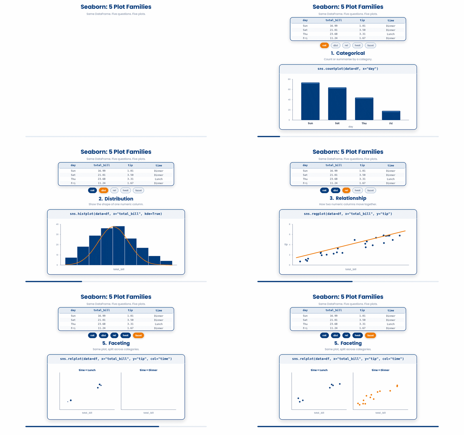
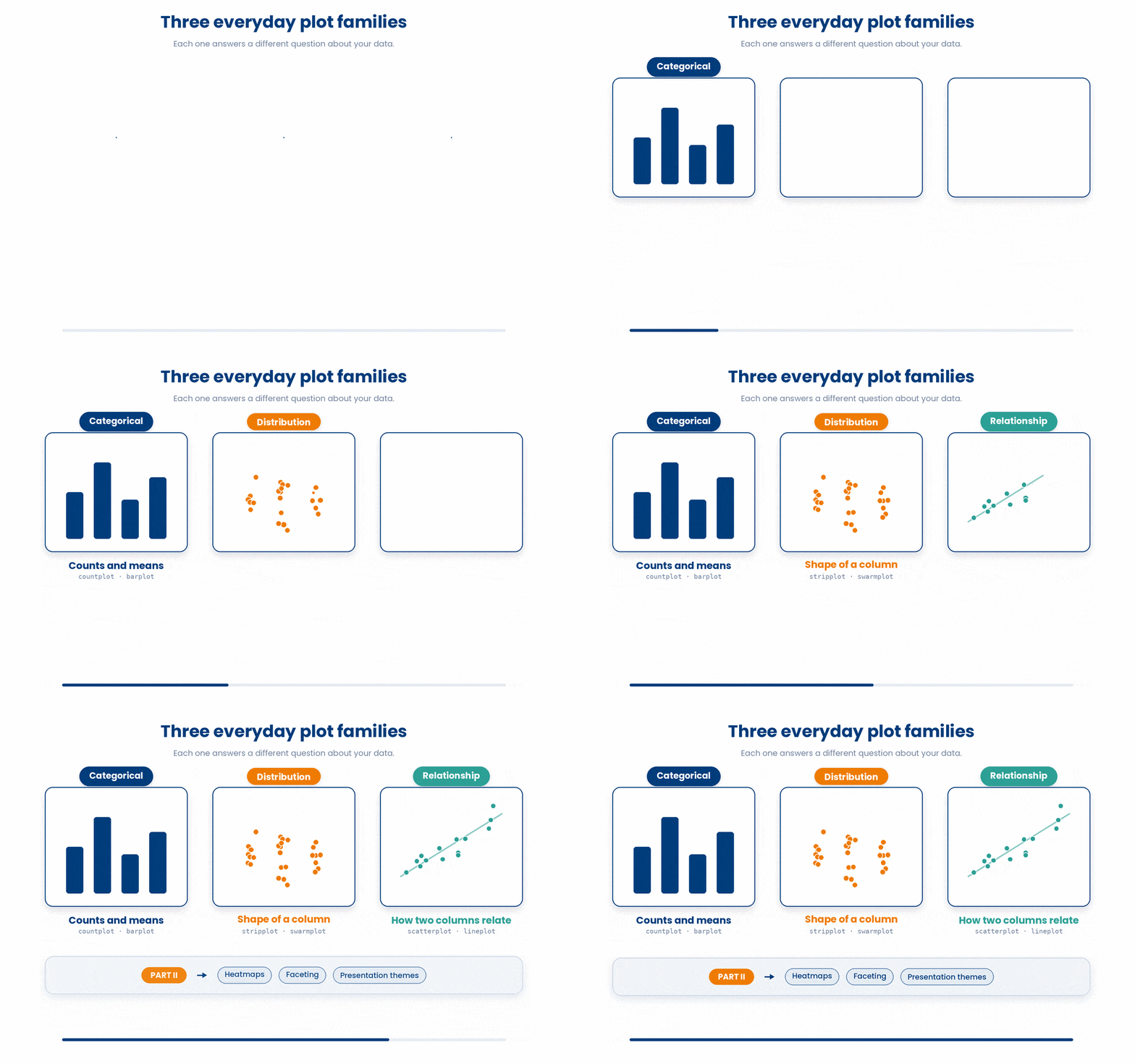
This is the first of two parts on Seaborn. It covers the three plot families you reach for most often — each answering one focused question about a single DataFrame:
- Categorical plots — counts and means broken down by a category, the two charts you draw most often when one of your columns is a label.
- Distribution plots — histograms, smooth densities, boxes, and violins for showing the shape of a numeric column, plus stripplot and swarmplot for showing every individual point.
- Relationship plots — scatter plots and fitted regression lines for showing how two numeric columns move together.
Part II then builds on these to combine and present plots: heatmaps, faceted grids of small multiples, and the themes and palettes that make a chart presentation-ready.
To follow along with this module, you will need the same two standard imports at the top of every script: seaborn (aliased as sns) and matplotlib.pyplot (aliased as plt). When you are ready to see your chart, calling plt.show() will pop the figure onto your screen, though Jupyter notebooks will usually display it for you automatically.
Be sure to test out each snippet in the Python Scratchpad on the right as you go. By the end of this part you will be able to look at a DataFrame and, in a single line, draw the right plot for counts, means, distributions, and the relationship between two numeric columns.
3 Categorical plots (count, bar)
Categorical columns hold text labels like clinic names, biological sexes, or blood types—not numbers. When working with these, you usually want to answer one of two questions: how many records belong to each category, or what is the average of a specific number within that category?
Seaborn has a simple, one-line solution for both: countplot for counts, and barplot for averages.
This is what we will be exploring in this section.
3.1 sns.countplot
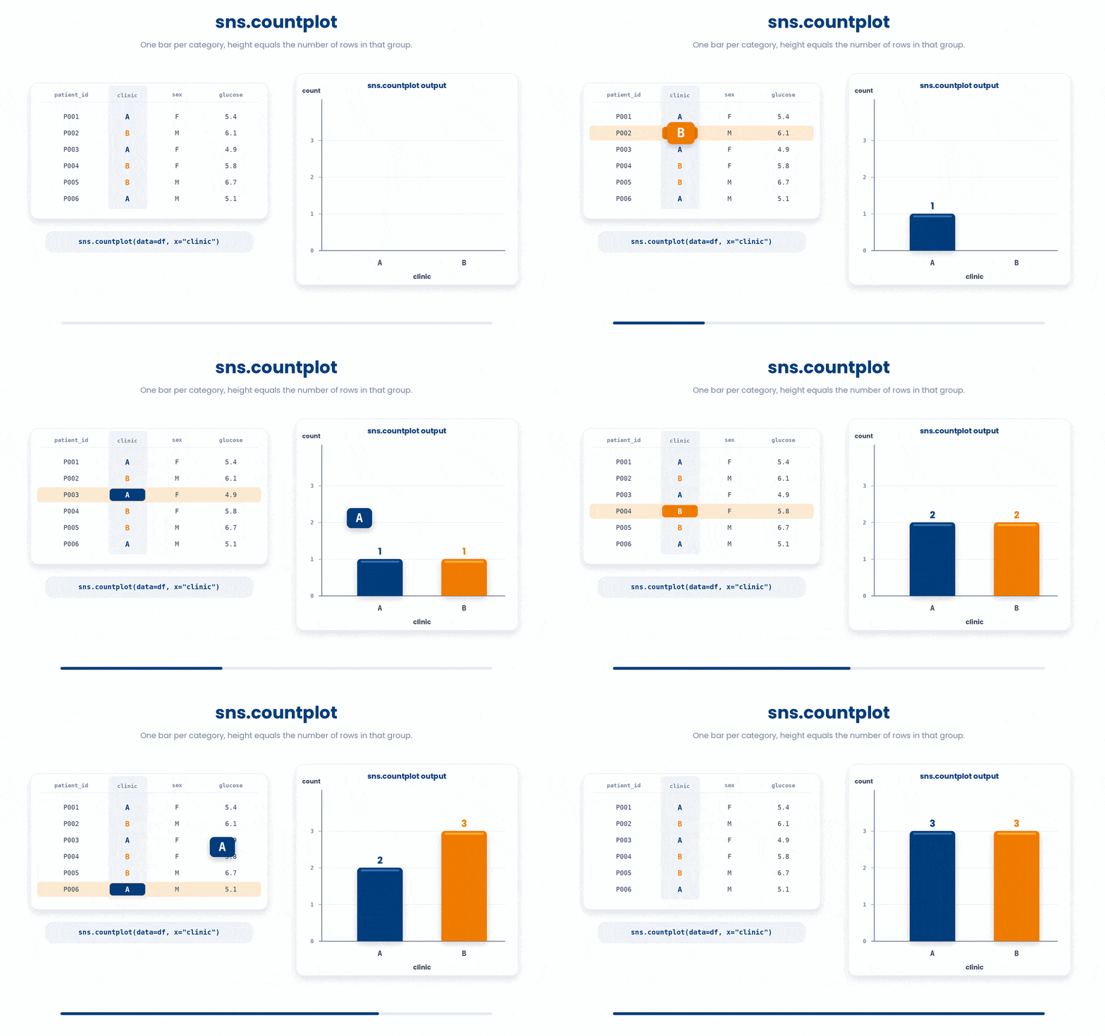
Let’s look at sns.countplot first. It is the simpler of the two and essentially acts like a histogram for categories. You just pass your DataFrame as data and the category column name as x. Seaborn will automatically draw one bar per category, where the height of the bar shows exactly how many rows belong to that group.
Try this snippet in the Python Scratchpad on the right.
import seaborn as sns
import matplotlib.pyplot as plt
import pandas as pd

df = pd.DataFrame({
    "patient_id": ["P001", "P002", "P003", "P004", "P005", "P006"],
    "clinic": ["A", "B", "A", "B", "B", "A"],
    "sex": ["F", "M", "F", "F", "M", "M"],
    "glucose": [5.4, 6.1, 4.9, 5.8, 6.7, 5.1],
})
sns.countplot(data=df, x="clinic")
plt.show()Here is an image to illustrate how countplot works.
countplot takes a hue argument too, and it is one you will reach for constantly: it breaks the count within each category down by a second column.
Try this snippet in the Python Scratchpad on the right.
import seaborn as sns
import matplotlib.pyplot as plt
import pandas as pd

df = pd.DataFrame({
    "patient_id": ["P001", "P002", "P003", "P004", "P005", "P006"],
    "clinic": ["A", "B", "A", "B", "B", "A"],
    "sex": ["F", "M", "F", "F", "M", "M"],
    "glucose": [5.4, 6.1, 4.9, 5.8, 6.7, 5.1],
})
sns.countplot(data=df, x="clinic", hue="sex")
plt.show()Now each clinic shows two bars side by side instead of one — female patients and male patients counted separately — so you can see at a glance whether a clinic sees more of one sex than the other.
3.2 sns.barplot
When you want to find the average instead, use sns.barplot.
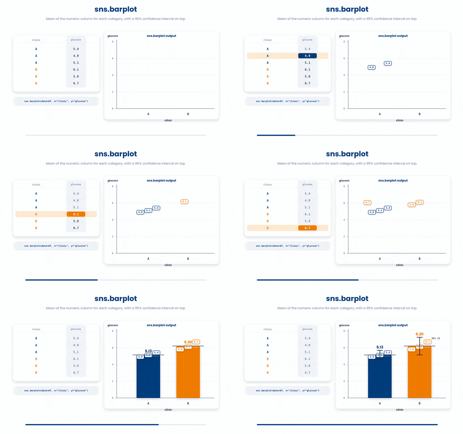
Here, you pass a category column as x and a numeric column as y. Seaborn instantly calculates the average (mean) of y for each x category and draws the corresponding bars. It even adds a thin vertical line on top of each bar to represent the 95% confidence interval for that mean, which it calculates for you automatically behind the scenes.
Try this snippet in the Python Scratchpad on the right.
import seaborn as sns
import matplotlib.pyplot as plt
import pandas as pd

df = pd.DataFrame({
    "clinic": ["A", "A", "A", "B", "B", "B"],
    "glucose": [5.4, 4.9, 5.1, 6.1, 5.8, 6.7],
})
sns.barplot(data=df, x="clinic", y="glucose")
plt.show()Here is a figure to illustrate the process.
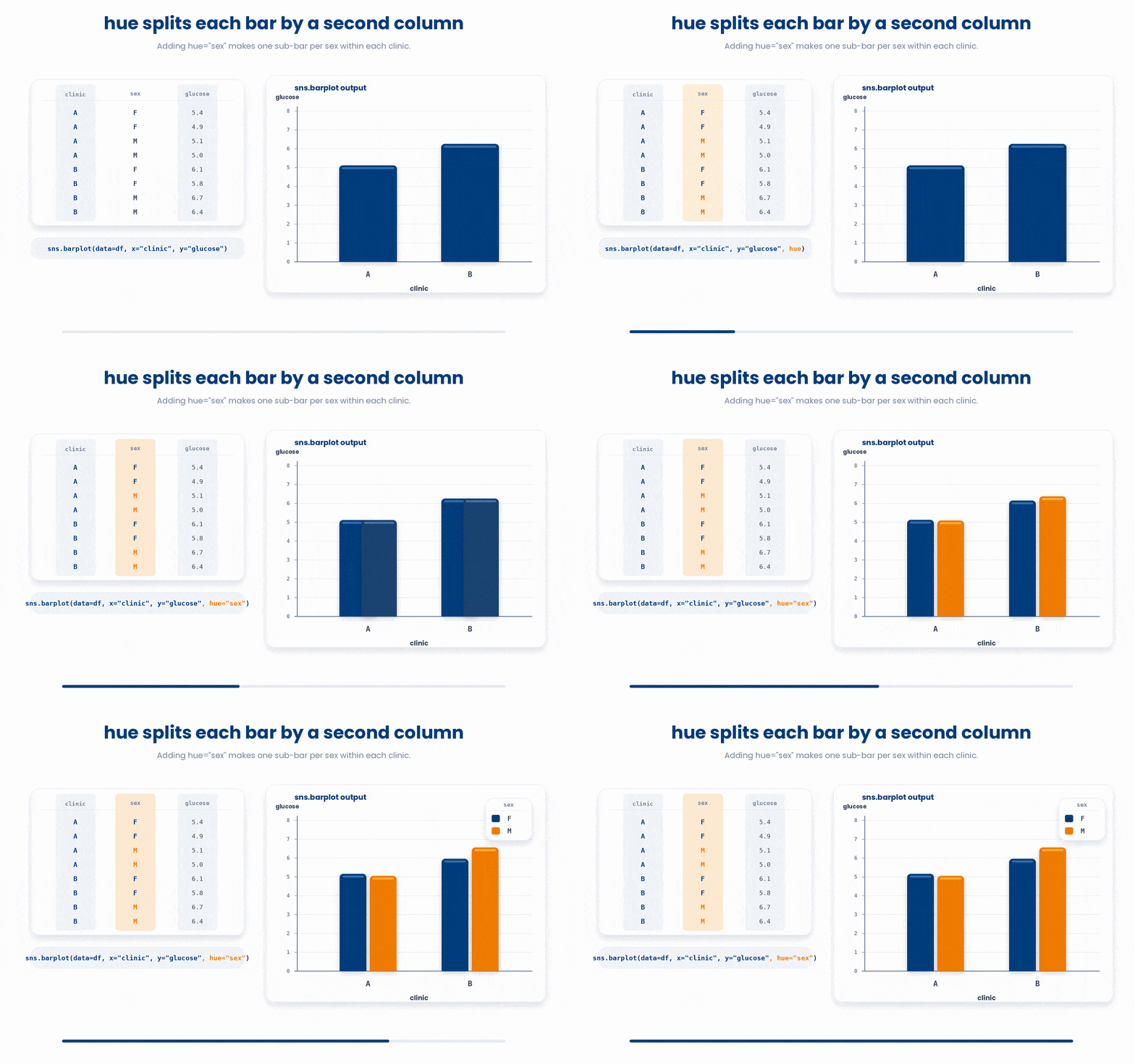
The hue argument splits each category by a second column.
Try this snippet in the Python Scratchpad on the right.
import seaborn as sns
import matplotlib.pyplot as plt
import pandas as pd

df = pd.DataFrame({
    "clinic": ["A", "A", "A", "A", "B", "B", "B", "B"],
    "sex": ["F", "F", "M", "M", "F", "F", "M", "M"],
    "glucose": [5.4, 4.9, 5.1, 5.0, 6.1, 5.8, 6.7, 6.4],
})
sns.barplot(data=df, x="clinic", y="glucose", hue="sex")
plt.show()If you pass hue="sex", seaborn draws the bars side by side within each clinic — one for each level of sex — with a legend off to the right. This is the move that lets you compare two breakdowns at once on one chart.
There are two more helpful arguments you should know about.
First, the order argument (like order=["B", "A"]) lets you arrange the bars along the x-axis exactly how you want them. This is great for setting up an alphabetical sort, ordering by severity level, or organizing days of the week.
Second, the estimator argument lets you change the default math Seaborn uses. If you don't want the mean, you can use estimator=np.median (after importing numpy) to find the median, use estimator="sum" for totals, or pass any function that takes an array and returns a single number.
Try this snippet in the Python Scratchpad on the right.
import seaborn as sns
import matplotlib.pyplot as plt
import pandas as pd
import numpy as np

df = pd.DataFrame({
 "clinic": ["A", "A", "B", "B", "B"],
 "glucose": [5.0, 6.0, 7.0, 8.0, 9.0],
})
sns.barplot(data=df, x="clinic", y="glucose", order=["B", "A"], estimator="sum")
plt.show()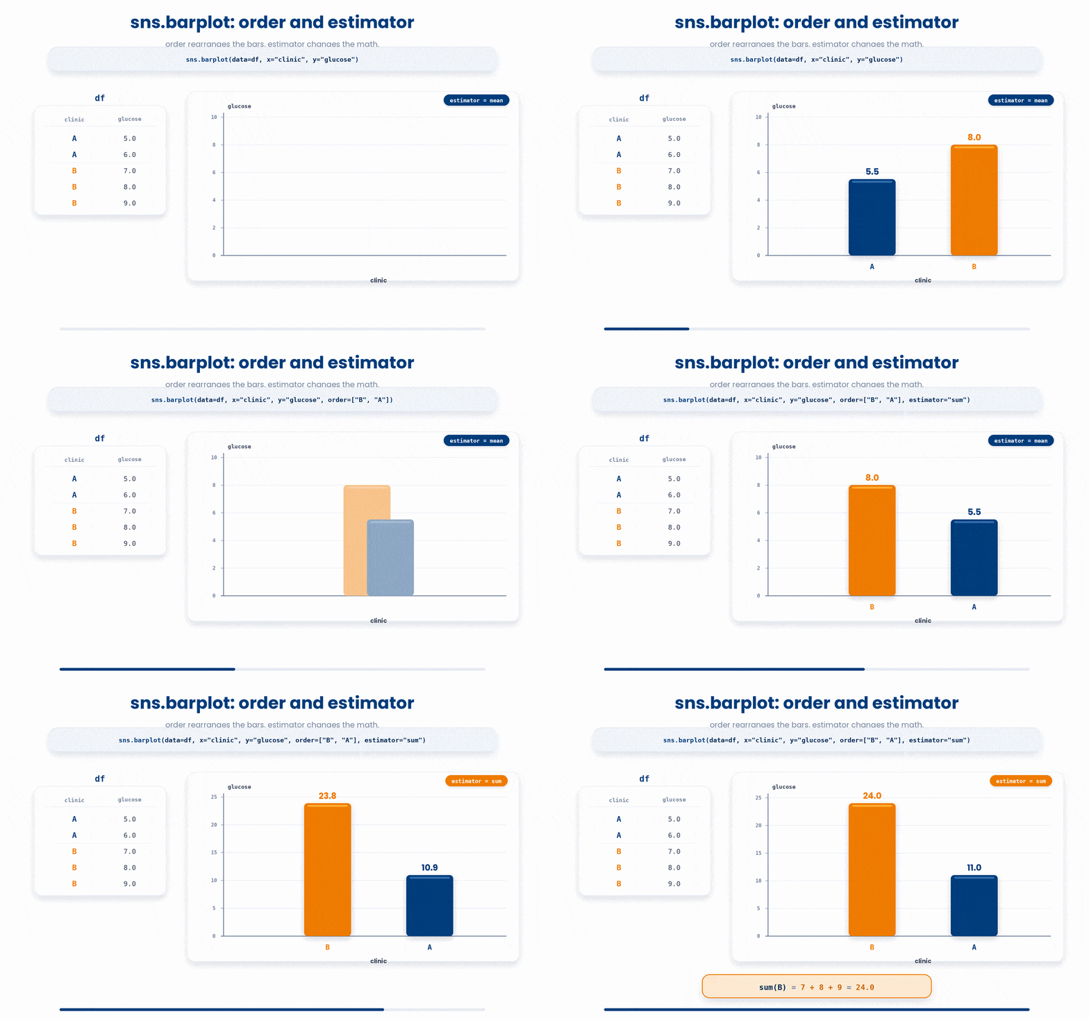
Finally, here is a very common point of confusion:
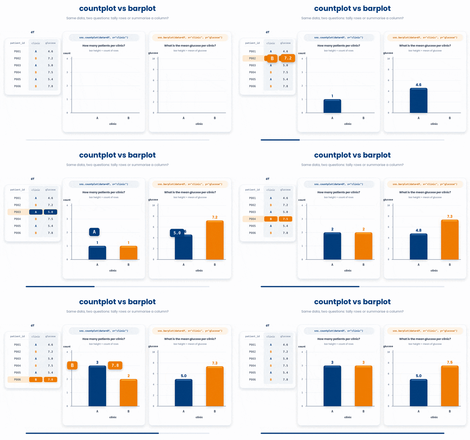
countplot and barplot look almost identical on the screen, but they answer fundamentally different questions. The bar height in a countplot simply represents a count of rows. The bar height in a barplot represents a summary (like the mean) of a specific numeric y column.
4 Distribution plots (histogram, KDE, box, violin)
A distribution plot answers a different set of questions: what does the overall shape of this data look like? Are the numbers bunched around a single peak, or split into two? Is there a long tail of unusually high readings? Where do the outliers sit?
Building a habit of always plotting your data's distribution before you summarize it will save you from a lot of analytical blind spots. Seaborn gives you four common ways to visualize these shapes.
First is sns.histplot, which draws a standard histogram. Pass a numeric column as x, and Seaborn slices the values into bins, drawing a bar to show how many observations fell into each one.
There are two useful arguments that you can use:
- The
bins=argument lets you control the number of bars. - The
kde=Trueargument lets you overlay a smooth curve on top, which helps highlight underlying shapes that the choppy bars might hide.
Try this snippet in the Python Scratchpad on the right.
import seaborn as sns
import matplotlib.pyplot as plt
import pandas as pd

df = pd.DataFrame({
    "glucose": [5.4, 4.9, 5.1, 6.1, 5.8, 6.7, 5.9, 5.2,
                  6.3, 5.6, 4.8, 7.1, 5.5, 6.0, 5.7, 6.4],
})
sns.histplot(data=df, x="glucose", bins=8, kde=True)
plt.show()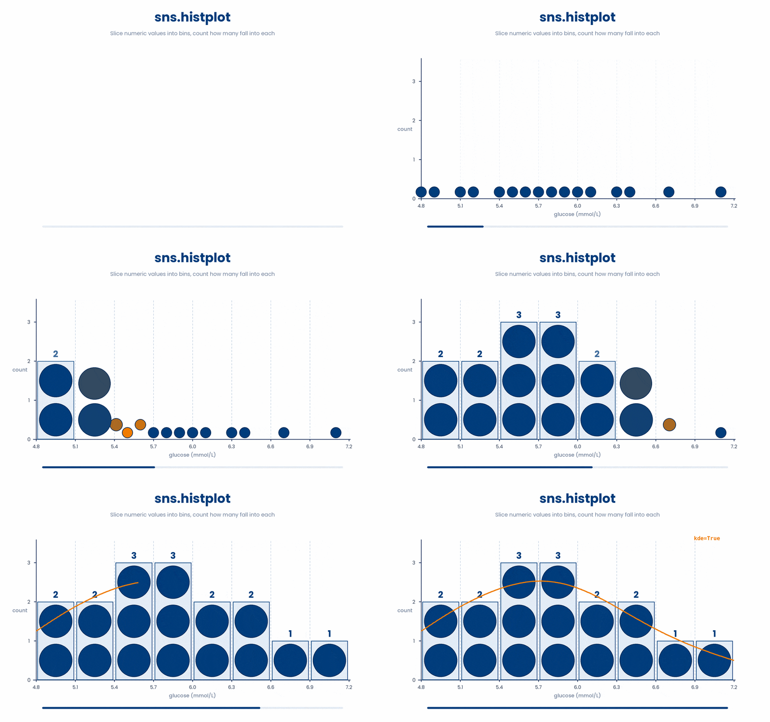
sns.histplot is not the only way to draw a histogram: sns.displot takes the same arguments and produces the same-looking chart, but where histplot draws into whatever axes are already open, displot always opens a brand new figure of its own. Run it on the same data as above:
Try this snippet in the Python Scratchpad on the right.
import seaborn as sns
import matplotlib.pyplot as plt
import pandas as pd

df = pd.DataFrame({
    "glucose": [5.4, 4.9, 5.1, 6.1, 5.8, 6.7, 5.9, 5.2,
                  6.3, 5.6, 4.8, 7.1, 5.5, 6.0, 5.7, 6.4],
})
sns.displot(data=df, x="glucose", bins=8, kde=True)
plt.show()If you just want that smooth curve without the bars getting in the way, use sns.kdeplot. It acts as a smooth estimate of your data's density. This is exactly what you should reach for when you want to compare the shapes of two or three distributions overlapping on the same chart. Pass hue="clinic" to draw a differently colored curve for each clinic.
Try this snippet in the Python Scratchpad on the right.
import seaborn as sns
import matplotlib.pyplot as plt
import pandas as pd

df = pd.DataFrame({
    "clinic": ["A"]*8 + ["B"]*8,
    "glucose": [5.4, 4.9, 5.1, 5.0, 5.5, 5.2, 4.8, 5.3,
                  6.1, 5.8, 6.7, 6.3, 5.9, 6.0, 6.4, 6.2],
})
sns.kdeplot(data=df, x="glucose", hue="clinic")
plt.show()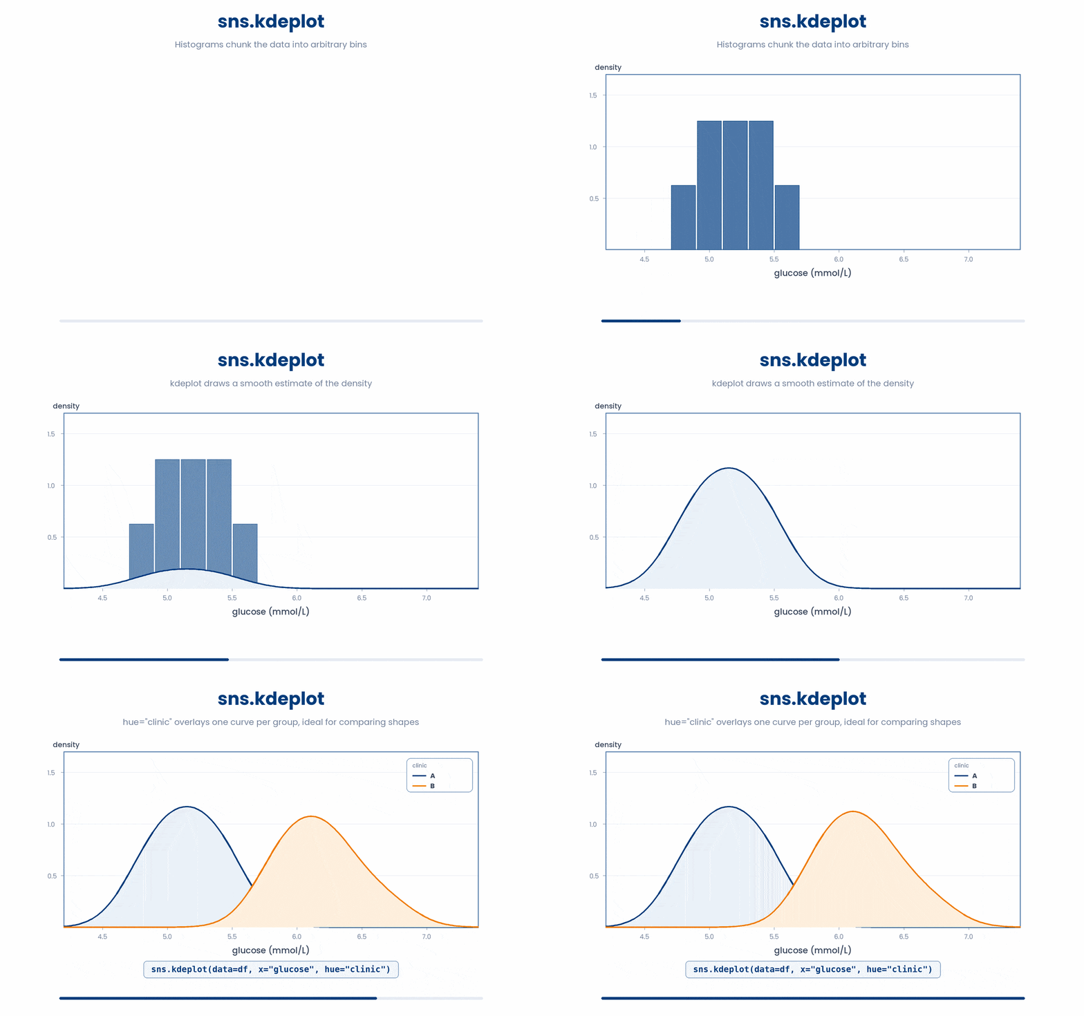
When you want to compare distributions across many groups, sns.boxplot is perfect. It displays a clean, five-number summary (minimum, 25th percentile, median, 75th percentile, maximum) and marks any outliers as individual points. By crossing a category column on the x axis with a numeric column on the y axis, you get neat, side-by-side boxes.
Try this snippet in the Python Scratchpad on the right.
import seaborn as sns
import matplotlib.pyplot as plt
import pandas as pd

df = pd.DataFrame({
    "clinic": ["A"]*6 + ["B"]*6 + ["C"]*6,
    "bmi": [27.3, 24.1, 31.2, 22.8, 26.5, 28.0,
             29.5, 30.1, 27.8, 32.4, 28.9, 31.7,
             24.2, 25.8, 23.7, 26.1, 24.9, 25.4],
})
sns.boxplot(data=df, x="clinic", y="bmi")
plt.show()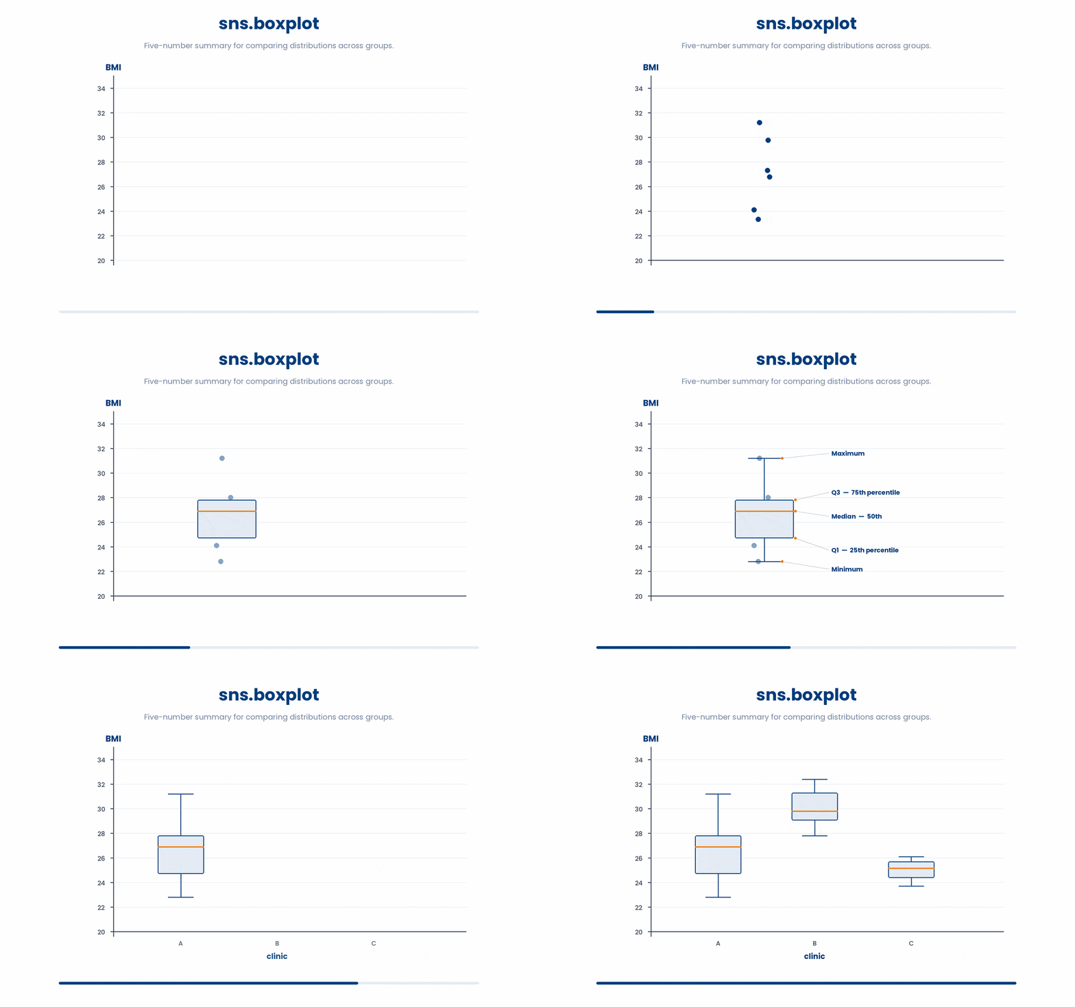
Finally, sns.violinplot is the richer, more detailed cousin of the boxplot. It still gives you the box-and-whisker summary in the middle, but the outer shape is a mirrored density curve (like the KDE). A wide bulge means lots of values exist at that range, while a narrow neck means very few. Boxplots hide bumps, skews, and multiple peaks under a single rectangle—violins reveal them.
Try this snippet in the Python Scratchpad on the right.
import seaborn as sns
import matplotlib.pyplot as plt
import pandas as pd

df = pd.DataFrame({
    "clinic": ["A"]*8 + ["B"]*8,
    "bmi": [22.0, 23.1, 24.0, 23.5, 31.0, 32.1, 30.8, 31.5,
             27.0, 28.0, 27.5, 28.5, 27.2, 28.3, 27.8, 28.1],
})
sns.violinplot(data=df, x="clinic", y="bmi")
plt.show()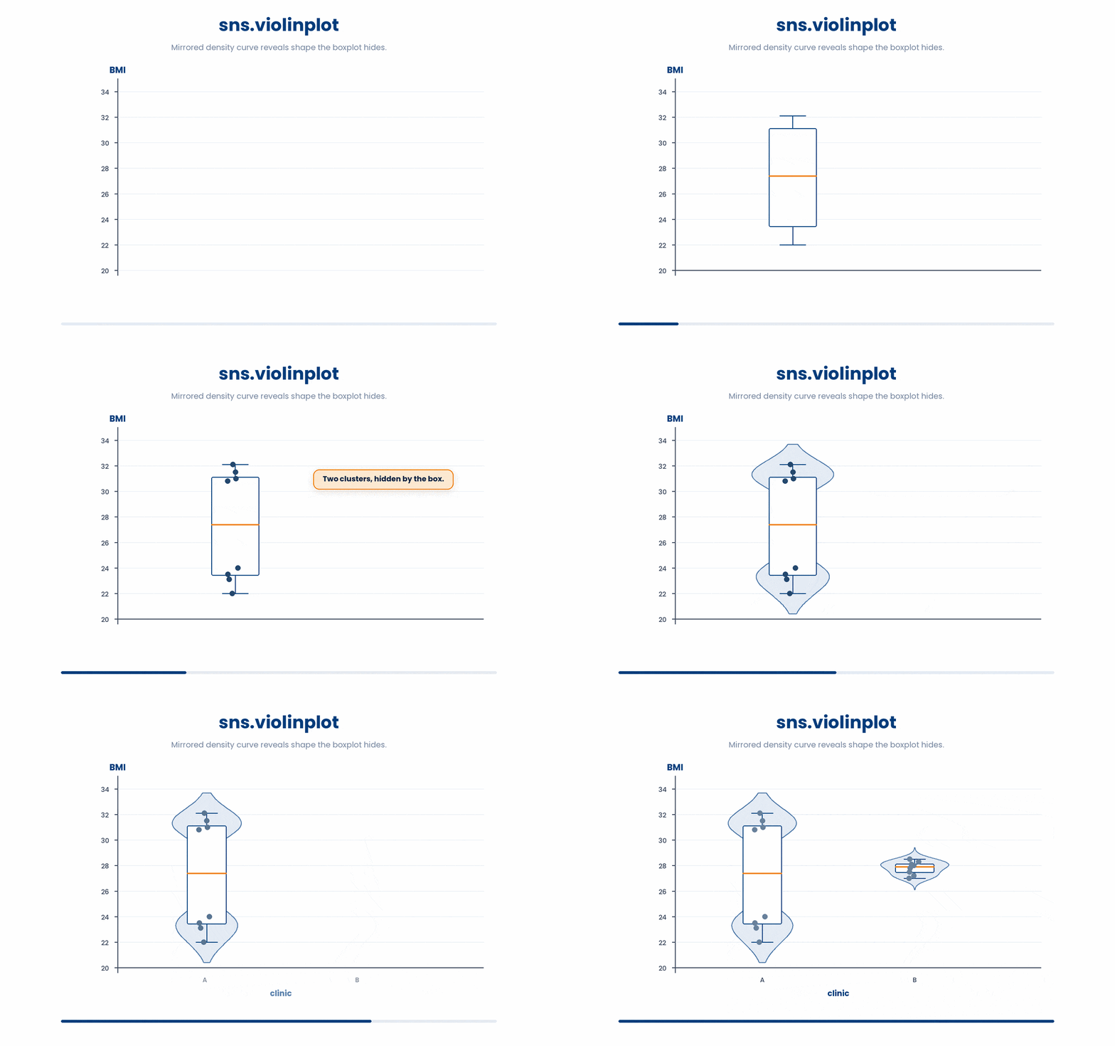
Which should you pick?
None of these are wrong; they just emphasize different things.
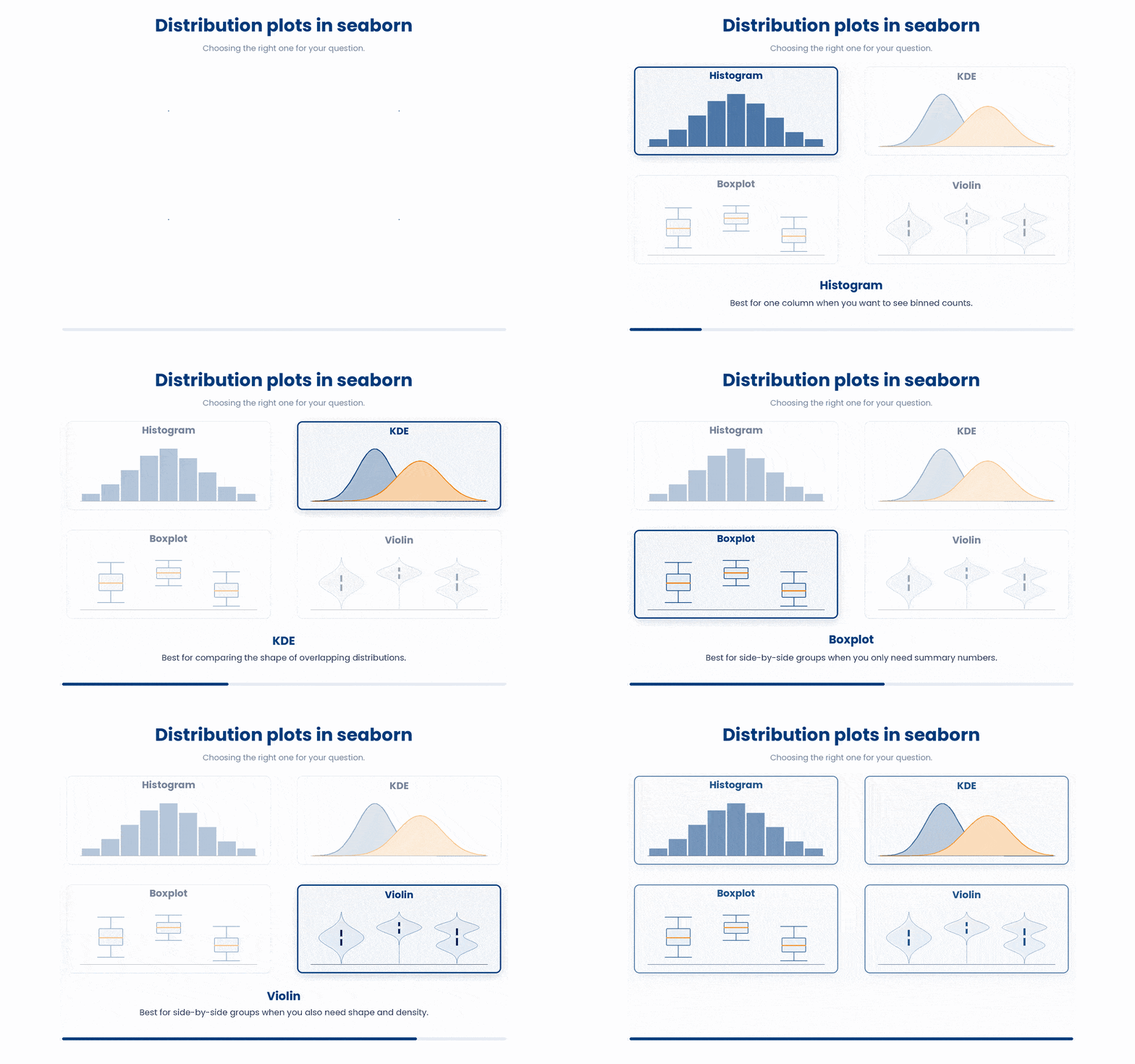
- Histogram: Best for a single column when you want to see actual, binned counts.
- KDE: Best for comparing the overall shapes of overlapping distributions.
- Boxplot: Best for a quick side-by-side view of many groups when you only care about the core summary numbers.
- Violin: Best when you need that side-by-side view, but also need to see the true shape and density of each group.
boxplot and violinplot both have a figure-level cousin, sns.catplot, which draws either one depending on its kind= argument. Passing kind="box" gives the boxplot above; passing kind="violin" gives the exact same violin you just made:
Try this snippet in the Python Scratchpad on the right.
import seaborn as sns
import matplotlib.pyplot as plt
import pandas as pd

df = pd.DataFrame({
    "clinic": ["A"]*8 + ["B"]*8,
    "bmi": [22.0, 23.1, 24.0, 23.5, 31.0, 32.1, 30.8, 31.5,
             27.0, 28.0, 27.5, 28.5, 27.2, 28.3, 27.8, 28.1],
})
sns.catplot(data=df, x="clinic", y="bmi", kind="violin")
plt.show()5 Showing individual points with stripplot and swarmplot
Boxplots and violin plots are fantastic for summarizing a distribution, but they hide the individual data points. When you are working with a smaller sample size—say, twenty patients per clinic instead of two thousand—you will often want to see the actual dots.
Seaborn gives you two great tools for this:
sns.stripplotplots one dot per row and adds a tiny bit of random "jitter" to spread them out so the points don't just stack completely on top of each other.sns.swarmplottakes it a step further, neatly arranging the dots into a shape so they never overlap at all.
One of the best visualization tricks in Seaborn is layering these plots together. By calling a strip plot or swarm plot right after a box plot, you can show the raw data points directly on top of the statistical summary.
Try this snippet in the Python Scratchpad on the right.
import seaborn as sns
import matplotlib.pyplot as plt
import pandas as pd

df = pd.DataFrame({
    "clinic": ["A"]*5 + ["B"]*5 + ["C"]*5,
    "bmi": [27.4, 29.0, 25.2, 28.1, 26.8,
               31.1, 30.5, 32.8, 29.9, 33.2,
               24.8, 26.1, 23.9, 25.5, 24.2],
})
sns.boxplot(data=df, x="clinic", y="bmi", color="lightgrey")
sns.stripplot(data=df, x="clinic", y="bmi", color="black")
plt.show()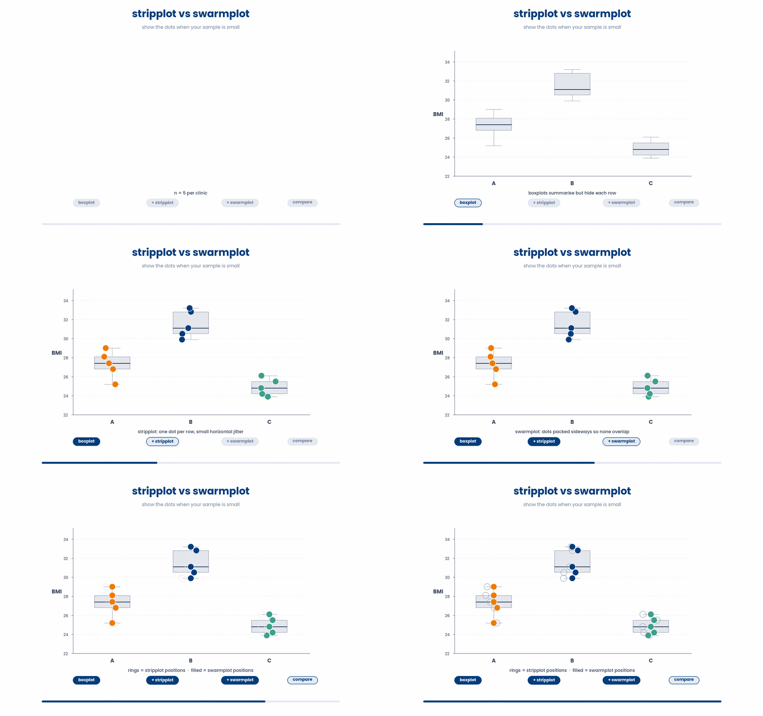
6 Relationship plots (scatter, regression)
When you need to know how two numeric columns relate to each other—like asking whether BMI goes up with age or if cholesterol tracks with glucose—you need a relationship plot. The foundation of these plots is the scatter plot. Seaborn makes building them incredibly simple while giving you powerful tools to add trendlines or split your charts into multiples.
Let's start with sns.scatterplot, which is the simplest option. You just pass in your x and y numeric column names, and Seaborn plots one dot for every row in your data. It is highly customizable: you can add hue="sex" to color the points based on gender, use size="bmi" to scale the markers, or apply style="sex" to change the marker shapes altogether.
Try this snippet in the Python Scratchpad on the right.
import seaborn as sns
import matplotlib.pyplot as plt
import pandas as pd

df = pd.DataFrame({
    "age": [54, 61, 47, 72, 38, 55, 49, 67, 41, 58],
    "bmi": [27.3, 24.1, 31.2, 22.8, 29.5, 26.0,
             28.4, 23.5, 30.1, 25.7],
    "sex": ["F", "M", "F", "M", "F", "M", "F", "M", "F", "M"],
})
sns.scatterplot(data=df, x="age", y="bmi", hue="sex", size="bmi", style="sex")
plt.show()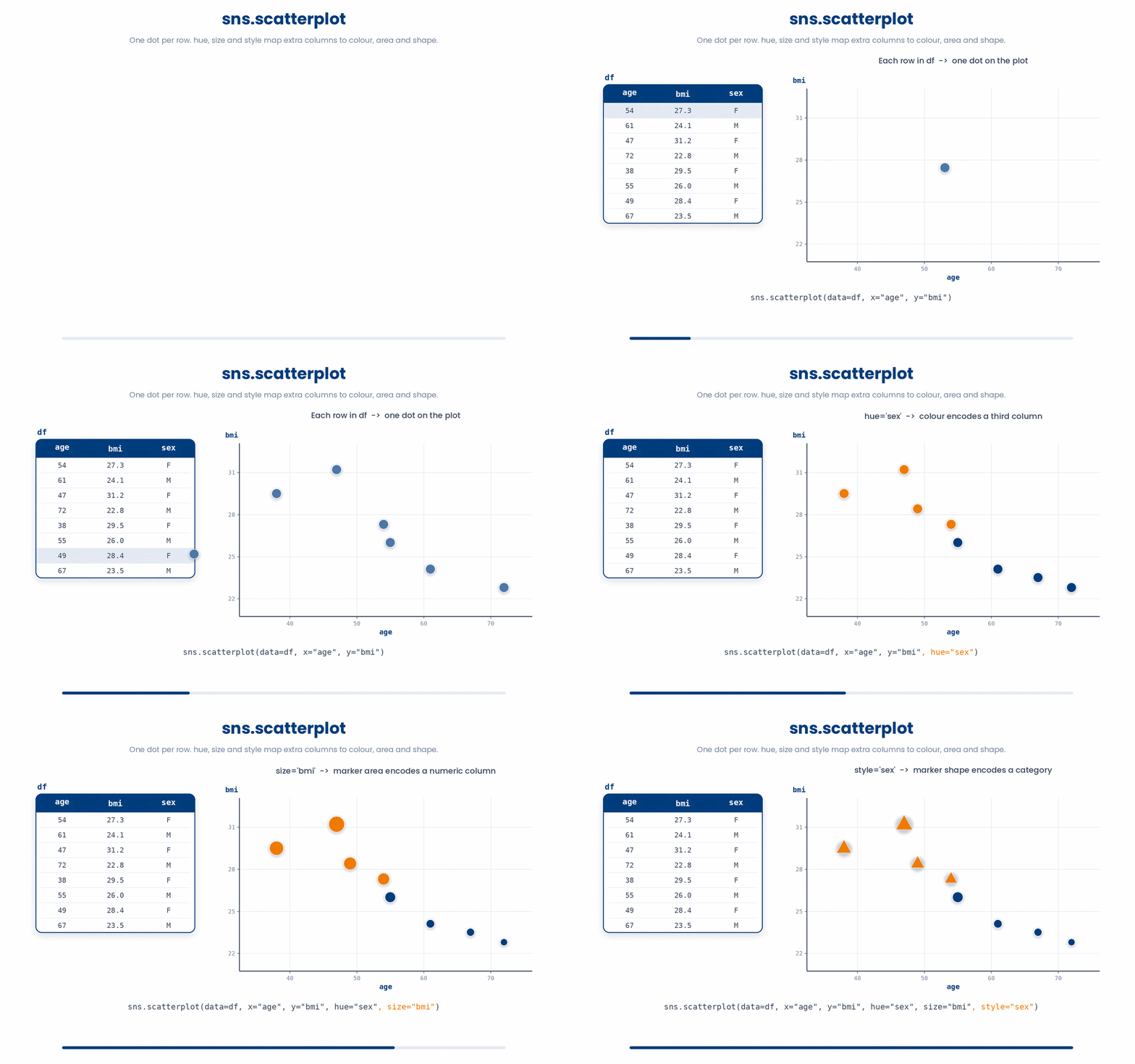
Once you plot your points, you will naturally wonder if there is an actual trend. That is where sns.regplot comes in. It plots your scatter points and automatically calculates and draws a regression line right through the data, complete with a translucent 95% confidence band. By default, it draws a straight line, but you can pass order=2 to fit a quadratic curve, or lowess=True for a non-parametric local fit if the relationship clearly isn't straight.
Try this snippet in the Python Scratchpad on the right.
import seaborn as sns
import matplotlib.pyplot as plt
import pandas as pd

df = pd.DataFrame({
    "age": [54, 61, 47, 72, 38, 55, 49, 67, 41, 58, 63, 45],
    "bmi": [27.3, 28.4, 26.1, 30.2, 24.5, 27.0,
             25.8, 29.7, 24.0, 28.1, 29.5, 25.5],
})
sns.regplot(data=df, x="age", y="bmi")
plt.show()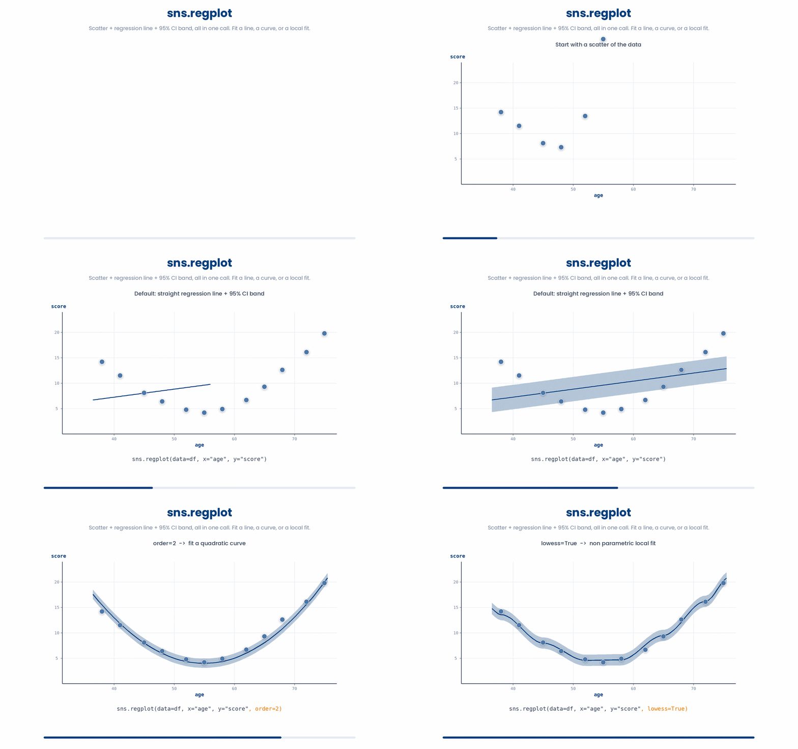
What if you want to compare those trends across different groups? Enter sns.lmplot, which is essentially regplot’s big sibling. It does the exact same scatter-plus-line trick, but because it controls the entire figure (rather than a single set of axes), you can split your plot into small multiples. If you pass col="sex", you instantly get two side-by-side panels—one for each sex—that share the same axes for incredibly easy comparison. You can even use the same hue argument from earlier to draw separate lines for different groups within the same panel.
Try this snippet in the Python Scratchpad on the right.
import seaborn as sns
import matplotlib.pyplot as plt
import pandas as pd

df = pd.DataFrame({
    "age": [54, 61, 47, 72, 38, 55, 49, 67, 41, 58, 63, 45],
    "bmi": [27.3, 28.4, 26.1, 30.2, 24.5, 27.0,
             25.8, 29.7, 24.0, 28.1, 29.5, 25.5],
    "sex": ["F", "M", "F", "M", "F", "M",
             "F", "M", "F", "M", "F", "M"],
})
sns.lmplot(data=df, x="age", y="bmi", col="sex")
plt.show()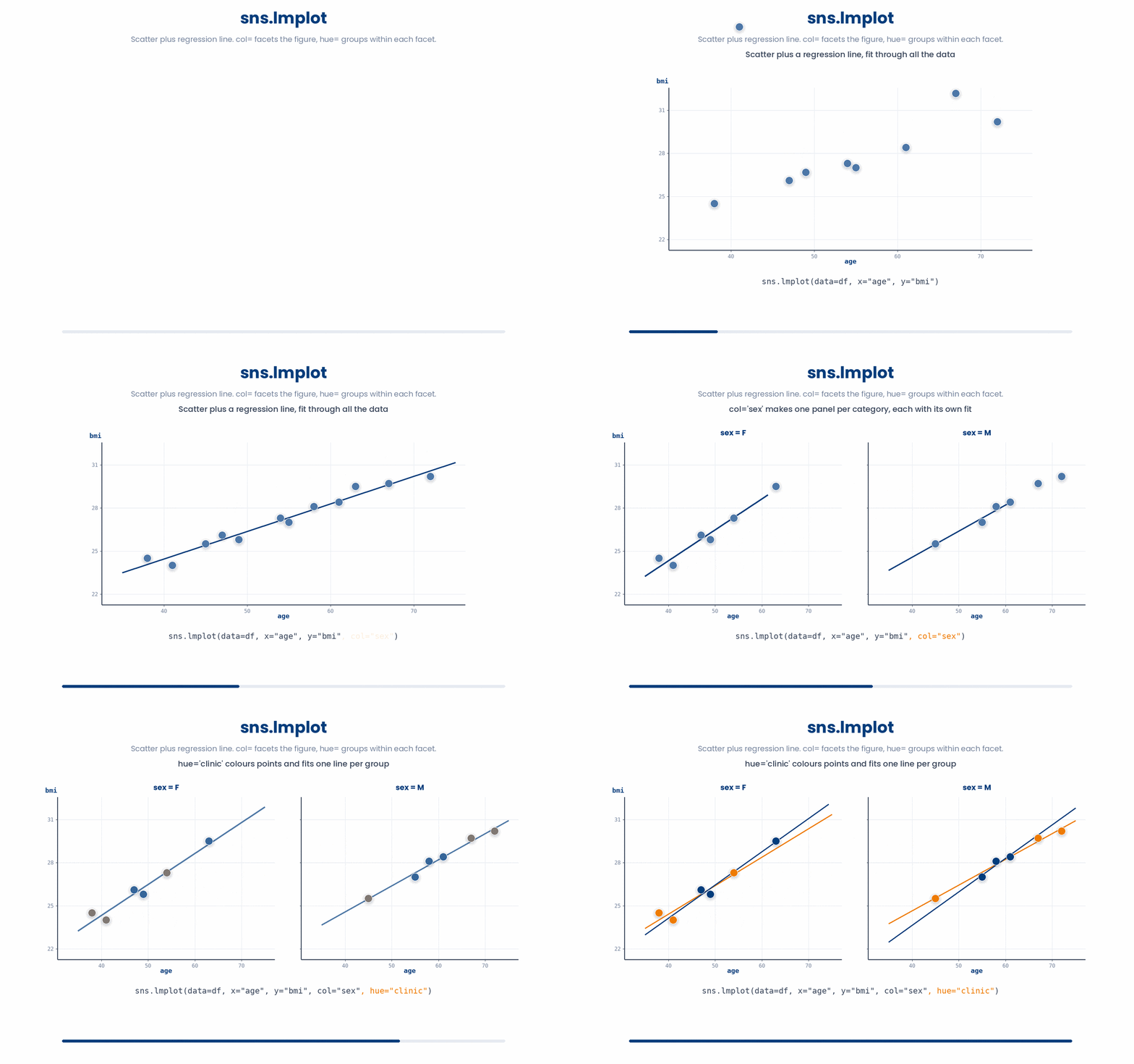
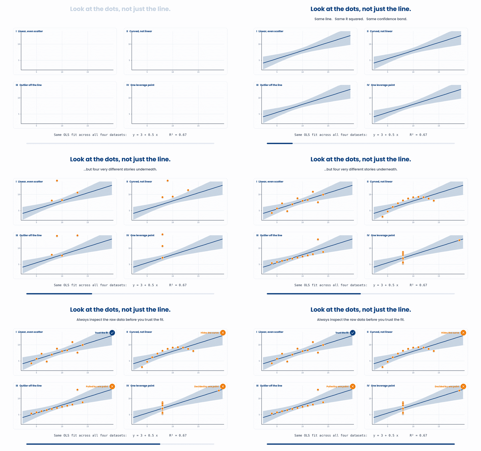
A point worth remembering: Seaborn’s default confidence bands look very official and reassuring, but they are only honest if your data actually follows a straight line with even scattering. Always look at the raw dots first. If your cloud of points fans out, curls drastically, or has huge outliers, do not blindly trust the straight line just because Seaborn drew one for you.
As a general rule of thumb: reach for scatterplot when you only want the points. Use regplot when you want those points plus a single trendline on one chart. Grab lmplot when you want to take that same relationship and split it into panels across another column. That third scenario is incredibly common when comparing cohorts, sites, or treatments, so lmplot is a fantastic tool to know right from day one.
7 Wrapping up Part I
You now have the three everyday plot families: categorical plots for counts and means, distribution plots — with stripplot and swarmplot — for the shape of a column, and relationship plots for how two numeric columns move together. Part II picks up from here with heatmaps, faceting, and presentation-ready themes.
8 Check your understanding
You have reached the end of the module. Try the same questions again — your answers here, paired with your pre-test answers, are how we measure what the module taught you. Answer every question and confidence rating, then click Submit and see results to view your score.
You have a DataFrame with columns clinic and patient_id and want a chart of how many patients are at each clinic. Which call is right?
In sns.barplot(data=df, x="clinic", y="glucose"), what does the height of each bar represent by default?
Which seaborn call shows the shape of a single numeric column, with the option to overlay a smooth density curve?
You want to compare the shapes of the glucose distribution for clinic A versus clinic B as two smooth curves overlaid on the same axes. Which call fits best?
You want to compare the distribution of bmi across three clinics in one chart, and you need to see whether any clinic has a bimodal distribution (two separate peaks). Which plot is the best choice?
With only about 15 patients per clinic, you want to show every individual bmi point on top of a boxplot, arranged so the dots never overlap. Which call adds those points?
You want a scatter of age vs bmi with a fitted regression line and a 95% confidence band. Which one-line call does this on a single set of axes?
You want a scatter of age vs bmi where the point colour shows sex and the point size reflects bmi. Which call does this?
I can pick the right seaborn plot for a given question about a DataFrame — counts per category, distribution shape, or the relationship between two numeric columns.
I can choose between a histogram, KDE, boxplot, and violin plot to show a distribution, and overlay a stripplot or swarmplot to show the individual points.
9 Your results
Here is how your post-test answers compare with your pre-test answers. The pre/post pairing is the most reliable way to see what this module actually taught you.
Submit the post-test to see your results.
What is the one thing from this module that is still unclear to you?