

1 Before you start
This is not graded, and it does not count towards anything. Answer every question even if you are only guessing — having a go at something before you have been taught it is one of the best ways to remember it afterwards. The lesson ends with another short check, and there you will be shown the correct answer for anything you missed. Choose an option for every question and confidence rating, then click Submit answers.
You add label="Cohort 1" to plt.plot but the legend does not appear in your figure. What else do you need?
You want to draw a horizontal reference line at y=7.0 across the whole plot to mark a clinical threshold. Which call adds it?
Your x-axis shows the numbers 0, 1, 2, but you want the ticks to read "Baseline", "Week 1", "Week 2" instead. Which call does this?
You write fig, axes = plt.subplots(1, 2) and try axes[0, 0].plot(...). Python raises IndexError: too many indices for array. What is the fix?
Inside a figure made with fig, axes = plt.subplots(1, 2), you want to give the LEFT panel its own title. Which approach is correct?
In a multi-panel figure, the subplot titles and axis labels overlap and collide with each other. Which single call fixes the spacing automatically?
You call plt.savefig("figure.png") after plt.show() in a script and the saved PNG file is blank. What should you do?
You are exporting a figure for a journal submission that must stay perfectly sharp at any zoom level. Which file format is the best choice?
I can build a one-panel matplotlib figure with axis labels, a title, and a legend, and save it as a PNG.
I can build a two- or four-panel figure with plt.subplots, label every panel, and save the result as a 300-dpi PDF ready to drop into a paper or slide.
I can customize a plot with a threshold line, custom axis limits, and named tick labels, and style its lines with colours, markers, and line styles.
2 Introduction
In Part I you set up figures and drew the core plot types: line, scatter, bar, and histogram. A plot that is correct, though, is not yet a plot that is clear. It still needs labels and a legend a reader can follow, it often needs to sit alongside related panels, and it usually needs to be saved to a file you can drop into a report or slide.
This second part is about turning those plots into finished, presentation-ready figures:
- Customizing plots — labels, titles, colors, line styles, markers, and the legend that ties it all together.
- Subplots and multiple figures — putting two, four, or more panels in the same figure with
plt.subplots. - Saving figures — writing your finished plot to a PNG or PDF you can drop into a slide, an email, or a paper.
Try every snippet in the Python Scratchpad on the right. By the end of this part you will be able to label and style a figure, lay out a multi-panel figure with plt.subplots, and save a publication-ready image to disk.
3 Essential matplotlib customizations
A plot without context is just a line. Adding labels, titles, and legends makes the difference between a figure that confuses and one that convinces.
Here is a practical guide to formatting, structuring, and exporting your plots so they are always ready for reports or presentations.
3.1 Labels, titles and legends
Get into the habit of adding these foundational elements to every figure, even quick throwaway ones:
plt.xlabel()andplt.ylabel()– Always include the units in parentheses (e.g., "Weight (kg)").plt.title()– Sits at the top of the figure to summarize the data.plt.grid(True)– Adds a faint background grid to make reading values easier.plt.legend()– Creates the legend box. Crucial detail: You must pass label="Your Name" inside your plt.plot() calls first, otherwise the legend will be completely empty.
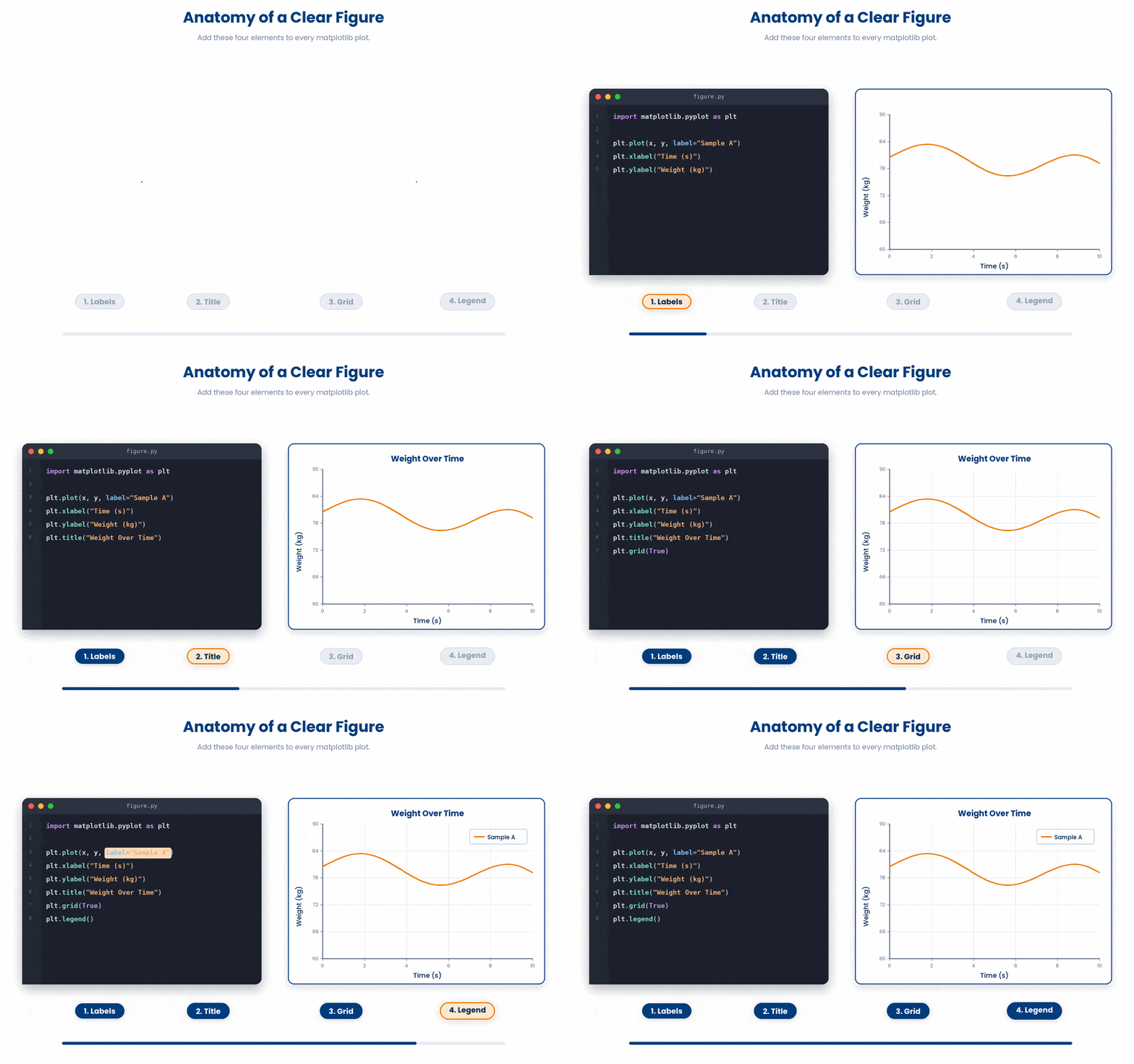
Try this snippet in the Python Scratchpad on the right.
import matplotlib.pyplot as plt

months = [0, 3, 6, 12]
weight_kg = [82, 79, 75, 73]

plt.plot(months, weight_kg)
plt.xlabel("Months since baseline")
plt.ylabel("Weight (kg)")
plt.title("Patient weight during 12-month follow-up")
plt.grid(True)
plt.show()To customize the look of your lines, use the color (names like steelblue or hex codes), linestyle (-, --, :), and marker (o, s, ^) arguments.
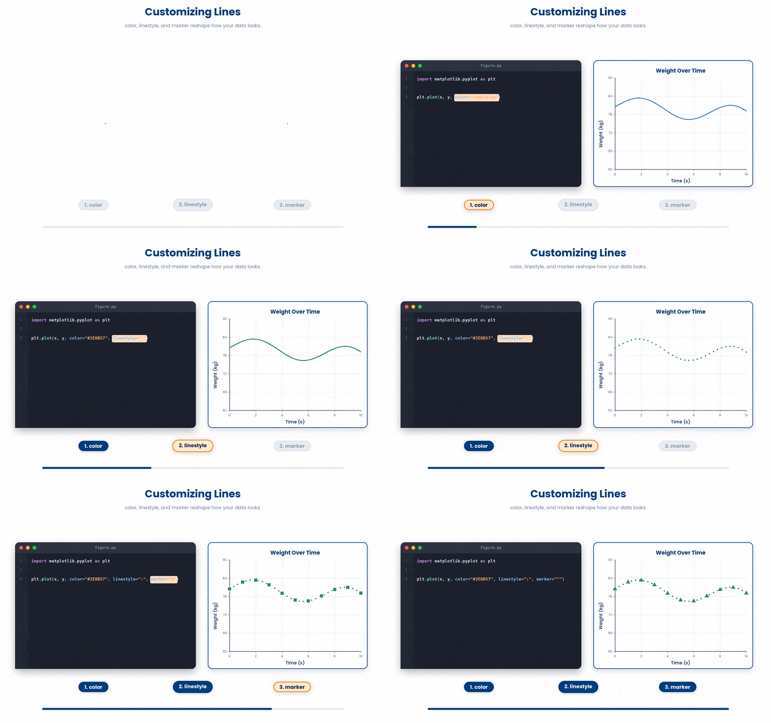
Try this snippet in the Python Scratchpad on the right.
import matplotlib.pyplot as plt

months = [0, 3, 6, 12]
patient_a = [82, 79, 75, 73]
patient_b = [78, 76, 75, 74]

plt.plot(months, patient_a, color="steelblue", linestyle="-", marker="o", label="Patient A")
plt.plot(months, patient_b, color="darkorange", linestyle="--", marker="s", label="Patient B")
plt.xlabel("Months since baseline")
plt.ylabel("Weight (kg)")
plt.title("Two patients, twelve months")
plt.legend()
plt.show()3.2 Threshold, limits and custom ticks
Often, you need to highlight a specific clinical cutoff or zoom in on a region of interest.
- Threshold lines – Use plt.axhline(y=...) to draw a horizontal line across the entire plot, or plt.axvline(x=...) for a vertical one. Both accept color and linestyle arguments.
- Axis limits – Override the default zoom using plt.xlim(lo, hi) and plt.ylim(lo, hi).
- Custom ticks – plt.xticks(positions, labels) allows you to replace standard numbers with named categories (e.g., mapping [0, 1] to ["Baseline", "Week 12"]).
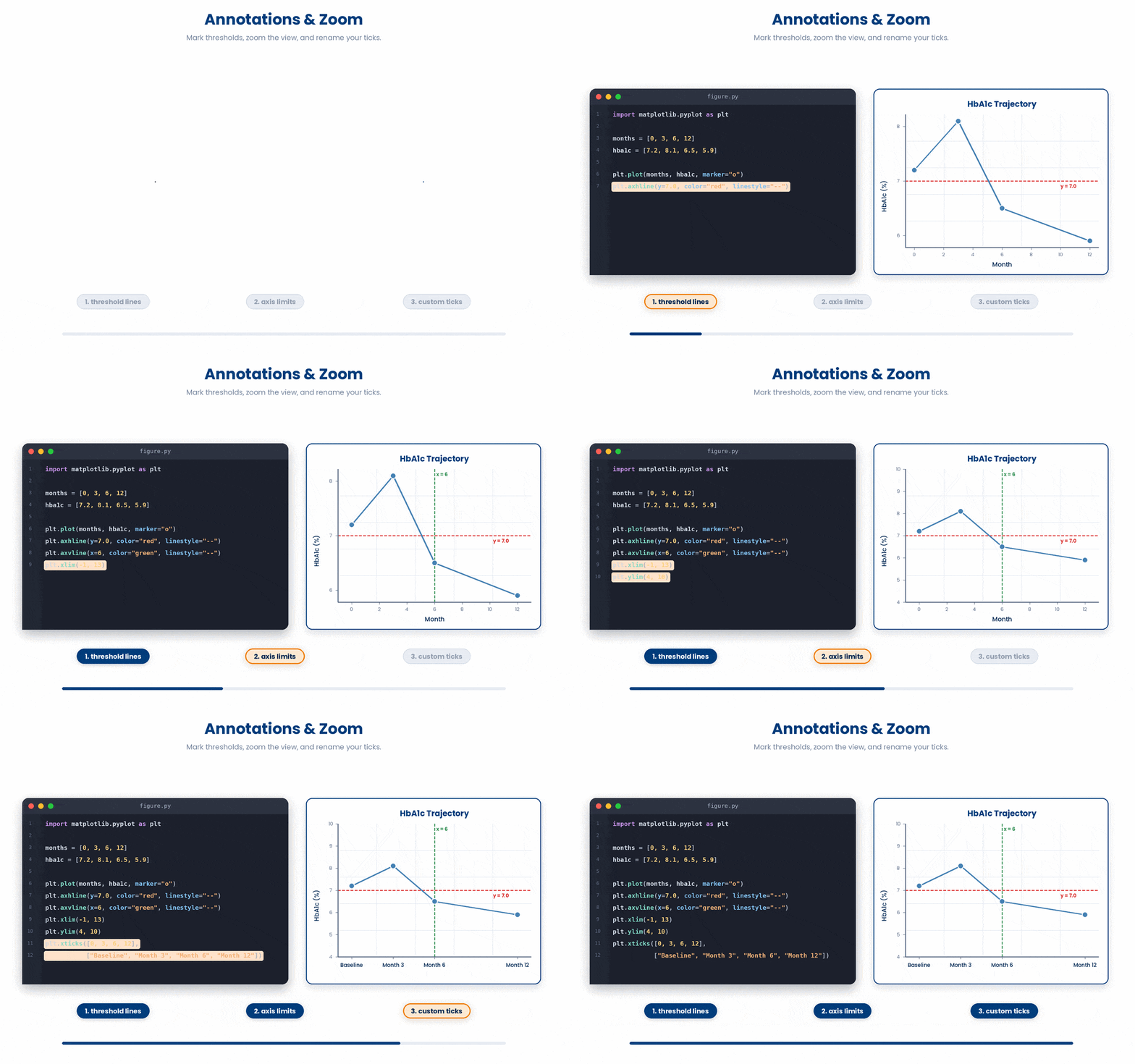
Try this snippet to see how plt.axhline() draws a horizontal threshold line across a plot
Try this snippet in the Python Scratchpad on the right.
import matplotlib.pyplot as plt

months = [0, 3, 6, 12]
hba1c = [7.2, 8.1, 6.5, 5.9]
plt.plot(months, hba1c, marker="o")
plt.axhline(y=7.0, color="red", linestyle="--", label="Threshold")
plt.xlabel("Month")
plt.ylabel("HbA1c (%)")
plt.legend()
plt.show()Try this snippet to see how to customize the x- and y-axis limits and ticks.
Try this snippet in the Python Scratchpad on the right.
import matplotlib.pyplot as plt

x = [0, 1, 2, 3, 4]
y = [10, 25, 30, 35, 40]
plt.plot(x, y, marker="o")
plt.xlim(-0.5, 4.5)
plt.ylim(0, 50)
plt.xticks([0, 1, 2, 3, 4], ["Baseline", "Week 1", "Week 2", "Week 4", "Week 12"])
plt.show()4 Subplots and multiple figures
When you need to compare datasets, placing them in a single figure is almost always cleaner than generating separate images. The reader's eye can compare panels directly without flipping pages.
fig, axes = plt.subplots(nrows, ncols) creates a grid. It returns the overall figure object and an array of individual axes.
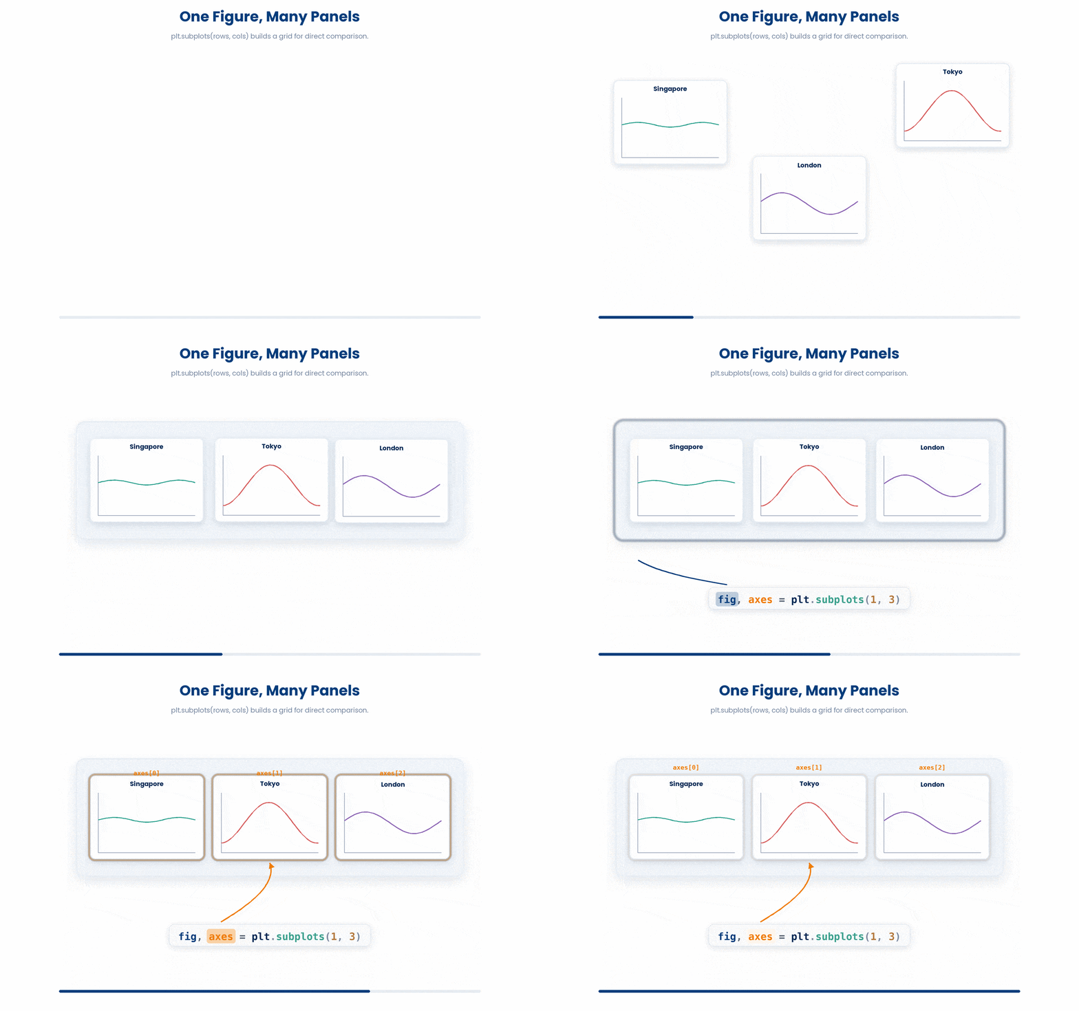
When working with subplots, you must switch to object-oriented syntax:
- Use
axinstead ofplt– Inside a multi-panel figure, standardplt.somethingcalls only apply to the most recently created axis, which gets confusing fast. Instead, call methods directly on the specific axis object you want to change:ax.plot(),ax.set_title(), andax.set_xlabel(). figsize=(width, height)– Sets the overall figure size in inches. Matplotlib's default is quite small. For slides or papers, bump it up to 8 by 5 or 10 by 6. Match your aspect ratio to your grid—use a wide figure for side-by-side panels, and a tall one for stacked panels.plt.tight_layout()– Always call this once at the very end. It automatically adjusts the spacing between subplots so that titles and axis labels do not collide and overlap.
Try this snippet in the Python Scratchpad on the right.
import matplotlib.pyplot as plt

ages = [54, 61, 47, 72, 38, 65, 49, 58, 71, 44]
bmi  = [27.3, 24.1, 31.2, 22.8, 29.5, 26.0, 30.1, 25.4, 23.7, 28.2]

fig, axes = plt.subplots(1, 2, figsize=(10, 4))

axes[0].hist(ages, bins=8)
axes[0].set_title("Age distribution")
axes[0].set_xlabel("Age (years)")

axes[1].hist(bmi, bins=5)
axes[1].set_title("BMI distribution")
axes[1].set_xlabel("BMI")

plt.tight_layout()
plt.show()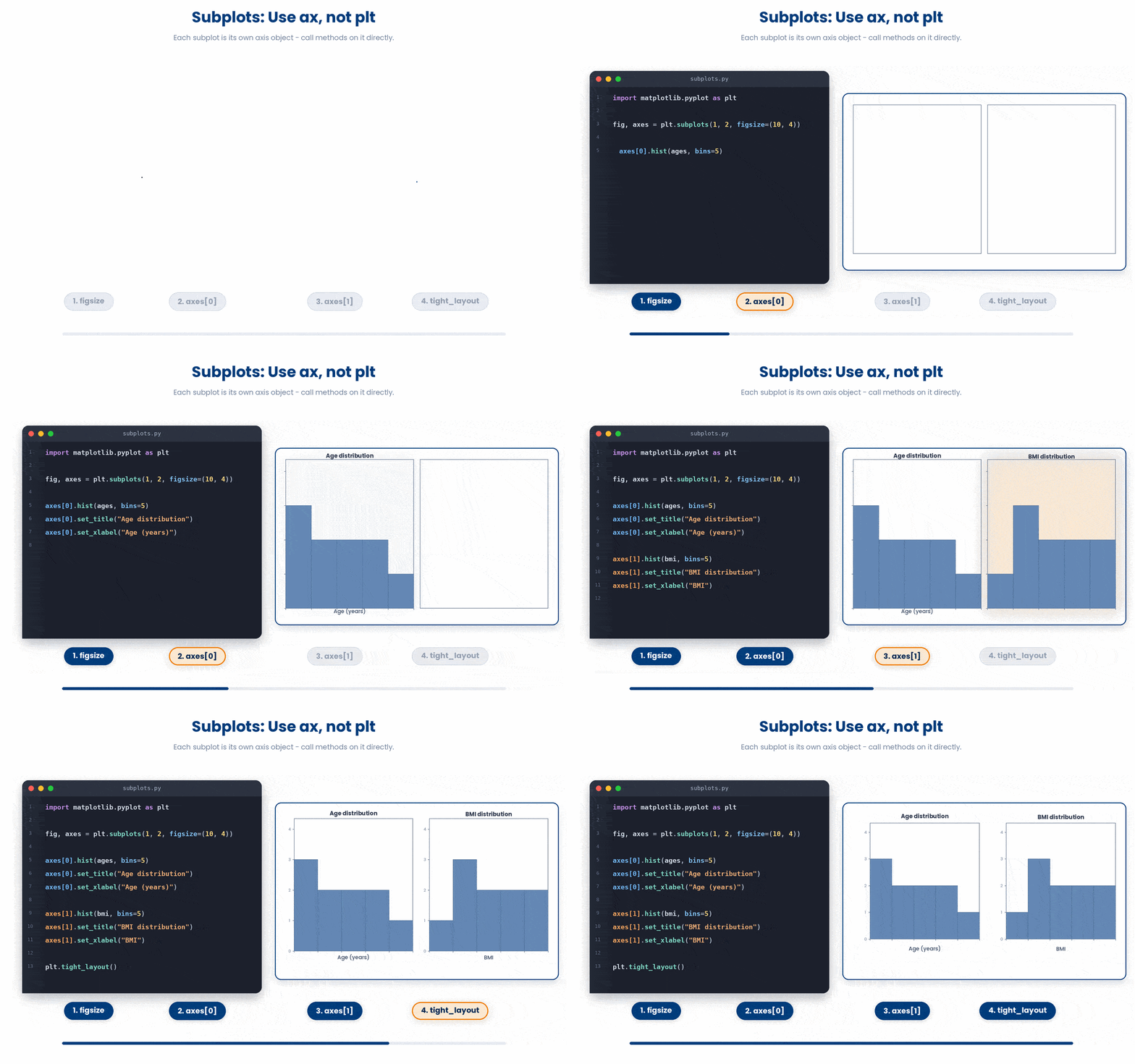
There is an older way to build subplots that you will still meet constantly in other people’s code, including the PHM5005 course notebooks: plt.subplot(nrows, ncols, index). It builds one panel at a time instead of handing you a whole array up front. index counts panels from 1, not 0, filling the grid left to right and then row by row down the page, so plt.subplot(1, 2, 1) is the first (leftmost) panel and plt.subplot(1, 2, 2) is the second.
Try this snippet in the Python Scratchpad on the right.
import matplotlib.pyplot as plt

ages = [54, 61, 47, 72, 38, 65, 49, 58, 71, 44]
bmi  = [27.3, 24.1, 31.2, 22.8, 29.5, 26.0, 30.1, 25.4, 23.7, 28.2]

plt.figure(figsize=(10, 4))

plt.subplot(1, 2, 1)
plt.hist(ages, bins=8)
plt.title("Age distribution")
plt.xlabel("Age (years)")

plt.subplot(1, 2, 2)
plt.hist(bmi, bins=5)
plt.title("BMI distribution")
plt.xlabel("BMI")

plt.tight_layout()
plt.show()This draws exactly the same figure as fig, axes = plt.subplots(1, 2) further up, using the older plt.subplot calls instead. The difference shows up once a figure gets more complicated. Every plt.something call after a plt.subplot(...) line applies to whichever panel you selected most recently, and there is no named variable for ‘the left panel’ the way axes[0] is one. That ambiguity is exactly what the object-oriented style avoids, so prefer fig, ax = plt.subplots(...) for anything you are building on — but expect to keep reading plt.subplot() in other people’s code.
When you create a 2D grid (like 2 by 2), axes becomes a 2D array. You index it using axes[row, col]:
Try this snippet in the Python Scratchpad on the right.
import matplotlib.pyplot as plt

fig, axes = plt.subplots(2, 2, figsize=(8, 6))

axes[0, 0].plot([1, 2, 3], [1, 4, 9])
axes[0, 0].set_title("Top left")

axes[0, 1].scatter([1, 2, 3], [3, 1, 2])
axes[0, 1].set_title("Top right")

axes[1, 0].bar(["A", "B", "C"], [3, 5, 2])
axes[1, 0].set_title("Bottom left")

axes[1, 1].hist([1, 2, 2, 3, 3, 3, 4, 4, 5], bins=5)
axes[1, 1].set_title("Bottom right")

plt.tight_layout()
plt.show()![Each axes[row, col] expression picks one subplot in a 2D grid — the first index selects the row, the second selects the column.](GIF_plt_axes_indexing.gif)
There is a second reason to reach for plt.xlim/plt.ylim beyond zooming to a cutoff: keeping two panels honest. Each subplot scales its own axes to fit its own data by default, so two histograms sitting side by side can look almost identical while covering completely different ranges of values or counts. Comparing panels is only fair once their limits match.
Try this snippet in the Python Scratchpad on the right.
import matplotlib.pyplot as plt

clinic_a = [92, 95, 88, 101, 97, 90, 99, 94, 96, 98,
            93, 100, 91, 95, 97, 89, 102, 96, 94, 98]
clinic_b = [90, 95, 100, 92, 97]

fig, axes = plt.subplots(1, 2, figsize=(10, 4))
axes[0].hist(clinic_a, bins=6)
axes[0].set_title("Clinic A (n=20)")
axes[0].set_xlabel("Glucose (mg/dL)")
axes[0].set_ylabel("Count")
axes[1].hist(clinic_b, bins=6)
axes[1].set_title("Clinic B (n=5)")
axes[1].set_xlabel("Glucose (mg/dL)")
axes[1].set_ylabel("Count")
plt.tight_layout()
plt.show()Clinic B has only five readings, so even its tallest bar is small in absolute terms. But Matplotlib stretches each panel’s y-axis to fill the space with whatever data it has, so that short bar gets blown up to the same height on the page as Clinic A’s much taller one. Side by side like this, the two clinics look like they have similarly shaped distributions. They do not.
Try this snippet in the Python Scratchpad on the right.
import matplotlib.pyplot as plt

clinic_a = [92, 95, 88, 101, 97, 90, 99, 94, 96, 98,
            93, 100, 91, 95, 97, 89, 102, 96, 94, 98]
clinic_b = [90, 95, 100, 92, 97]

fig, axes = plt.subplots(1, 2, figsize=(10, 4))
axes[0].hist(clinic_a, bins=6)
axes[0].set_title("Clinic A (n=20)")
axes[0].set_xlabel("Glucose (mg/dL)")
axes[0].set_ylabel("Count")
axes[1].hist(clinic_b, bins=6)
axes[1].set_title("Clinic B (n=5)")
axes[1].set_xlabel("Glucose (mg/dL)")
axes[1].set_ylabel("Count")

top = max(axes[0].get_ylim()[1], axes[1].get_ylim()[1])
axes[0].set_ylim(0, top)
axes[1].set_ylim(0, top)

plt.tight_layout()
plt.show()Reading each axis’s own auto-picked limit with get_ylim() and applying the larger one to both panels is a pattern worth keeping: it works whatever the data turns out to be, so you never have to guess or hard-code a number. With the same ylim on both panels now, Clinic B’s bars sit where they actually belong — clearly lower than Clinic A’s, not equal to them.
5 Saving figures
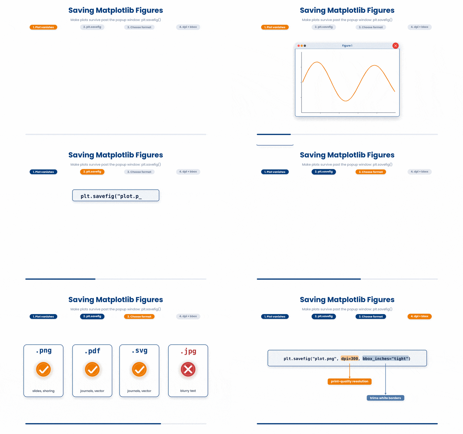
A figure that lives only in a popup window is gone the moment you close it. Most of the time you want a saved file you can drop into a slide, attach to an email, or include in a paper. Use plt.savefig("filename.ext") to export a clean, high-quality image.
- File Formats – Use .png for slides and quick sharing. Use .pdf or .svg for journal submissions because they are vector formats that stay perfectly sharp at any zoom level. Never use .jpg for plots. It causes blurry text and artifacting.
- Quality – Pass dpi=300 to guarantee print-quality resolution.
- Cropping – Pass bbox_inches="tight" to automatically trim off excess white borders.
Two critical rules for saving:
- Order matters – Always call
plt.savefig()beforeplt.show(). If you callshow()first, matplotlib often clears the canvas, resulting in a blank saved file. - Prevent memory leaks – If you are saving figures inside a loop (e.g., one plot per patient), add
plt.close(fig)at the end of each loop iteration to free up your computer's memory.
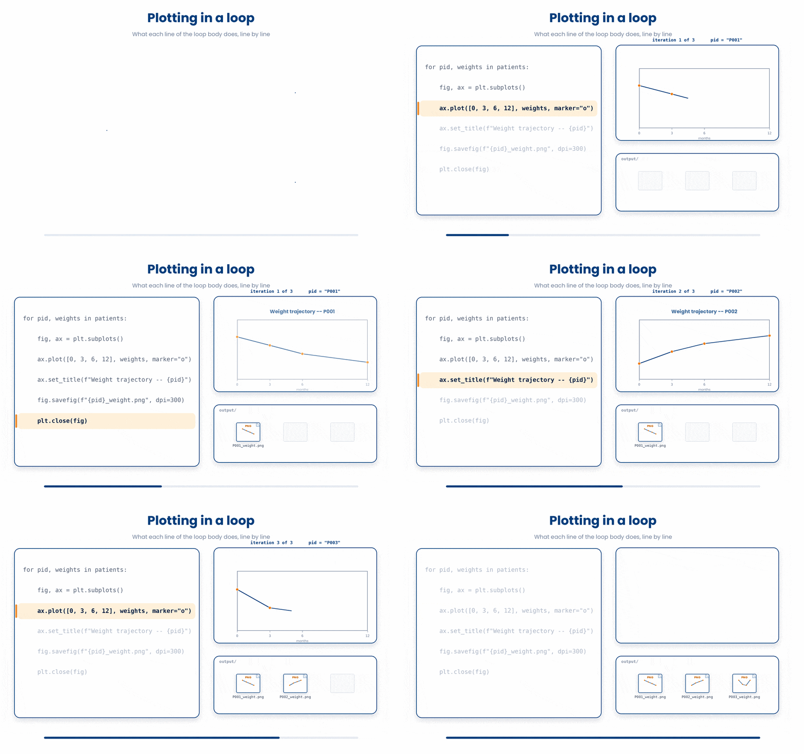
Try this snippet in the Python Scratchpad on the right.
import matplotlib.pyplot as plt

patients = [
    ("P001", [82, 80, 78, 76]),
    ("P002", [91, 90, 88, 85]),
    ("P003", [70, 71, 70, 69]),
]

# One figure per patient -- save and close inside the loop.
for pid, weights in patients:
    fig, ax = plt.subplots()
    ax.plot([0, 3, 6, 12], weights, marker="o")
    ax.set_title(f"Weight trajectory -- {pid}")
    fig.savefig(f"{pid}_weight.png", dpi=300, bbox_inches="tight")
plt.close(fig) # frees memory before the next iterationNote: This will appear under the files tab in the Python Scratchpad. You can download the graphs to view.
6 Putting it together
The tools across both parts of this module are usually used together. A typical short visualization workflow picks the right plot type from Part I, then labels and styles it, arranges it next to related panels, and saves the result. That is exactly what the worked example below does on a small patient dataset.
Work through this example in three stages. You unlock each stage only after the tutor confirms the previous one. Each stage removes more of the scaffolding — by the end you are writing it yourself.
Problem: You have ten patients with ages and BMI values. Build a figure with two side-by-side panels: a histogram of ages on the left, and a scatter plot of BMI versus age on the right. Label both axes on each panel, give each panel a title, and save the result as a 300-dpi PDF called patient_overview.pdf.
import matplotlib.pyplot as plt

ages = [54, 61, 47, 72, 38, 65, 49, 58, 71, 44]
bmi  = [27.3, 24.1, 31.2, 22.8, 29.5, 26.0, 30.1, 25.4, 23.7, 28.2]

fig, axes = plt.subplots(1, 2, figsize=(10, 4))

axes[0].hist(ages, bins=5, color="steelblue")
axes[0].set_xlabel("Age (years)")
axes[0].set_ylabel("Number of patients")
axes[0].set_title("Age distribution")

axes[1].scatter(ages, bmi, color="darkorange")
axes[1].set_xlabel("Age (years)")
axes[1].set_ylabel("BMI")
axes[1].set_title("BMI vs age")

plt.tight_layout()
plt.savefig("patient_overview.pdf", dpi=300, bbox_inches="tight")
plt.show()- Create the two-panel figure with plt.subplots(1, 2) so the two panels sit side by side, and set figsize so the saved figure is wide enough to read each panel comfortably.
- Use axes[0].hist on the left panel because we are showing the distribution of one variable (ages), and pick a colour. Then set the axis labels and a title with the set_xlabel, set_ylabel, and set_title methods on that axes.
- Use axes[1].scatter on the right panel because we are showing a relationship between two variables (age and BMI), and label both axes the same way.
- Call plt.tight_layout() once at the end so the panel titles and labels do not bump into each other; this is much easier than fiddling with the spacing manually.
- Save before showing — plt.savefig with dpi=300 and bbox_inches="tight" produces a publication-ready PDF, and plt.show() at the very end is what displays the figure on screen.
The same solution with key parts replaced by ???.
Fill in every ??? so the code matches the reference,
then ask the tutor to check it.
Your turn: You have a list of cholesterol values and a matching list of systolic blood pressures for fifteen patients. Build a 1-by-2 figure: histogram of cholesterol on the left, scatter of blood pressure versus cholesterol on the right. Label both axes on each panel, give each a title, and save as a 300-dpi PNG called cohort_overview.png.
All the lines you need are in the Line bank on the left — some may be distractors you should leave behind. Drag the lines you need into the Your solution column on the right, in the correct order, then click Check.
Task: Assemble a script that plots a single patient's weight at four follow-up visits, labels both axes (with units), gives the figure a title, and saves the result as a 300-dpi PNG before showing the figure on screen.
plt.savefig("weight.png", dpi=300)plt.scatter(months, weight_kg, marker="o")plt.plot(months, weight_kg, marker="o")plt.show()import matplotlib.pyplot as pltplt.ylabel("Weight (kg)")plt.show()plt.title("Patient weight over follow-up")months = [0, 3, 6, 12]weight_kg = [82, 79, 75, 73]plt.xlabel("Months since baseline")plt.legend("Patient A")plt.savefig("weight.png", dpi=300, bbox_inches="tight")
- Drop lines here, in order.
Generating a reflection question for you…
7 Showing an array as a picture
Every digital image is secretly a grid of numbers. plt.imshow(array) takes a 2D array and displays it as a picture: one cell becomes one pixel, and that cell’s value decides the pixel’s shade. Build the array yourself with numpy and there is no image file to load at all.
Try this snippet in the Python Scratchpad on the right.
import numpy as np
import matplotlib.pyplot as plt

row = np.linspace(0, 1, 20)
image = np.zeros((20, 20)) + row
image[6:10, 6:10] = 1.0

plt.imshow(image, cmap="gray")
plt.colorbar(label="Pixel value")
plt.axis("off")
plt.show()row holds 20 values evenly spaced between 0 and 1. Adding it to a 20-by-20 block of zeros copies that row into every row of the array, which is why the image shades smoothly from black on the left to white on the right; setting a small block of cells to 1.0 afterwards drops a bright square into the middle. cmap="gray" maps low values to black and high values to white — the same convention an X-ray, CT, or MRI image uses. plt.colorbar(label=...) adds the strip that shows which shade means which value, and plt.axis("off") hides the row and column numbers around the edge, since a pixel’s index is rarely something a reader needs to see.
By default, imshow stretches its color range to fit the min and max of whatever array you give it, so the darkest pixel is always black and the brightest is always white — regardless of the actual numbers underneath. That works for one image on its own, but it breaks the moment you put two images side by side: each one stretches independently, so a genuinely darker scan can end up looking just as bright as a lighter one. vmin= and vmax= fix this by pinning both images to the same scale, so a given shade means the same value in both.
You already met this idea earlier in this lesson, matching ylim across two histogram panels, and the heatmap lesson makes exactly the same argument for vmin, vmax, and center on sns.heatmap. Same reasoning, now for pixel data.
Try this snippet in the Python Scratchpad on the right.
import numpy as np
import matplotlib.pyplot as plt

row = np.linspace(0, 1, 20)
scan_a = np.zeros((20, 20)) + row
scan_b = np.zeros((20, 20)) + row * 0.4

fig, axes = plt.subplots(1, 2, figsize=(8, 4))
axes[0].imshow(scan_a, cmap="gray")
axes[0].set_title("Scan A")
axes[0].axis("off")
axes[1].imshow(scan_b, cmap="gray")
axes[1].set_title("Scan B")
axes[1].axis("off")
plt.show()Scan B’s values only run from 0 to 0.4 — it is objectively a darker scan than Scan A, whose values run all the way to 1. But drawn this way, both panels stretch to their own black-to-white range, so Scan B looks every bit as bright as Scan A. Nothing on screen tells you the two scans are not comparable.
Try this snippet in the Python Scratchpad on the right.
import numpy as np
import matplotlib.pyplot as plt

row = np.linspace(0, 1, 20)
scan_a = np.zeros((20, 20)) + row
scan_b = np.zeros((20, 20)) + row * 0.4

fig, axes = plt.subplots(1, 2, figsize=(8, 4))
axes[0].imshow(scan_a, cmap="gray", vmin=0, vmax=1)
axes[0].set_title("Scan A")
axes[0].axis("off")
axes[1].imshow(scan_b, cmap="gray", vmin=0, vmax=1)
axes[1].set_title("Scan B")
axes[1].axis("off")
plt.show()Pinning both panels to the same vmin=0, vmax=1 tells the honest story: Scan B never gets brighter than a mid-gray, because its values never actually reach the top of the scale. This is the version worth showing anyone you are asking to compare the two.
One more use for an array of pixel values: flatten it into a single list of numbers with .flatten() and pass that to plt.hist() as a quick sanity check before you trust an image. A healthy image spreads its pixel values across the range. A big spike stacked at the far left means most pixels are close to black — an under-exposed image; a spike at the far right means the same for an over-exposed one.
Try this snippet in the Python Scratchpad on the right.
import numpy as np
import matplotlib.pyplot as plt

image = np.zeros((20, 20))
image[6:10, 6:10] = 0.9

plt.hist(image.flatten(), bins=20)
plt.xlabel("Pixel value")
plt.ylabel("Count")
plt.show()Almost the whole array is 0 here, so the histogram is one tall spike at the far left, with a small bar near 0.9 for the bright square — a mostly-black image with one bright patch, read straight off the numbers instead of by eye.
8 Check your understanding
You have reached the end of the module. Try the same questions again — your answers here, paired with your pre-test answers, are how we measure what the module taught you. Answer every question and confidence rating, then click Submit and see results to view your score.
You add label="Cohort 1" to plt.plot but the legend does not appear in your figure. What else do you need?
You want to draw a horizontal reference line at y=7.0 across the whole plot to mark a clinical threshold. Which call adds it?
Your x-axis shows the numbers 0, 1, 2, but you want the ticks to read "Baseline", "Week 1", "Week 2" instead. Which call does this?
You write fig, axes = plt.subplots(1, 2) and try axes[0, 0].plot(...). Python raises IndexError: too many indices for array. What is the fix?
Inside a figure made with fig, axes = plt.subplots(1, 2), you want to give the LEFT panel its own title. Which approach is correct?
In a multi-panel figure, the subplot titles and axis labels overlap and collide with each other. Which single call fixes the spacing automatically?
You call plt.savefig("figure.png") after plt.show() in a script and the saved PNG file is blank. What should you do?
You are exporting a figure for a journal submission that must stay perfectly sharp at any zoom level. Which file format is the best choice?
I can build a one-panel matplotlib figure with axis labels, a title, and a legend, and save it as a PNG.
I can build a two- or four-panel figure with plt.subplots, label every panel, and save the result as a 300-dpi PDF ready to drop into a paper or slide.
I can customize a plot with a threshold line, custom axis limits, and named tick labels, and style its lines with colours, markers, and line styles.
9 Your results
Here is how your post-test answers compare with your pre-test answers. The pre/post pairing is the most reliable way to see what this module actually taught you.
Submit the post-test to see your results.
What is the one thing from this module that is still unclear to you?