

1 Before you start
This is not graded, and it does not count towards anything. Answer every question even if you are only guessing — having a go at something before you have been taught it is one of the best ways to remember it afterwards. The lesson ends with another short check, and there you will be shown the correct answer for anything you missed. Choose an option for every question and confidence rating, then click Submit answers.
You write a Python script that ends with plt.plot(ages) and run it. The script finishes without errors but no figure window appears on screen. What is the most likely cause?
You write fig, ax = plt.subplots() and want to draw a line on that panel using the object-oriented style. Which call is correct?
You plot age (x) against BMI (y) for 200 unrelated patients and join the points with plt.plot. Why is the result misleading?
You have one row per patient in a DataFrame and want to show the relationship between age and cholesterol. Which matplotlib call is the right one?
You want to compare two patients' weight trajectories on the same axes. What is the simplest correct approach?
You want to see the distribution of patient ages across your study. Which call produces the right plot?
You have the mean BMI for each of three clinics (A, B, C) and want to compare them. Which call is the right one?
You draw plt.hist(values, bins=3) on several hundred measurements and the distribution looks like a featureless block. What is the most sensible next step?
I can decide whether a particular plot should be a line plot, a scatter plot, a bar plot, or a histogram, and explain why.
I can set up a matplotlib figure in either the pyplot or the object-oriented style, follow the import-build-show skeleton, and plot one or more series on the same axes.
2 Introduction
Numbers don't become insights until you visualize them. A column of ages or a list of expression values tells you very little on its own. However, a histogram instantly reveals demographic trends, and a bar chart highlights exactly which gene is firing hardest. Visualization translates raw data into clear pictures, sparking the questions that drive your research.
Matplotlib is the foundational plotting library of the Python data stack. It’s the engine powering pandas' df.plot() and seaborn graphics under the hood. Because it easily produces high-quality outputs accepted by most scientific journals, learning just a small fraction of Matplotlib is enough to generate publication-ready figures for your reports, slides, and manuscripts.
This is the first of two parts on Matplotlib. It covers the foundations and the core plot types — everything you need to turn a raw column of numbers into the right kind of chart:
- Introduction to Matplotlib — the import convention, the simplest possible figure, and the figure-and-axes pair that everything else is built on.
- Line plots and scatter plots — when to draw a connecting line, when to draw a cloud of dots, and how to put more than one series on the same axes.
- Bar plots and histograms — comparing one number per category, and showing the distribution of values inside a single column.
Part II then builds on these to make a figure presentation-ready: customizing labels, colours, and legends, arranging several panels with subplots, and saving the finished result to a file.
- We will run through some of the common plots that you will encounter in Matplotlib.
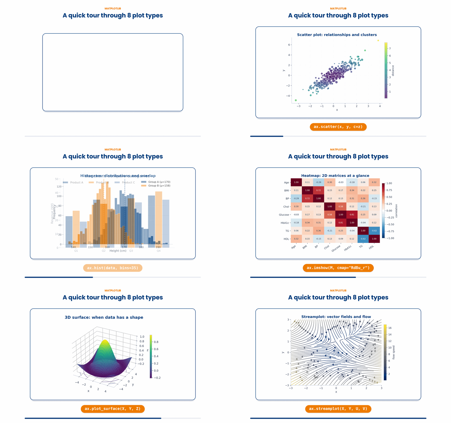
Try every snippet in the Python Scratchpad on the right. By the end of this part you will be able to set up a figure in either coding style, follow the three-step skeleton, and reach for the right basic plot — line, scatter, bar, or histogram — including plotting several series at once.
3 Introduction to Matplotlib
Matplotlib is a third-party package, so the first step is to make it available to your script. The convention is to import the part of it called pyplot under the alias plt. From that line onwards, every plotting tool is reached as plt.something.
Try this snippet in the Python Scratchpad on the right.
import matplotlib.pyplot as plt

ages = [54, 61, 47, 72, 38, 65, 49]
plt.plot(ages)
plt.show()This creates a complete, working figure in just four lines. plt.plot draws a line through your data, and plt.show() opens the figure window.
NOTE: In Jupyter notebooks, figures usually appear inline automatically. In a plain Python script, nothing appears until you explicitly call show()
4 The Canvas vs The Plot
Behind the scenes, Matplotlib manages two related objects:
- ‘Figure’ – The entire canvas is the window that holds everything
- ‘Axes’ – The actual plotting area inside the figure i.e. the box containing your data, tick marks, and labels.
A single Figure can hold multiple Axes (subplots). A simple plt.plot call automatically creates one of each, which is all you need to worry about for a one-panel figure.
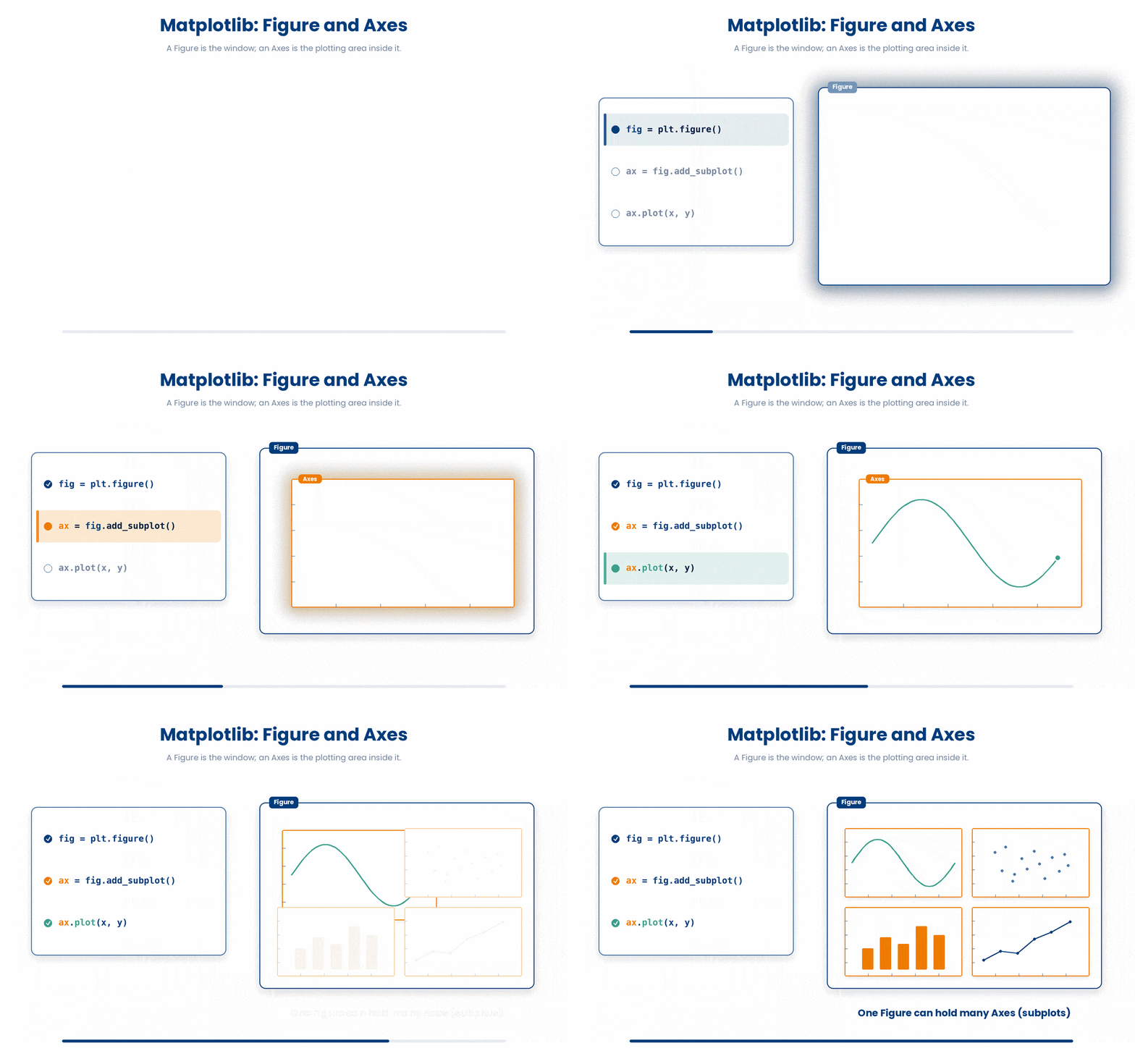
You can try the code here:
Try this snippet in the Python Scratchpad on the right.
import matplotlib.pyplot as plt
fig, (ax1, ax2) = plt.subplots(1, 2)
fig.suptitle("One Figure (the whole window)")
ax1.set_title("Axes 1 (a panel inside)")
ax2.set_title("Axes 2 (another panel)")
ax1.plot([1, 2, 3], [1, 4, 9])
ax2.plot([1, 2, 3], [3, 2, 1])
plt.show()5 Two Ways to Code
You will encounter two different styles of writing Matplotlib code:
- The ‘pyplot’ style – A sequence of
plt.somethingcalls that quietly modify the active figure. It is shorter and great for quick, one-off plots. - The Object-oriented style – Explicitly creates the figure and axes upfront, then calls methods directly on the axes object. It is cleaner and highly recommended for complex or multi-panel figures.
Here are the two different styles
(a) pyplot style
Try this snippet in the Python Scratchpad on the right.
import matplotlib.pyplot as plt

ages = [54, 61, 47, 72, 38, 65, 49]
plt.plot(ages)
plt.show()(b) Object-oriented style
Try this snippet in the Python Scratchpad on the right.
import matplotlib.pyplot as plt

fig, ax = plt.subplots()
ax.plot([54, 61, 47, 72, 38])
plt.show()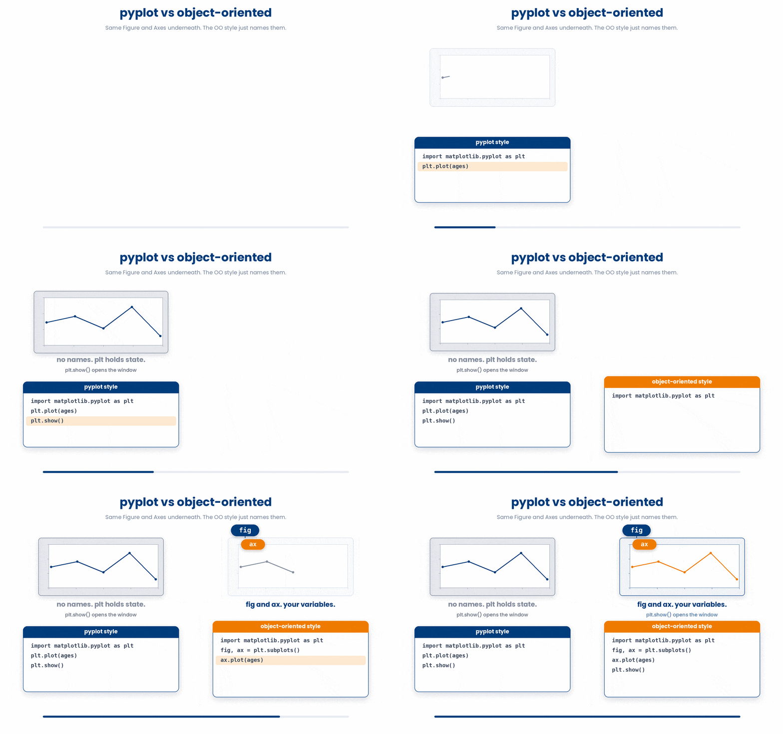
NOTE: Calling plt.subplots() with no arguments returns one Figure and one Axes. Storing the axes in a variable named ax is standard practice, and it pays off immediately when you need to draw more than one panel.
![Object-oriented style scales to many subplots: pyplot tracks one implicit active subplot at a time, while named ax[i] variables let the programmer target any panel directly.](GIF_plt_oo_pays_off.gif)
6 The Three-Step Skeleton
From here on, every plot in this module follows the same rhythm:
- Import Matplotlib
- Build the plot with
pyplotor object-oriented calls - Show (or
savefig) the final output
Once that rhythm is in your fingers, the rest of the module is just about what you put between the import and the show
# The three-step skeleton every plot follows.
import matplotlib.pyplot as plt # 1. import

plt.plot([54, 61, 47, 72, 38]) # 2. build (one or more pyplot calls)
plt.xlabel("Patient index")
plt.ylabel("Age")

plt.show() # 3. show (or .savefig for a file)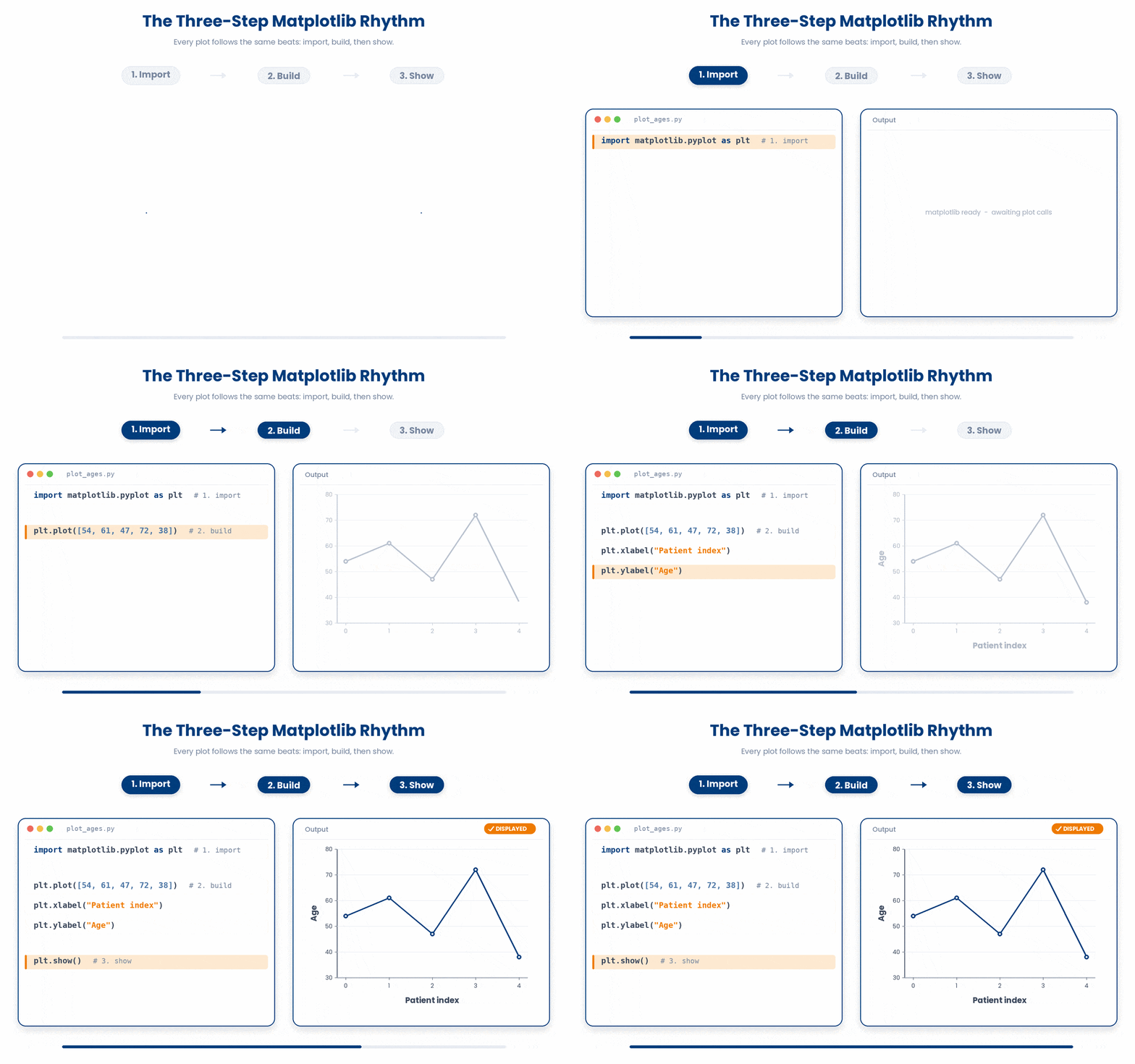
Every plot you have drawn so far uses Matplotlib’s default look. plt.style.use("ggplot") changes that in one line: it swaps in a different set of default colors, background shading, and grid lines for every plot you draw after it, without changing anything about the plotting calls themselves. Run print(plt.style.available) to see the full list of built-in styles that ship with Matplotlib, and try a few until one fits your report.
Try this snippet in the Python Scratchpad on the right.
import matplotlib.pyplot as plt

plt.style.use("ggplot")

ages = [54, 61, 47, 72, 38, 65, 49]
plt.plot(ages)
plt.show()plt.style.use() is a global setting for the rest of the session, not an argument you pass to one figure. Call it once, near the top of your script, right after the import, and every plot you draw afterwards picks up the new look, even ones on a completely different topic later in the same notebook. To go back to Matplotlib’s own look, call plt.style.use("default").
7 Choosing your plot
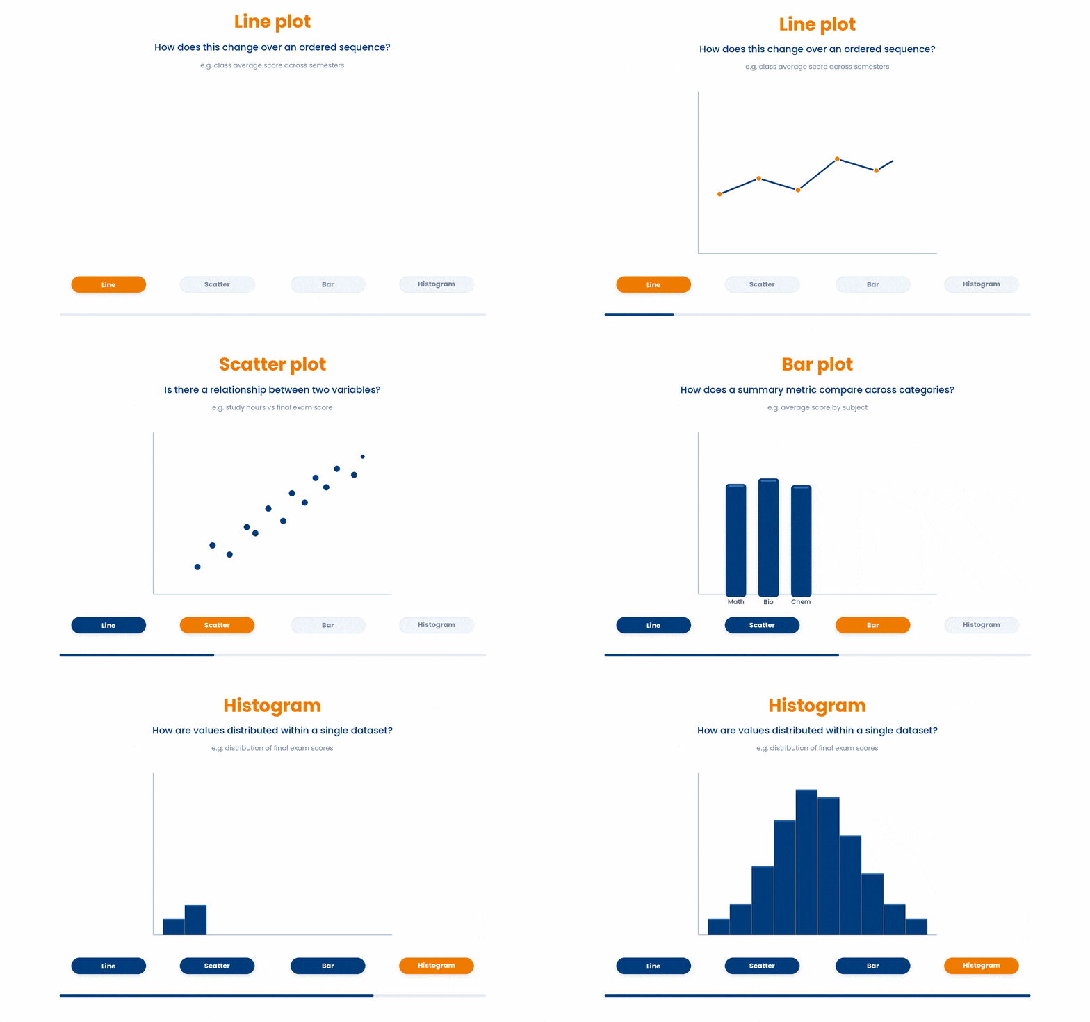
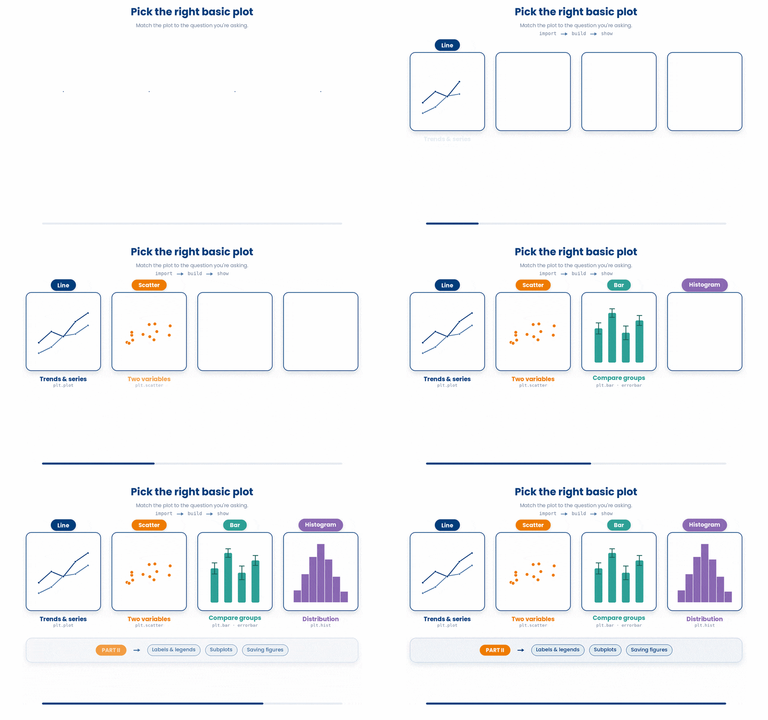
Four of the most common plots answer fundamentally different questions about your data. Choosing the right one comes down to identifying exactly what you want the viewer to see:
- Line plots ask: How does this change over an ordered sequence (like time)?
- Scatter plots ask: Is there a relationship between these two variables?
- Bar plots ask: How does a summary metric compare across distinct categories?
- Histograms ask: How are the values distributed within a single dataset?
Choosing the right plot comes down to identifying which question you are trying to answer.
7.1 plt.plot for line plot
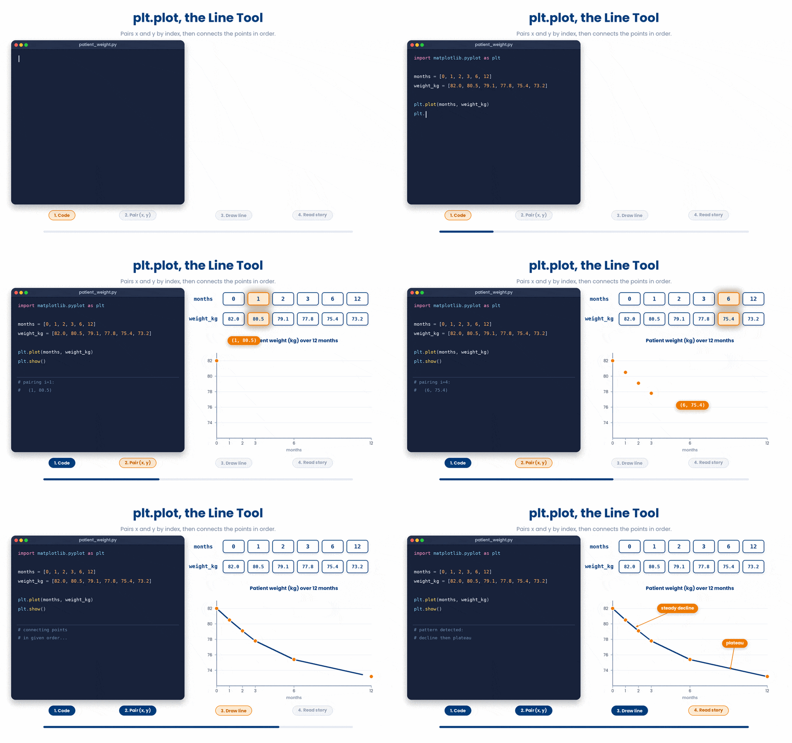
plt.plot is the line tool. It takes a list of x values and a list of y values, drawing a line that connects the points in order. (If you only provide one list, Matplotlib defaults the x-axis to index numbers 0, 1, 2...).
Try this snippet in the Python Scratchpad on the right.
import matplotlib.pyplot as plt

months = [0, 1, 2, 3, 6, 12]
weight_kg = [82.0, 80.5, 79.1, 77.8, 75.4, 73.2]

plt.plot(months, weight_kg)
plt.show()This shows a single patient's weight over a year. The connecting line makes the trajectory obvious, i.e. a steady decline followed by a plateau. Line plots shine when the x-axis has a natural order, such as time, dose, or position along a chromosome.
7.2 plt.scatter for scatter plots
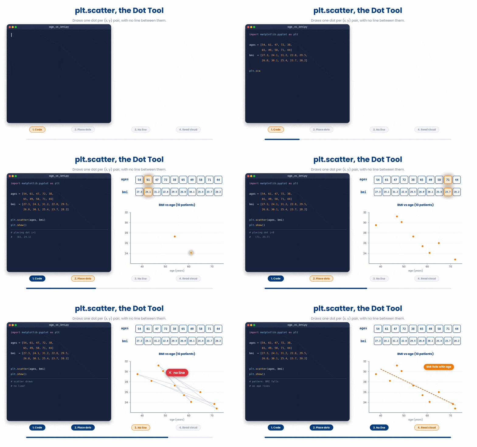
plt.scatter is the dot tool. It takes x and y arrays and draws one dot per pair without connecting them. Use this when consecutive points have no logical link—for example, plotting age versus BMI across different patients. A line here would falsely imply a trajectory.
Try this snippet in the Python Scratchpad on the right.
import matplotlib.pyplot as plt

ages = [54, 61, 47, 72, 38, 65, 49, 58, 71, 44]
bmi = [27.3, 24.1, 31.2, 22.8, 29.5, 26.0, 30.1, 25.4, 23.7, 28.2]

plt.scatter(ages, bmi)
plt.show()Each dot represents one patient. The overall "cloud" instantly reveals whether age and BMI move together, highlighting loose patterns far faster than staring at raw CSV columns.
With a handful of points, a scatter plot is easy to read. With hundreds, markers stack directly on top of each other and the cloud turns into a solid blob, hiding the density pattern you wanted to see. alpha= fixes this by making each marker partly see-through, on a scale from 0 (invisible) to 1 (fully solid). Where points overlap, the transparency stacks, so a crowded region reads darker than a lone point — the shading itself now shows you where the data is dense.
Try this snippet in the Python Scratchpad on the right.
import numpy as np
import matplotlib.pyplot as plt

rng = np.random.default_rng(seed=1)
ages = rng.normal(55, 12, 500)
bmi = rng.normal(27, 4, 500)

plt.scatter(ages, bmi, alpha=0.3)
plt.show()7.3 Plotting multiple series
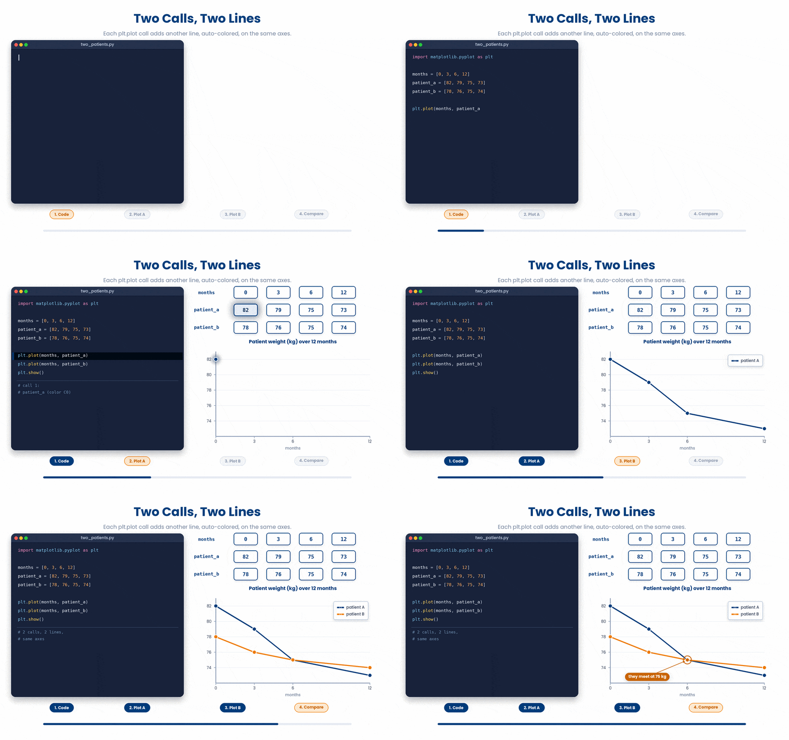
You can plot more than one series on the same axes simply by calling plt.plot or plt.scatter twice. Matplotlib will automatically assign different colors to each series so you can tell them apart.
Try this snippet in the Python Scratchpad on the right.
import matplotlib.pyplot as plt

months = [0, 3, 6, 12]
patient_a = [82, 79, 75, 73]
patient_b = [78, 76, 75, 74]

plt.plot(months, patient_a)
plt.plot(months, patient_b)
plt.show()Plotting multiple patients on the same axes tells a richer story. The reader's eye can directly compare the lines on the exact same scale, without mentally juggling two separate figures side-by-side.
7.4 plt.bar for bar plots
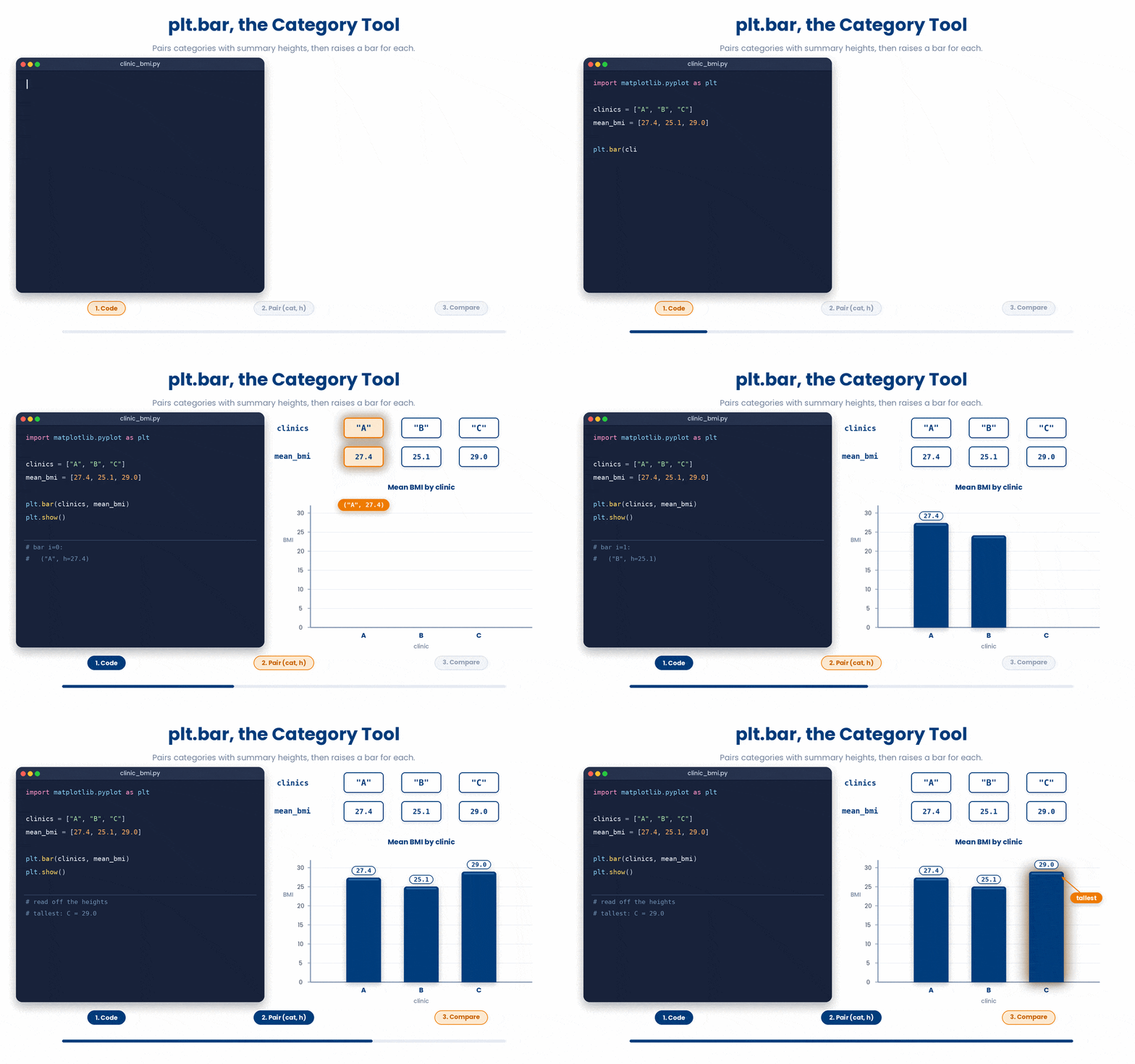
plt.bar takes a list of categories for the x-axis and a list of heights for the y-axis. The heights are usually a summary metric, like a mean or percentage.
Try this snippet in the Python Scratchpad on the right.
import matplotlib.pyplot as plt

clinics = ["A", "B", "C"]
mean_bmi = [27.4, 25.1, 29.0]

plt.bar(clinics, mean_bmi)
plt.show()If your category names are long and overlap on the x-axis, use plt.barh instead to draw horizontal bars (the categories will run down the y-axis).
7.5 plt.hist for historgrams
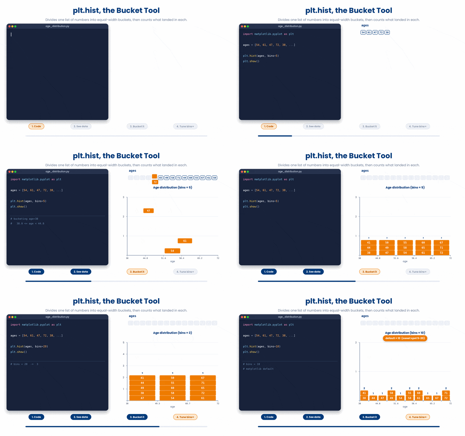
A histogram buckets a single list of numbers for you. plt.hist divides your data range into equal-width buckets and draws one bar per bucket to show how many values landed inside.
Try this snippet in the Python Scratchpad on the right.
import matplotlib.pyplot as plt

ages = [54, 61, 47, 72, 38, 65, 49, 58, 71, 44, 60, 55, 67, 41, 50]

plt.hist(ages, bins=8)
plt.show()The bins= argument is the main knob you need to turn. Too few bins smooth out the shape of your data; too many create visual static. Between 5 and 20 bins is usually the sweet spot—adjust it until the picture clearly shows what you want to see. If you omit it, Matplotlib defaults to 10.
By default, the bars in a histogram touch with no border between them, so two adjacent bars of similar height can blend into one shape. Passing edgecolor="white" draws a thin line around every bar, which keeps them visually separate even when several bars are close in height or the figure is printed small.
Try this snippet in the Python Scratchpad on the right.
import matplotlib.pyplot as plt

ages = [54, 61, 47, 72, 38, 65, 49, 58, 71, 44, 60, 55, 67, 41, 50]

plt.hist(ages, bins=8, edgecolor="white")
plt.show()Rule of thumb: reach for edgecolor whenever you are drawing many thin bars side by side, and reach for alpha whenever you are drawing many overlapping points. Both solve the same underlying problem — markers crowding each other out — for the two plot types where it comes up most.
7.6 plt.errorbar for adding uncertainty
A standard bar plot of group means hides how spread out the underlying data is. plt.errorbar solves this by adding a vertical line through each point to show standard deviation, standard error, or a 95% confidence interval. You can pass the yerr argument either a single number (for a uniform error) or a list (one error value per point).
Try this snippet in the Python Scratchpad on the right.
import matplotlib.pyplot as plt

clinics = ["A", "B", "C"]
mean_bmi = [27.4, 31.1, 24.8]
sem = [0.8, 1.1, 0.6]
plt.errorbar(clinics, mean_bmi, yerr=sem, fmt="o", capsize=5)
plt.ylabel("Mean BMI (with SEM)")
plt.title("BMI by clinic")
plt.show()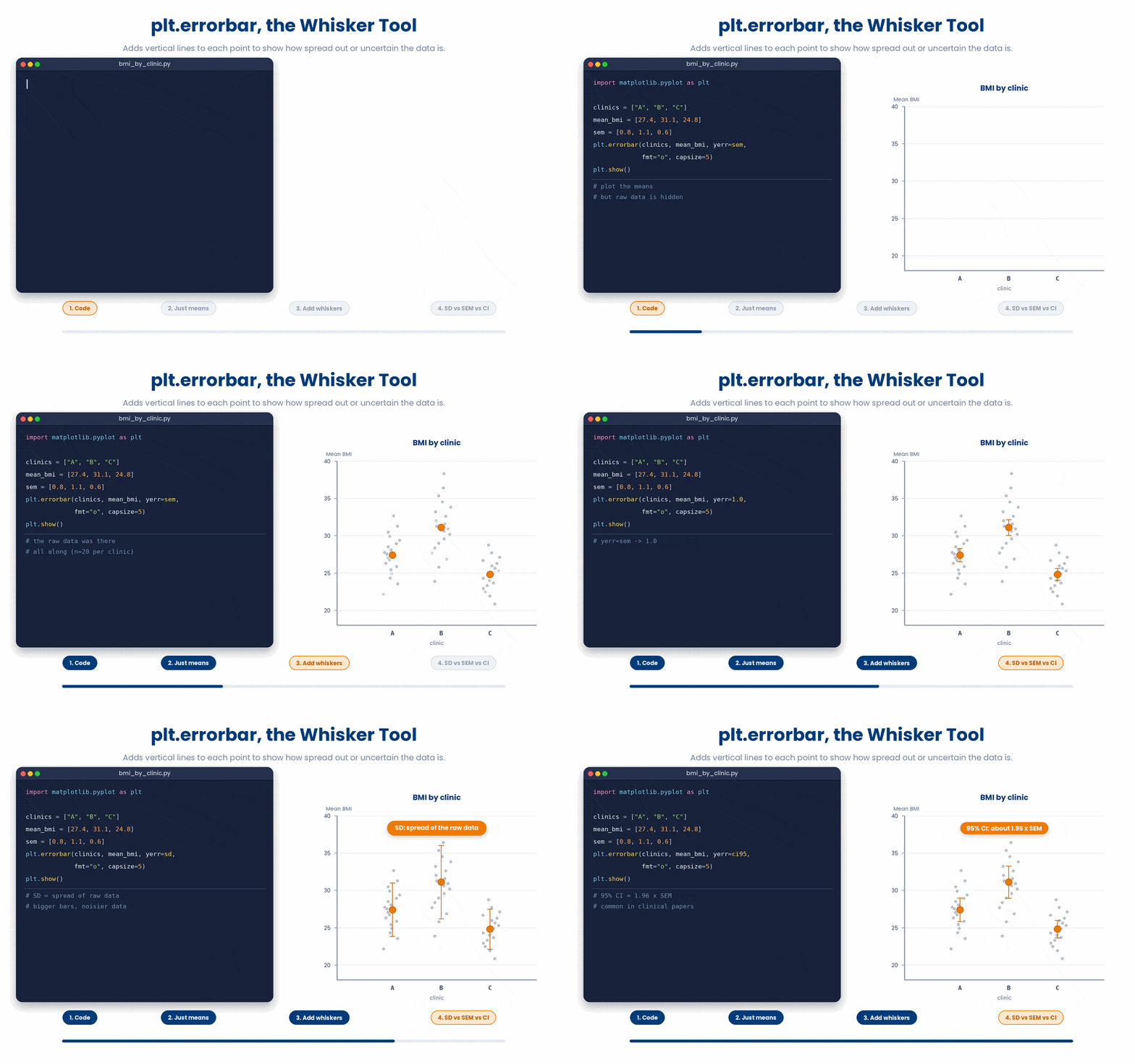
8 Wrapping up Part I
You can now set up a matplotlib figure two ways, follow the import—build—show skeleton, and choose the right basic plot — line, scatter, bar, or histogram — for the question you are asking, including plotting several series and adding error bars for uncertainty. Part II picks up from here: making those plots clear and presentation-ready with labels and legends, arranging multiple panels with subplots, and saving figures to disk.
9 Check your understanding
You have reached the end of the module. Try the same questions again — your answers here, paired with your pre-test answers, are how we measure what the module taught you. Answer every question and confidence rating, then click Submit and see results to view your score.
You write a Python script that ends with plt.plot(ages) and run it. The script finishes without errors but no figure window appears on screen. What is the most likely cause?
You write fig, ax = plt.subplots() and want to draw a line on that panel using the object-oriented style. Which call is correct?
You plot age (x) against BMI (y) for 200 unrelated patients and join the points with plt.plot. Why is the result misleading?
You have one row per patient in a DataFrame and want to show the relationship between age and cholesterol. Which matplotlib call is the right one?
You want to compare two patients' weight trajectories on the same axes. What is the simplest correct approach?
You want to see the distribution of patient ages across your study. Which call produces the right plot?
You have the mean BMI for each of three clinics (A, B, C) and want to compare them. Which call is the right one?
You draw plt.hist(values, bins=3) on several hundred measurements and the distribution looks like a featureless block. What is the most sensible next step?
I can decide whether a particular plot should be a line plot, a scatter plot, a bar plot, or a histogram, and explain why.
I can set up a matplotlib figure in either the pyplot or the object-oriented style, follow the import-build-show skeleton, and plot one or more series on the same axes.
10 Your results
Here is how your post-test answers compare with your pre-test answers. The pre/post pairing is the most reliable way to see what this module actually taught you.
Submit the post-test to see your results.
What is the one thing from this module that is still unclear to you?